


In the same way that a sign above the doorway of a brick-and-mortar store impacts the number of people who decide to enter, your registration forms influence the number of people who end up registering for your camp.
Disorganized, long, boring online forms drive away potential customers, while clean, succinct, branded forms secure registrations and online payments.
Today we’ll help you create optimized camp registration forms that enhance the customer experience—and, as an extension, boost your camp’s sales.
- Customize Registration Forms With Your Branding
- Request Only the Necessary Information
- Collect Parents’ Signatures Electronically
- Integrate Payments Directly Into Your Forms
- Make Your Registration Forms Mobile-Friendly
- Conclusion
Customize Registration Forms With Your Branding
Customizing your registration forms reinforces your brand’s identity, helping your business stay unique from its competitors in the mind of prospective buyers.
Using branded forms also suggests to parents that your camp is professional—and, therefore, trustworthy.
A camp that takes the time to create aesthetically pleasing forms that align with the brand’s color palette and other elements signals that it has competent staff who pay attention to detail.
These two qualities—competent and detail-oriented—are ones that parents look for when assessing a camp for their children.
Even the smallest stuff matters when it comes to keeping kids safe.
To customize your camp’s registration forms, you should include the camp’s name, logo, color palette, typography, and relevant graphics and images.
Though not a summer camp, Yellowstone Forever does a great job of branding their registration form, so summer camps should take note:
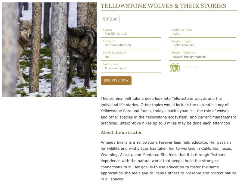

Source: Yellowstone Forever
They include an image of wolves, which relates to the topic of the seminar. And they use a lot of green, their brand’s main color.
The addition of the small green icon of two people hiking with a walking stick and backpack also gives prospective buyers a sense that this class is for people who enjoy outdoor activities.
It also reinforces the brand’s mission to help others explore nature.
Keep in mind that some camp registration form builders will offer more customization options than others.
To improve brand awareness and conversion rates, find one that gives you more control over the appearance of your forms.
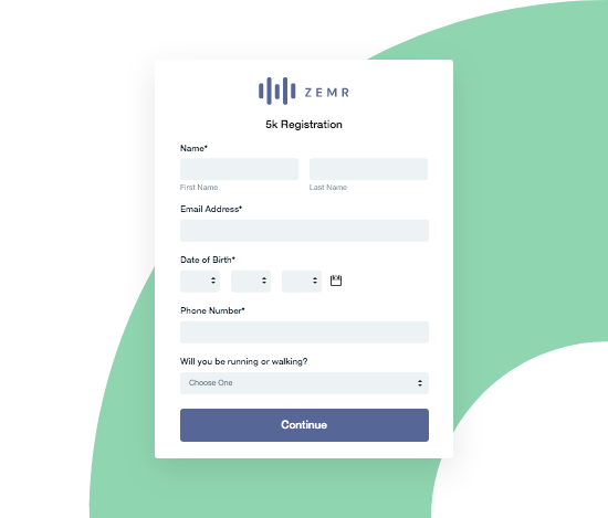
Request Only the Necessary Information
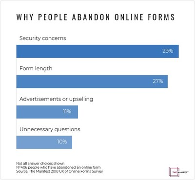
One of the top reasons why people abandon online forms is their excessive length:

Source: PR Newswire
People find it inconvenient to fill out a bunch of fields. They become fatigued and give up, especially if they think that a lot of the questions posed to them are irrelevant.
They might roll their eyes and murmur, “Why do they even need X?”, then click out with intentions to return to it later, only to forget about your camp entirely.
The antidote to form abandonment is asking fewer questions.
By minimizing the number of questions in your camp registration form, you’ll reduce the form’s length and increase the chances that parents finish and submit.
Instead, include only the necessary fields, the ones you need in order to effectively run your camp, and leave out the rest.
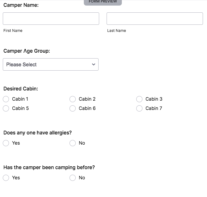
Below is some crucial information you should prioritize collecting:
| Camper personal and relevant medical info,
and camp preferences |
Learn the camper’s name, grade, allergies, medical conditions, and camp preferences (e.g., top bunk or lower bunk). |
| Parent contact info | Capture the parent’s name, email address, phone number, and street address. |
| Emergency contact info | Identify the emergency contact’s name, mobile phone number, email address, and street address. |
Depending on your camp, you might also need to know things like whether a particular camper can swim, if they want to room with a specific friend who’s also going to the camp, or if they’ve been camping before this.

Source: Jotform
Regardless, scrutinize each field’s right to belong on your form by asking yourself, “What would happen if we excluded this field?”
If nothing would change, or if the change would be insignificant, get rid of that field.
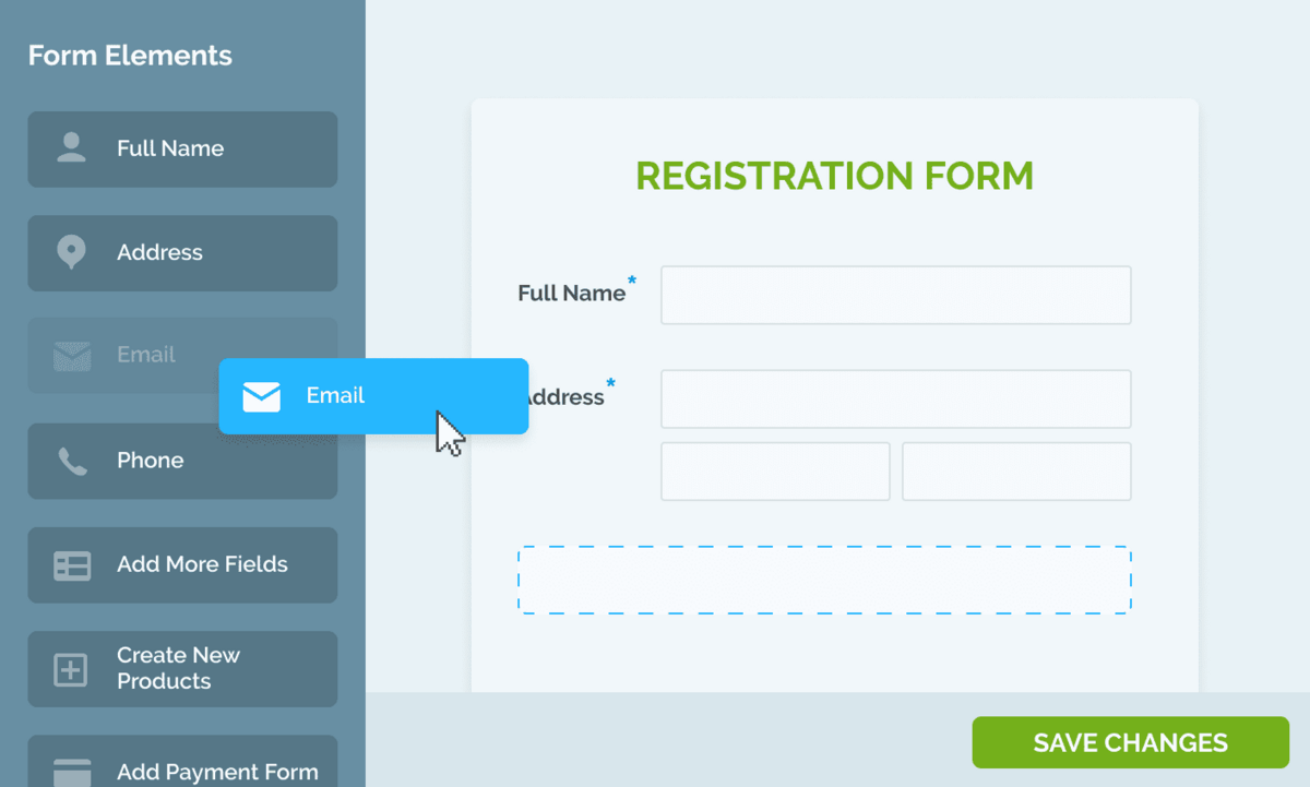
To create these succinct registration forms, consider using a camp registration software that makes it easy to create branded, custom forms with a drag-and-drop editor:

Source: Regpack
The software also allows you to set up conditional logic forms. With these, parents only see fields that relate to their specific situation. The others are hidden.
For example, if someone clicked “yes” to allergies, they might see a drop-down menu appear with the different allergies listed and checkboxes next to each one.
But if someone clicked “no” on the form, they’d skip that drop-down menu and move on to the next question without even having to see it.
This really streamlines the experience and reduces confusion about what they have to fill out and what they can leave blank.
Further, these forms will also guide parents through the registration process, making the process incredibly fast and simple.
In sum, you can increase your form conversion rate by being selective about which fields you include and by using conditional logic forms to personalize the experience.
Collect Parents’ Signatures Electronically
Another best practice when creating online registration forms is to allow parents to sign the form electronically from their phones or laptops.
This is much more convenient for the parents than printing, signing, and mailing a form. And you won’t have to chase anyone down to sign the form.
And this increased convenience will both lower form abandonment rates and reduce business costs associated with printing and paper.
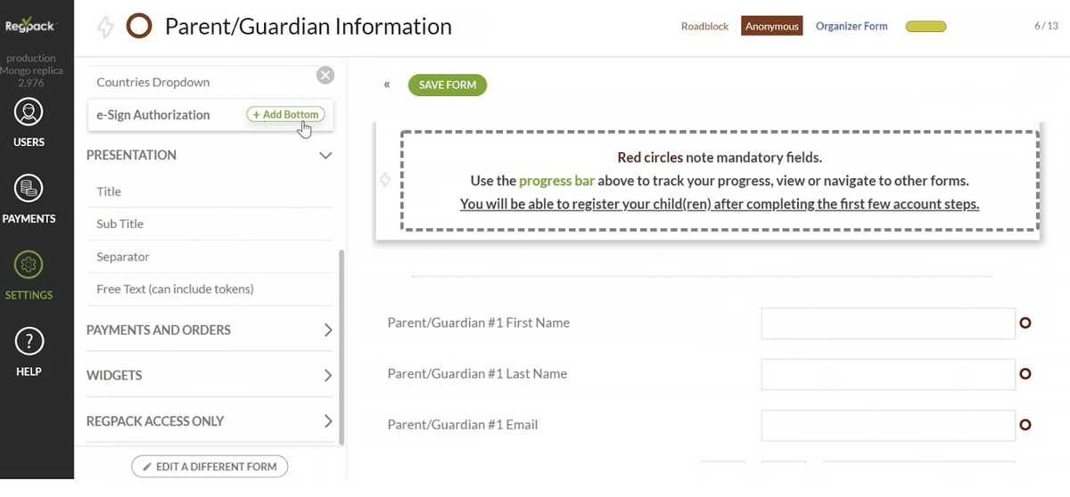
To collect electronic signatures in your forms, find a camp registration software that comes with an e-signature functionality.
The tool should enable you to add an e-signature field to your forms, as shown below in the top left-hand corner:

Source: Regpack
When users draw or type their e-signature, the software will save it and the document in the system, so that you can easily track and find the parent’s signature should you need it for legal purposes.
Integrate Payments Directly Into Your Forms
Streamline the payment process for your customers by empowering them to pay directly through your online registration forms.
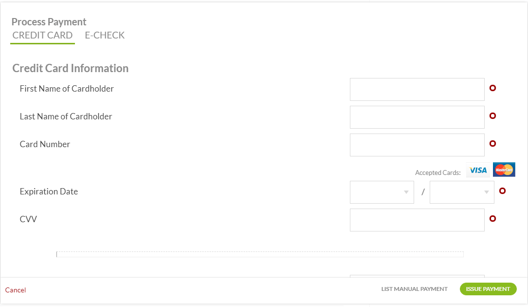

Source: Regpack
With integrated payments, you’ll reduce late payments and avoid having to chase down payments from customers who’ve registered for your camp but have not yet paid.
A high-quality camp registration software will make it easy for you to make forms that can accept and process online payments securely and quickly.
Tools like Regpack even allow you to accept multiple payment options, including credit card, debit card, ACH transfer, and PayPal, thereby making things more convenient for your buyers.
The more payment methods you support, the higher the chances that any particular customer is able to make the payment.
To further increase the form completion rate, it’s a good idea to also offer various payment schedules, especially if your camp’s cost is in the thousands.
For example, you might allow parents to select from three different payment plans, like in the registration form below:
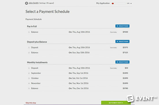

Source: Regpack
Customers can choose from in-full payment, deposit plus balance, or five monthly installments.
This way, you can make your camp more affordable to that segment of parents who can’t justify parting with such a large sum of money at once, but who might be able to spread the cost over several months.
Make Your Registration Forms Mobile-Friendly
Your camp registration forms should be mobile-friendly—otherwise, you risk annoying potential customers trying to sign up through their mobile devices.
Patience for technological incompetence is a virtue that customers haven’t quite mastered yet.
They’ll bounce off of that form in seconds if it’s unwieldy and designed solely for desktops.
To avoid this kind of form abandonment, look for a registration tool that comes with mobile-adaptive registration and payment forms.
With Regpack, for example, all the forms you create will automatically adapt to the user’s device, whether that’s a laptop, tablet, Android, or iPhone.
When creating your online forms, remember that simplicity is the soul of convenience.
Keep the layout neat, use lots of white space, and add big, brightly colored “next” and “submit” buttons that make it easy for the user to move through the form.
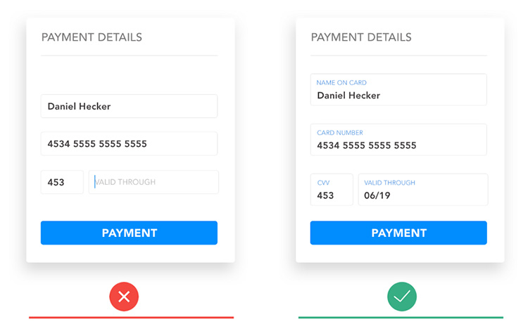
Also, clearly label what information you want from the user.
Don’t be vague like the example on the left:

Source: Lvivity
Note how in the picture on the right, the field names are above the fields, not next to them. This is a more pleasant visual experience for the user.
Also, when you can, use single columns of questions instead of multiple columns. Phone screens are essentially tall rectangles, so this format will look the best.

Source: Formstack
A wide form might go off-screen or force the user to scroll left and right, an annoying and unnatural process.
As a final precautionary step, be sure to test your forms on various devices before you publish them. This will ensure that you’re putting quality forms on your website.
In sum, when you provide customers with a convenient mobile experience, you’ll also evoke in them a feeling of trust for your brand.
Your business will look like one takes all aspects of running a camp seriously, not just the recreational part.
Conclusion
To create camp registration forms that convert, and also leave parents with a good impression of your brand, there are five best practices to follow.
They are to brand your forms, ask for only necessary details, include e-signature fields, integrate online payments into the forms, and make your online forms mobile-friendly.
If you follow these tips, you’ll maximize the potential of your forms, and ensure that people don’t abandon your forms because they’re too long, confusing, or finicky.