


Filling out registration forms can be something of a hassle, but it’s a necessary step we all have to take from time to time.
The bad news is that an overcomplicated registration process can turn people off from your service because they might find that it isn’t worth the trouble.
The good news, on the other hand, is that there are myriads of ways you can optimize your registration form to help more people complete the process without confusion and frustration.
Read on and find out how you can help users enter their information correctly, do away with unnecessary items, yet make the process more personalized for every user.
Jump to section:
Guide Users Through Each Field
Allow for Social Signups
Keep Your Forms Short and Simple
Flaunt Benefits and Value
Use Helpful Validation
Don’t Ask for the Password Twice
Use Conditional Logic
Guide Users Through Each Field
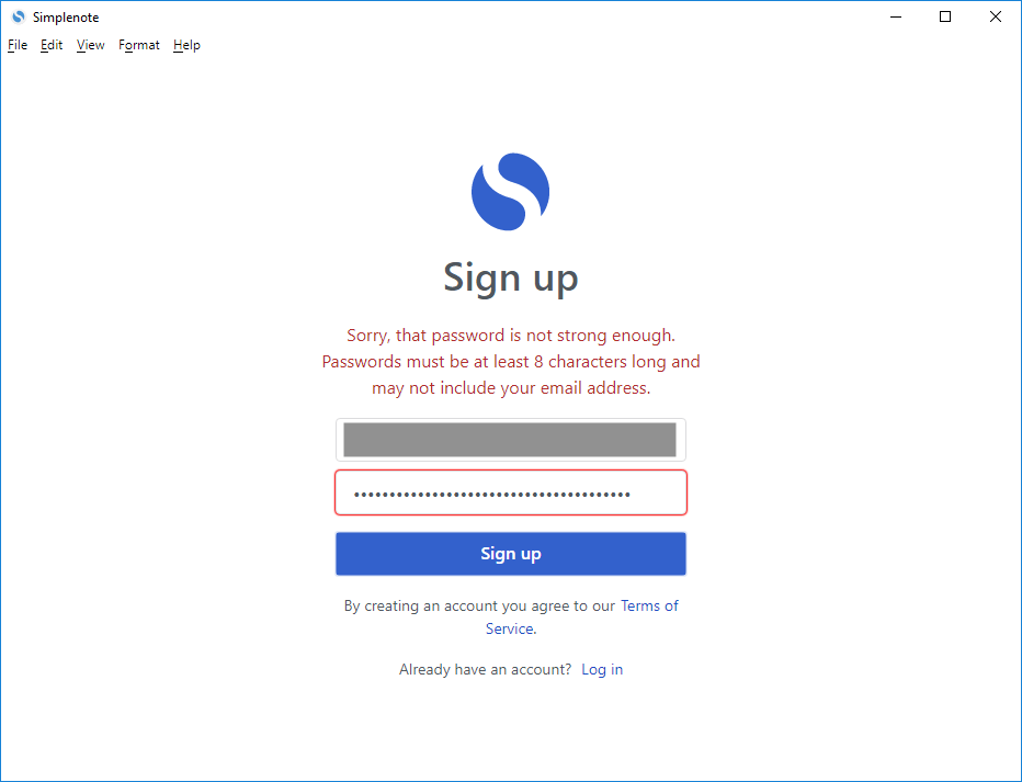
Registration forms can come with various requirements. For example, the password field can require numbers, capital letters, and a certain number of characters.
There are really no universal rules for signups, so it’s a good idea to provide guidance for the person filling out the form.
Otherwise, without any indication of how the form should be filled out, your prospective customer might be faced with an error message without knowing what they did wrong.

Source: GitHub
This can lead to some frustration on the part of the customer. In the worst-case scenario, it may even cause them to quit the registration process altogether.
There are several ways you can go about guiding your users through the registration process.
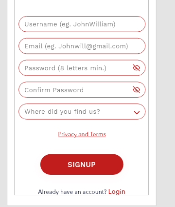
For example, if your registration form is relatively simple, you can put instructions in the placeholder text.

Source: Stack Exchange
A good practice to follow here is to provide examples, like in the screenshot above.
If your requirements are a little more complex, you should provide enough space to cover them in more detail. Just make sure they are easy to understand and clearly indicated for every field.
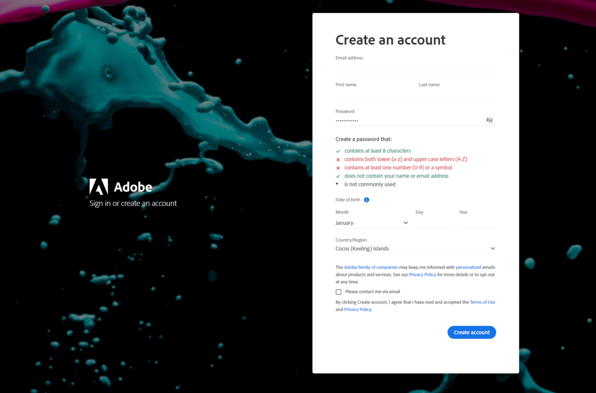

Source: Adobe ID
Have a look at how Adobe ID does it above. It even tells you if the requirements are fulfilled as you’re typing.
With a clear path forward and nothing to be confused about, your future customers will have an easy time completing the signup form, which will result in better customer retention.
Allow for Social Signups
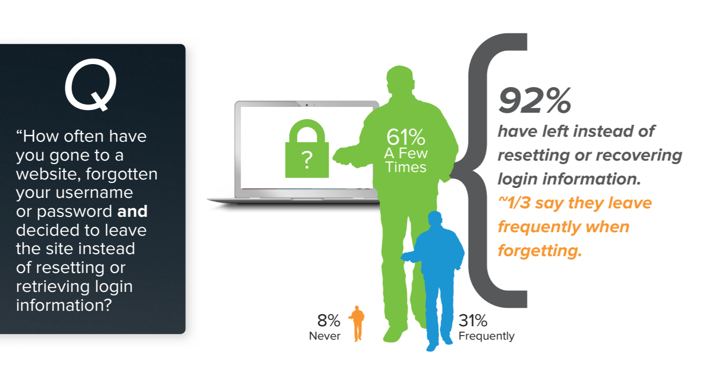
Coming up with new usernames and passwords for each signup form is not a fun exercise, and it’s something we’ve all been frustrated by.
Furthermore, research has shown that when users lose or forget their password, instead of recovering it, they are overwhelmingly prone to abandoning a site entirely.

Source: Janrain + Blue
That means that username and password procedures, however necessary, can cost you customers if not done carefully.
Luckily, there’s an easy fix for that: you can allow new users to sign up easily using their social media or email credentials.
Social signups have been around for a while: LoginRadius‘ Consumer Identity Trend Report for 2020 has shown that it’s now the preferred signup method for many internet users.
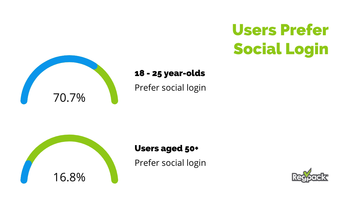

Data taken from: Loginradius
Additionally, a substantial number of users over 50 years of age have also said they preferred this method, even though this segment of internet users isn’t as likely to use social media.
When adding the option for social signup to your registration, there are many choices at your disposal. You can opt for just one or two credential options, like WordPress does in the example below.
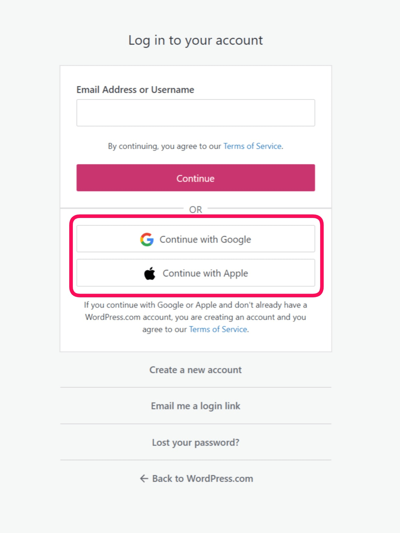

Source: WordPress
This is an easy and safe way to do it because it doesn’t require you to trust too many third-party servers. It also eliminates choice paralysis on the user’s part. However, this option may box out some users, for example, those that have neither Google nor Apple accounts.
If you’re not ready to risk that, you can provide a larger variety of options to cover a larger proportion of your customer base.
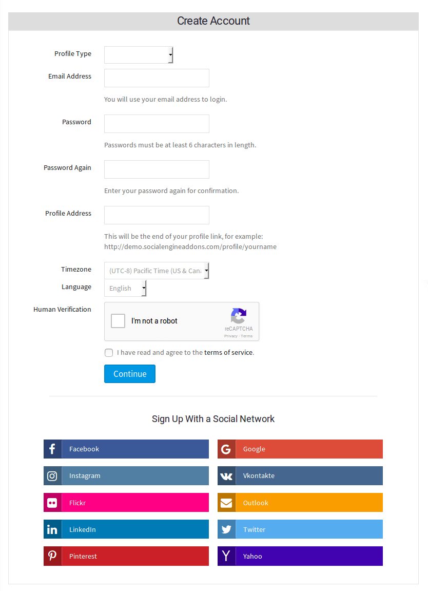

Source: Socialapps.tech
Just be careful to only add signup options that are legitimate and trustworthy.
Social signup has become the norm in the online registration process, so see if your signup flow can benefit from it as well.
Keep Your Forms Short and Simple
When it comes to the registration process, less really is more. Anything that distracts your customer from filling out the necessary fields could prolong the process, or even jeopardize its completion.


Source: Mequoda
Have a look at the screenshot above. If it takes you a second too long to even locate the registration form, that’s not the best way to handle registration.
Instead, the best practice is to keep the page as blank as possible, apart from the rubrics for the information you need, a couple of links to terms and conditions, and maybe a checkbox for marketing and newsletters.
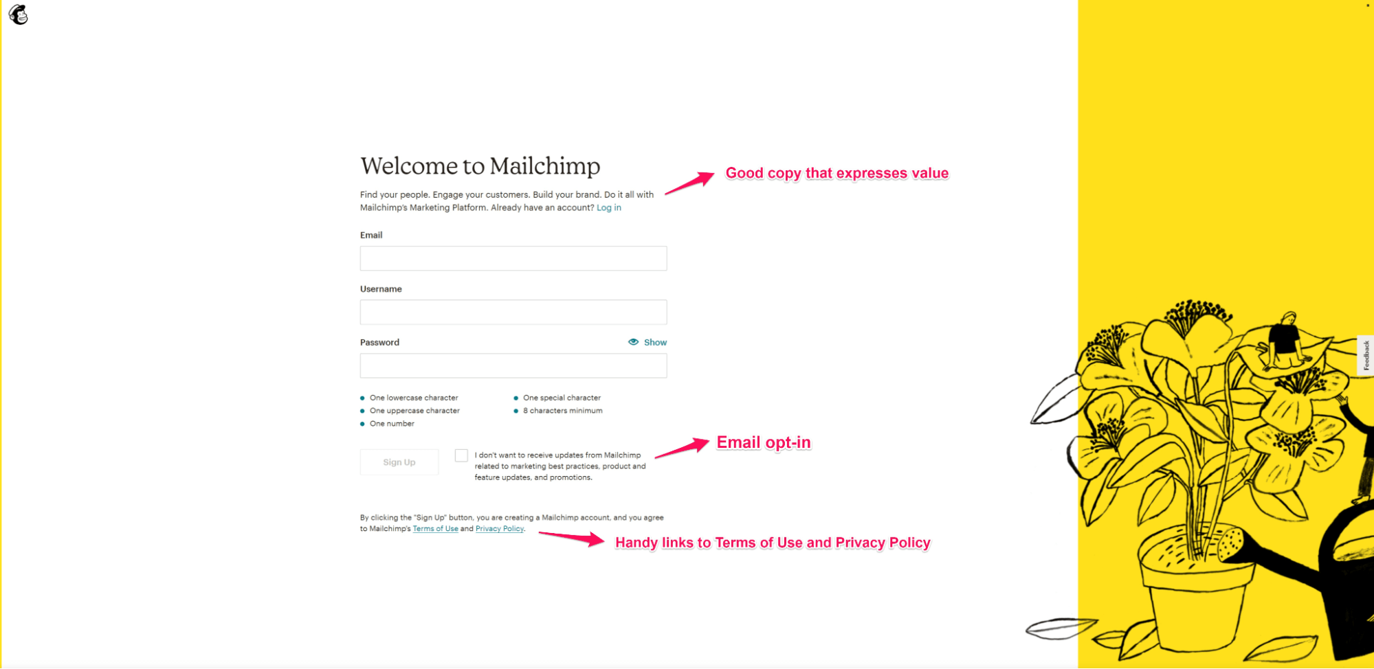

Source: Mailchimp
MailChimp does an excellent job here. They’ve even included a line or two of excellent copy to express the value their customers stand to receive after signup.
Another way to declutter your registration form is to only ask for the information essential for getting the customer started with your service. Once the customer has signed up, you can prompt them for additional information via email or a pop-up window that appears during their use of your service.
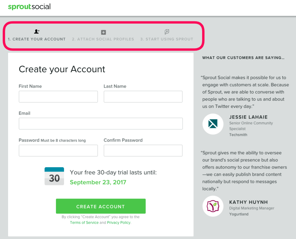
However, if you do require a lot of information upfront, It’s a good idea to break up the registration form into several pages. That way, the user won’t feel overwhelmed and his or her level of commitment to completing the process will increase with every page they fill out.

Source: Instapage
If you want to go with this approach, don’t forget to outline the steps somewhere in the registration form from the start, like in the example above. This will give users a sense of progression and prevent them from being unpleasantly surprised to discover there’s more work to do after the first window.
Remember that simplicity is the key to a perfect registration process. Don’t give your prospects any reason to change their mind and allow them to sign up in a blink of an eye.
Flaunt Benefits and Value
The truth of the matter is that not every customer you acquire will be super-excited to complete your registration process. Some of them will, inevitably, have doubts about whether your service is the right fit for them.
With that in mind, why not include some reassuring information that will nudge them in the right direction?
Communicating value in the registration form can send your signup conversions skyrocketing. That’s exactly what happened to Betting Expert when they changed their form to reflect the benefits users stand to gain.
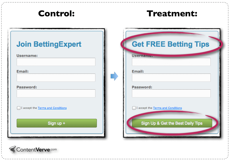

Source: Neil Patel
They added a call to action that expressed the value of their service (“Get FREE Betting Tips”), and their signup numbers rose by a whopping 31.54%!
So, try to convey the value you offer in a sentence or two and then find a place for it on the registration form.


Source: HubSpot
See how HubSpot did it? They included a few words about what makes their software better and added a call to action.
Another way to express value is to include indicators of trust by naming some of your bigger clients. If the prospects see those listed while they sign up, they might have an easier time deciding to sign up themselves, knowing that other, successful companies have done so before them.

Source: Toptal
For example, Toptal boasts an impressive client list, which they proudly exhibit on their signup page. Seeing that all of these famous companies have put their trust in Toptal, you would probably be more inclined to enlist their services as well, wouldn’t you?
Having second thoughts about making a commitment is normal. In many cases, customers will harbor their doubts because they don’t know you that well. In that case, flaunting value and benefits can go a long way to assuage them and get new clients on board.
Use Helpful Validation
Another way to ensure that the registration process flows smoothly is to validate every field as the user is filling it out.
You can do this by displaying short messages, signs (like a checkmark or an x), or even coloring the item in green or red to indicate correctness.
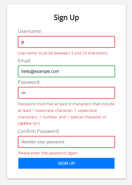

Source: Javascript tutorial
In the example above, you can see that the correctly filled-out item is marked as green, while the incorrect ones are marked red. The red fields also display short messages explaining exactly what the user needs to do to fix their mistake, making this signup process even easier.
This kind of validation ensures that your user puts in all of their information the right way on their first try. That’s a much better solution than bringing them to the next page and displaying an error message.
You can take this great practice further by adding a password strength meter to your registration form.
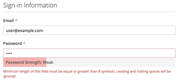

Source: DevDocs
A password strength meter will guide your users on their way to create a strong password that’s less likely to be hacked. That’s an excellent way to ensure your user’s account is safe and protected from the get-go.
In short, with step-by-step validation, you’re eliminating almost every mistake your customer can make while signing up for your service. It’s definitely a very handy feature to have in your registration form.
Don’t Ask for the Password Twice
To reiterate a previous point, your registration form should be as short and simple as possible. Eliminating everything that isn’t fundamental to allowing your new customer to use your service is the key to a well-optimized signup process.
It’s, therefore, quite surprising to see that so many websites still ask users to confirm or verify their password when registering.
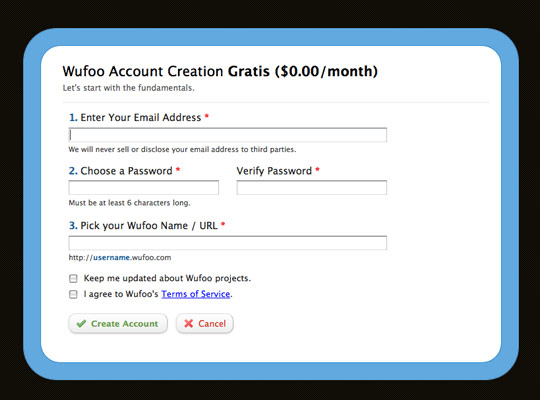

Source: Lee Munroe
Passwords are usually masked at signup, so the logic to this practice is that users would have to put in the exact same password twice to make sure they didn’t make a typo.
However, asking the user for the password twice adds an unnecessary step to the process, making it longer and needlessly more complicated.
In more recent times, we have developed other, more convenient ways to verify that the user hasn’t made a mistake while entering their password.
For example, you could add an option for the user to reveal the password as they’re typing it.
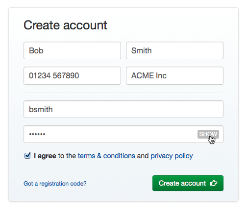

Source: Stack Exchange
That’s a very simple way to allow the user to check what they’ve written before they submit the form.
Asking users two put in their password twice is an outdated practice and better solutions have been developed since. Instead of making users double-type their password, try providing the option to unmask the password to make verification easier.
Use Conditional Logic
Last but not least, you can optimize your registration procedure by adding conditional logic questions to your forms.
This is very useful for registration forms that contain multiple steps, and is a great way to make the process more personalized, which users always like to see.
Conditional logic is built on triggering the next window according to a specific action on the part of the user.
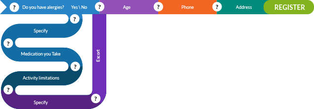

Source: Regpack
For example, say you need to know if your new user has any allergies before they complete the registration process. In that case, you could ask for that information in the form of a yes or no question.
If the user clicks “no”, the form will simply allow them to continue the registration process. On the other hand, if they select “yes”, the action will trigger a new line of questions they need to answer before they can move on to the rest of the registration process.
Conditional logic is actually a major feature of Regpack’s own registration software. It allows you to build registration forms that feel completely customized and personalized to your needs.
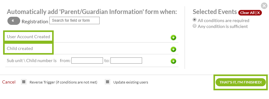

Source: Regpack
In the example above, the conditional logic feature is used to trigger a question to input parent/guardian information if a child is added to the registration form.
Keep in mind that your registration process will be completed by a diverse base of users. Forcing them to answer questions and fill out forms that don’t apply to them is a good way to frustrate them.
What you can do instead is use customizing features, like RegPack’s conditional logic feature, to connect users to the right forms, making for an enjoyable registration experience.
Conclusion
We hope this article has given you some helpful tips on how to optimize your registration forms for an excellent user experience.
From helpful ways you can lead the customer through the registration process, to all the unnecessary fields and pieces of information that can be removed, there are many small actions you can take that can have a major impact on your signup completion numbers. And that leads to improved acquisition and retention numbers as well.
A key takeaway here is that your registration and signup procedures are a very early touchpoint between you and your customer. Therefore, it’s worth giving it your best to make a good first impression.