


SaaS companies have to rely on good user onboarding because it sets the stage for everything else.
The first experience you have of something shapes your entire future perception of it.
Therefore, if potential customers have a positive onboarding experience, they are more likely to have a positive attitude towards your product.
This means that good user onboarding directly impacts your future growth.
It may be difficult to convince potential customers that your product has value, but there are some steps you can take to help them realize it.
Here are some of the best practices that will significantly improve your results.
Jump to Section
Make Signing Up as Simple As Possible
Personalize Onboarding to Different User Types
Have a Short Product Walkthrough
Get to the Aha! Moment as Quickly as Possible
Make Sure Your User Flow is Smooth
Guide Your Users With Checklists
Create a Sense of Accomplishment With Progress Bars
Re-Engage Inactive Users Through Email
Announce New Features With Pop-Ups and Tooltips
Make Signing Up as Simple As Possible
We touched upon the importance of a smooth sign-up process in our previous article.
Still, it’s important to dive deeper into why streamlining the process is a critical factor in a good onboarding experience.
Sign-ups are the center of all digital interactions because that’s when companies collect the personal data of their clients. It is the first step in the process of acquiring customers.
However, as with anything on the Internet, if you’re not distinctive and appealing, you’ll lose potential customers.
Since SaaS is a subscription-based business model, the rule of thumb is to start by asking for the least amount of information possible.
“Keeping it simple” doesn’t mean you should remove all the fields that ask for the data you need, only that you should focus on mandatory information that helps your initial goals: name, email, and billing information if it’s relevant.
If you ask for the essential data upfront, the users are more likely to finish the sign-up process because they have already put a certain amount of effort into gaining access to the product.
When you explain why you’re asking for this info, then even those who might be debating whether the process is worth it or not might change their minds.
The real goal here is to persuade your visitors to become customers and fill in the form, but allow for these extra steps like adding social media sign-ups (Gmail or Facebook) and offer value right at the start to hook the visitor.
See how Freshbooks did it.
Best Practices: Freshbooks
The company starts their marketing by offering a discount from the very beginning, which helps persuade some undecided visitors to fill in the form.
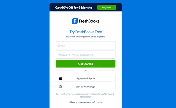

For the quicker of the two sign-up processes, customers only have two fields to fill in (other essential data will be added in the account setup), and there is a sign-up option through Apple or Google.
The company has also added a disclaimer for some likely concerns users might have upon reaching the sign-up stage (“No credit card required. Cancel anytime!”).
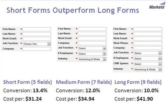
Deciding on the length and when to offer your sign-up form is essential. It’s mostly based on your product and how you’re willing to approach your potential customer.
Marketo, a marketing automation company, has found that shorter forms outperform longer ones, while VentureHarbor reports multi-step forms are better than single-step forms in customer conversion.

The best way to start a successful onboarding process is to make the initial sign-up extremely simple.
Personalize Onboarding to Different User Types
Don’t forget to customize your onboarding experience and cater to users with different needs.
SaaS covers a lot of different customers, with a variety of expectations.
Therefore, they can’t provide a single user experience, or a one-size-fits-all onboarding strategy.
Users aren’t all interested in the same features and functions of a particular product.
The best plan is to have a personalized, goal-oriented onboarding experience that is tailored for each new customer. In this way, you shorten the time to value.
Nowadays, it’s more common for users to drop a product after just one use if they haven’t seen the value from the start.
Some studies show that app abandonment rates peaked in 2019, with 25% only launching an app once and quitting.
A personalized onboarding experience will help achieve customer longevity.
Best practices: Canva and Ghost
The best way to ensure that customers will have the best experience in onboarding is to streamline content, i.e., ask them which type of user they are or what they’ll use the product for.
Look at the simple way Canva streamlines its content.
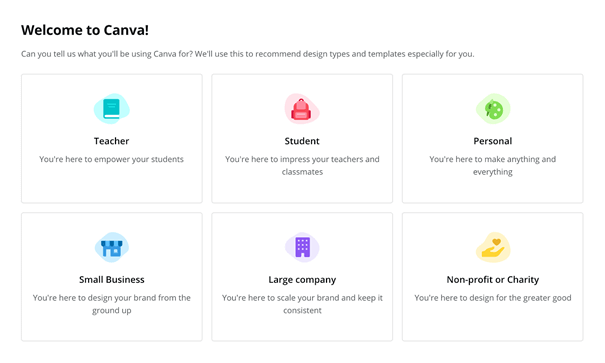

Nothing has changed in the features of their product, but they want to show each of their customers only those features that will be most useful to them, based on what they need from the product.
In this way, they ensure that time to value is quick, which helps gain longtime customers.
Here is another, simpler streamline that the blogging site Ghost uses.
They are focused on their customers’ technical skills in making/designing a blog, so they offer two different products.
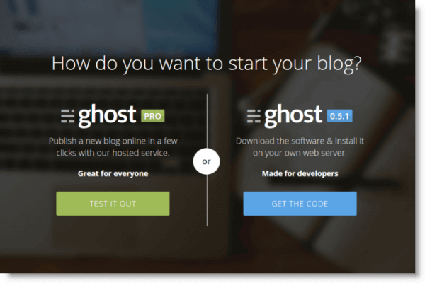

Ghost Pro is for those who are new to blogging and just want to create a blog and start writing without much fuss.
The other option is for more advanced users who might want to use their coding skills and customize the experience of creating a unique blog.
They can add features they want instead of the default ones the hosting service provides.
With simple explanations under each category, it’s easier for the customer to get started and use the product.
Personalization removes the friction in using a new product, ensuring that the customers find value and become loyal much sooner.
Have a Short Product Walkthrough
Set up a practical product walkthrough to set yourself up for long-term success.
In your product walkthrough, you’re influencing your customer’s behavior.
It’s important only to show the key features that might interest the particular user.
In this way, you give them enough reasons to get to their Aha! Moment (more on why that’s important in the next chapter) and understand how it can benefit them.
It’s your job to get them to this moment and make sure you do it as quickly as possible.
You should explain why each step in this process is necessary and help them find their way.
For better retention, you should never leave your customers to learn about your product on their own, even if they are knowledgeable.
Whenever applicable, try to cover the basics of how the product is used so customers can start using it with minimal hurdles. This also shows you respect their time.
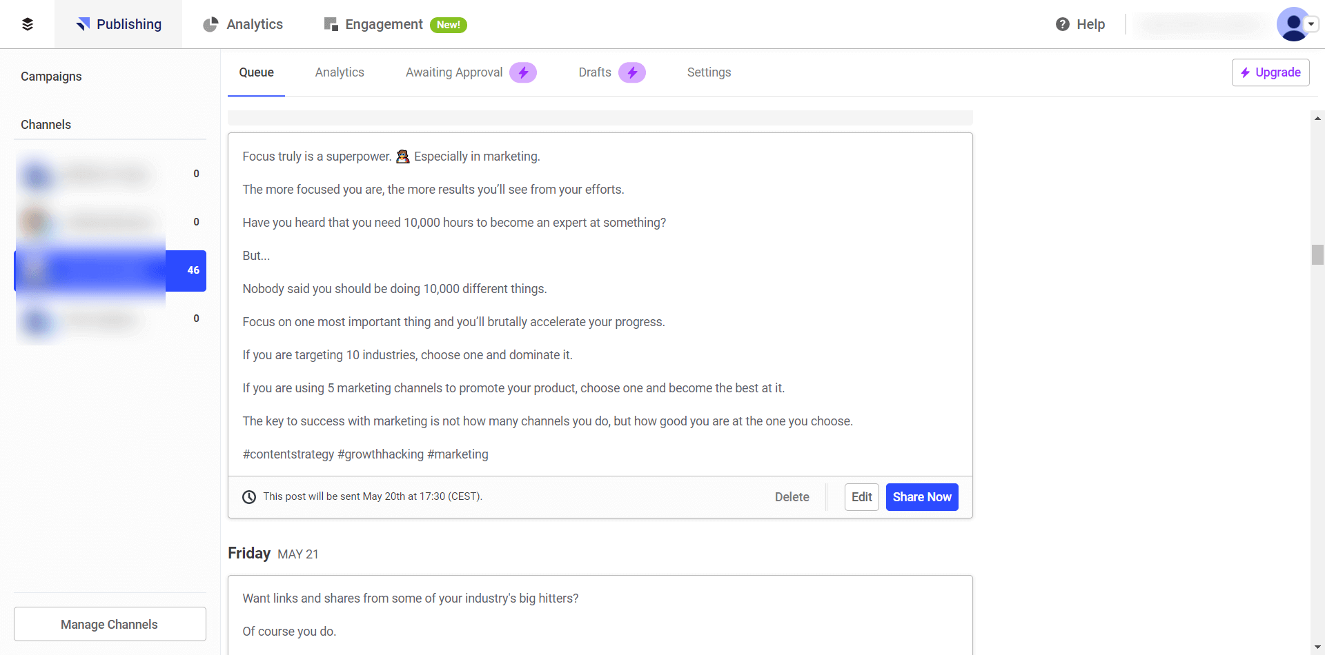
Best Practices: Asana
A walkthrough that’s too long adds to a bad onboarding experience, and customers are more likely to hit cancel than with anything else.
Here is an example of a simple walkthrough from Asana, a project management software that helps teams with organizing their tasks and tracks their work.
Their walkthrough guides the user in creating their first task. In this case, it’s setting up the first list of tasks in a template project overview.
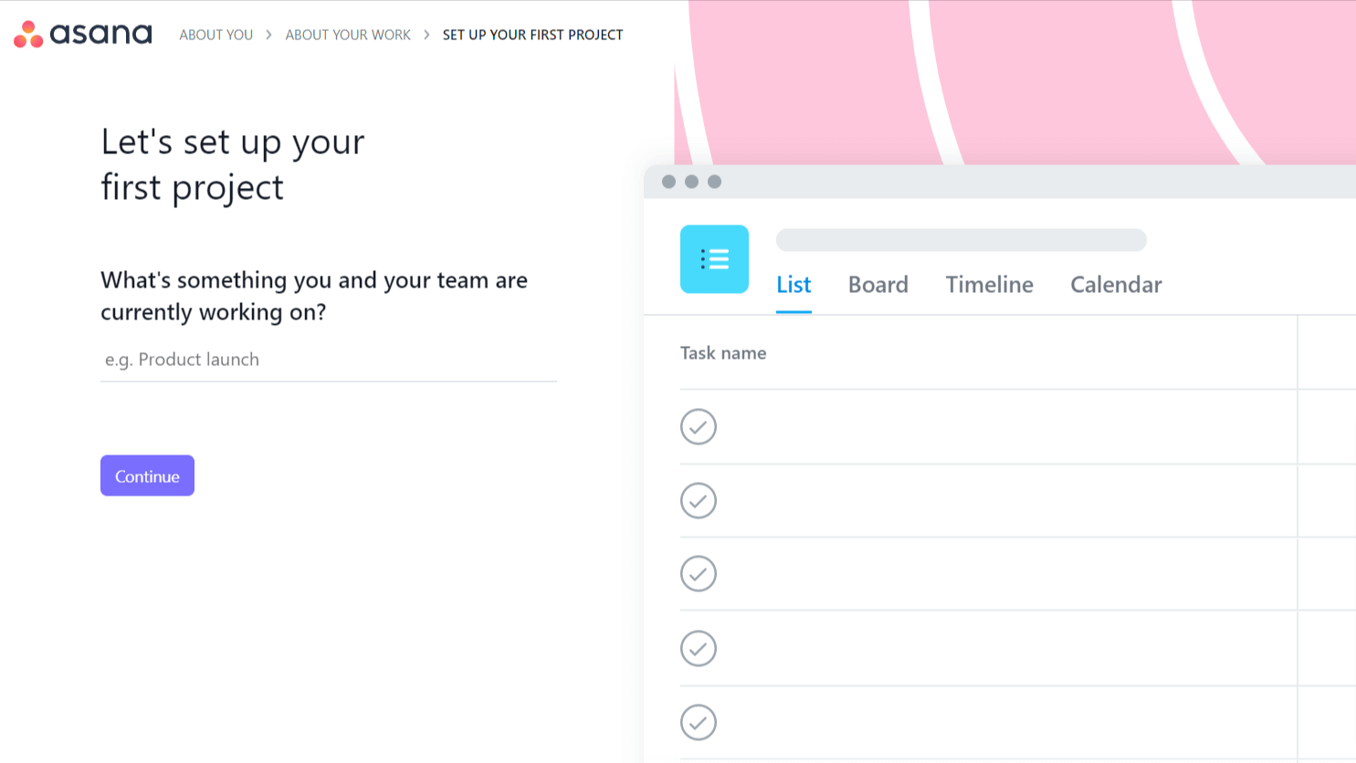

The walkthrough is action-driven, and visual cues guide the user through each step, helping them familiarize themselves with Asana’s UI.

By making their first task in Asana, the user gets a simple and easy route towards their Aha! Moment and at the end of a walkthrough, the toolkit shows them that help is only a click away for further instructions.
The customer doesn’t feel left to their own devices, while the product is presented in a very straightforward way.
A short and simple guide helps users understand the product and find value as quickly as possible.
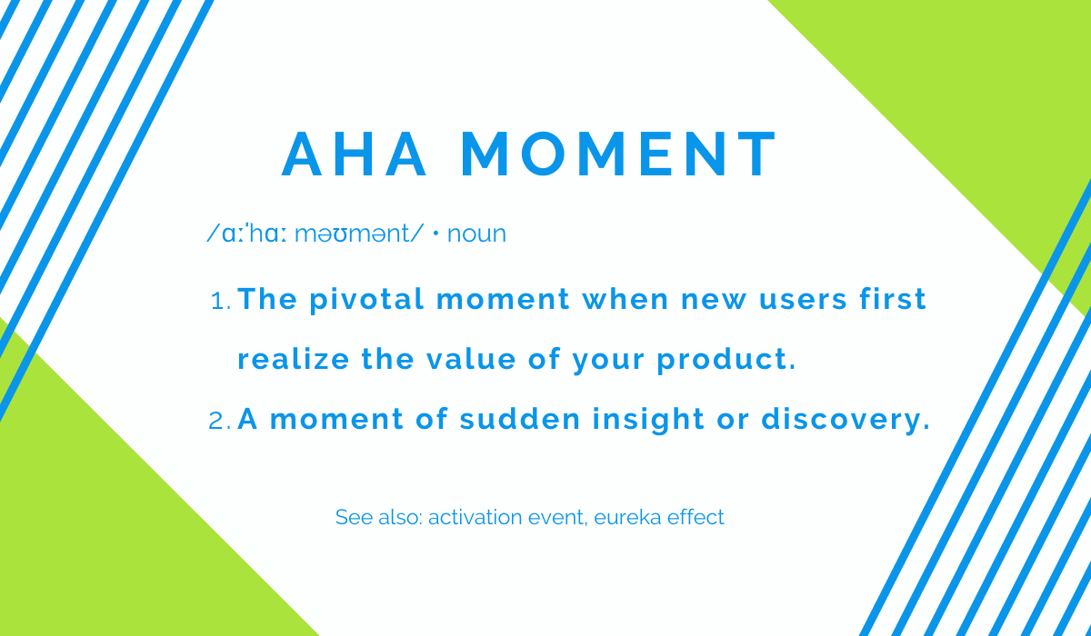
Get to the Aha! Moment as Quickly as Possible
The Aha! Moment is the first time the user realizes how your product benefits them, and internalizes this value.
It is an important factor in customer retention. Once the new user connects this moment of inspiration and recognition with your product, they are more likely to continue investing in it.
With the attention span shortening by each generation, customers are more selective. They are quick to give up on things that take too long to set up or understand.
People want quick results, plain and simple.
By getting to the Aha! Moment fast, you’re showing them that you value their time and effort, and that you’re likely to start building a good relationship with them.
According to Chameleon, improving the users’ first 5 minutes of trying out your product can increase 50% in lifetime value.
This means that during onboarding, you shouldn’t underestimate the value of a good Aha! Moment. It can be vital to your survival, especially since competition lurks at every corner to pick up where you bungled things up.
The question you are probably asking yourself right now is, what is my Aha! Moment?

It depends on several factors: product UX, user persona, and value proposition, among other things. These are all easily trackable things that can be identified with the right approach.
You should start with the value proposition statement on your website.
Then, ask your existing customers for feedback.
Why are they your customers in the first place? What value did they find in your product that might be beneficial in acquiring new customers and retaining ones in the onboarding process?
Sending a quick survey to find out what they think is a good way to elicit that information.
Such moments will vary depending on different user types because no customer is the same.
Try to find patterns in how they use your product and the kinds of struggles they encounter and use this information to improve your onboarding experience.
Here are some excellent examples of Aha! Moments from other SaaS companies.
Best Practices: Trello and Buffer
Trello is a project management platform that focuses on organizing and prioritizing everyday tasks. They showcase their product through a Welcome Board and encourage the user to interact with it.
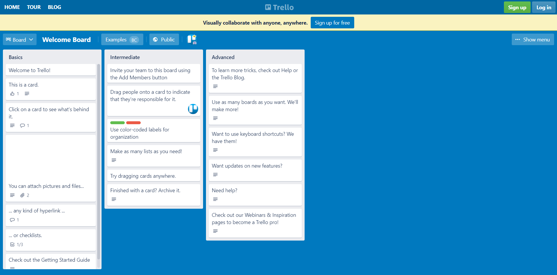

By completing the tasks, users quickly understand how the platform works and how to organize their projects by dragging, adding, and moving items across lists.
Trello’s core value is easy organization, and users can experience it firsthand.
Quick guidance through the most basic features is a good way to get to the Aha! Moment fast.
Another example is Buffer, a social media management tool that helps users schedule social posts.
A clean and simple UI combined with a straightforward guide on how to use the product is a recipe for success. Buffer knows this, so they utilized it to the max.
To get to the desired results, users only need to click several times to schedule their social media posts.
The “Add to queue” button is a valuable feature to help them reach the point where they realize and internalize the value of the product.
The Aha! Moment is a proven path towards product adoption, and it’s an important step in a successful onboarding experience.
But you shouldn’t stay at only one of those moments, even during the onboarding process.
Ensuring that there are several of them will increase customer retention and help you achieve your goals.
Make Sure Your User Flow is Smooth
Prevent any resistance that might interrupt your customer’s user flow.
In onboarding, friction comes in different shapes and sizes, but they all scare potential customers away.
From a complicated sign-up form to annoying tooltips and confusing microcopy, interruptions in the user flow are endless.
Anything that causes the user to stop their onboarding journey is a call for help.
Depending on your strategies, you will have to implement different things in your onboarding process to reduce friction.
Let’s look at an example.
When users interact with a UI, they expect some sort of feedback from it.
Checklists and progress bars are a great way to provide that feedback (more on them in later chapters).
![]()

Visual feedback is the best, but anything that triggers some action and lets the user see the outcome is excellent.
Depending on the type of product you have, you might want to ask for all of the customer’s data upfront. Sometimes this is a good thing, since most customers expect that type of user flow.
However, it is important to note that requiring the user to take too many steps to accomplish their goal will cause friction that will deter them from continuing the onboarding process.
One tip here is only to only ask users for the information that is absolutely necessary.
Another tip is that distracting UI is the killer for smooth user flow. When many things want to catch the customer’s attention, they are far more likely to give up.
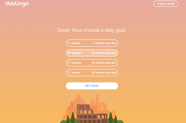
Best Practices: Duolingo
Here is an example from Duolingo.
They only put necessary information on their UI, and with clear visual cues, the user can take further actions to interact.
That way, they limited the number of options guiding the user towards their end goal. Too many choices lead to decision fatigue—which can mean that the next interaction your user initiates is clicking the “exit” button.

To prevent churn, a smooth user flow should be an important part of your overall onboarding experience.
Guide Your Users With Checklists
An important part of product walkthroughs that will get your users to extract value from the product faster are checklists.
In a successful onboarding experience, the power of psychology is everything.
Checklists are here to help you motivate new users to finish onboarding successfully and become loyal customers.
Including a simple checklist in your onboarding process will help establish a clear structure for navigating the new system you’re providing for your customers.
Also, checklists turn tedious tasks into enjoyable activities. They provide the psychological principles of commitment and consistency.
Once we commit to doing something and see a clear path of actionable steps to complete the task, it’s much easier to finish.
Products with quick wins can offer that sense of accomplishment fast and demonstrate the product’s immediate value.
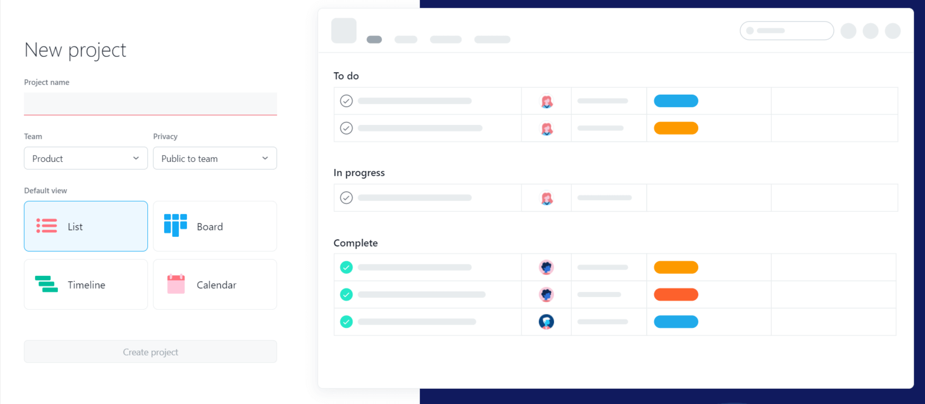
Best Practices: Asana, Once More
Even for those with more complex products that need several more steps in getting users to adopt new features, checklists are here to save the day.
To demonstrate, here is an example from Asana’s onboarding process.
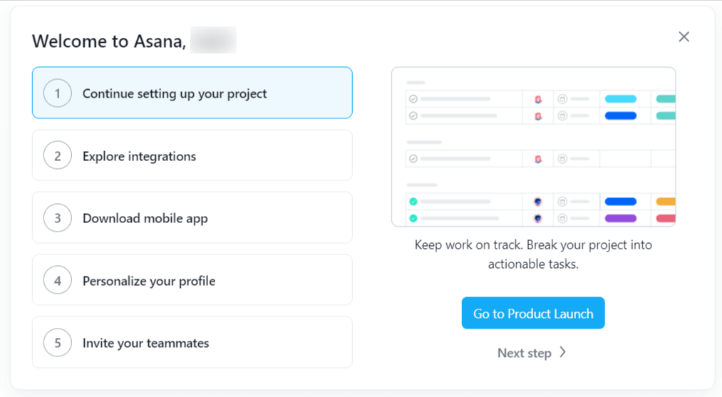

Their UI is simple, and they help the user navigate it with a distinctive visual cue at the bottom.
It consists of a checklist and a progress bar (which we will discuss further next section), made more remarkable by using a bright color.
The checklist is short, and once the user completes it, the text fades.
Incomplete tasks are marked in bold, and since the checklist is short to begin with, it’s much easier to finish it.
This motivates the user to the very end.
Users want to see that checklist finished, acting on the Zeigarnik Effect, which means that they will be overwhelmed with uncompleted tasks over time and push themselves to complete them.
In this way, SaaS companies can count on quick product adoption and customer retention.
Remember, you’re not just tricking your users into completing a checklist.
You’re teaching them to use your product. The stickiness of your product is something you should also keep in mind.
Checklists are only there to help you through this important process.
Create a Sense of Accomplishment With Progress Bars
A useful feature to combine with the checklists are progress bars.
Everything we’ve mentioned with regards to checklists and how they’re rooted in psychology is applicable for progress bars, but the latter are even more effective.
Checklists are not particularly useful if they’re overly complicated or lengthy.
With progress bars, you’re motivating the user to see how much they’ve progressed in the process and how much they still have to do.
As humans, we’re driven to do two things: have goals and accomplish them.
Progress bars serve to give the user meaningful feedback on their decisions, so they also feel like their time is well-spent.
In other words, you’re holding the user’s attention so they can extract value from your product.
Progress bars enrich the user experience.
It’s the same psychological trick that makes a lot of gamers addicted to games. When you see a clear path to progress it’s a powerful weapon for user engagement.
They’re not only a helpful tool in onboarding; users want progress bars when they start learning about new software.
The progress bar itself must be designed in such a way that it motivates users.
It’s far better to jump from 20% to 40% than to chart every step from 20% to 25%, as greater progress is an excellent incentive for the user to keep going.
Also, make the missions meaningful and instantly rewarding. Only include those that your users will find valuable.
Best Practices: Dropbox and Linkedin
One great example of tracking progress and motivating users at the same time is Dropbox, which gives additional storage for every completed task on your progress bar.
If your product can do something like that, great; if not, explain the benefits of completing the tasks like Linkedin does when setting up a profile.
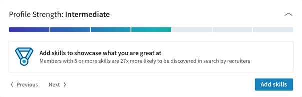

LinkedIn puts a statistic under their progress bar that tells the user that they are more likely to get to their desired goal if they finish setting their profile.
Using progress bars should be meaningful to your onboarding experience and is the safest way to have a smooth user flow while your customers are learning about your product.
Re-Engage Inactive Users Through Email
Emails should be an important part of your onboarding experience.
Sometimes customers leave without completing their onboarding. It happens, but it’s not the end of the world.
If you’ve done your work well until the moment they left, you’ll have valuable information on how to contact them.
Inactive users are potential loyal customers, and you should work on getting them back.
By sending them reminders about your product, you’re shifting their focus back on your value proposition and pushing them to reconsider your offer.
If their reason for bolting was some minor issue they encountered, you’re here to help them get back on their onboarding process.
Additionally, through no fault of yours, some users might get stuck during the onboarding process for one reason or another, and they just give up.
Send them an email offering them assistance to set up their account in the correct way.
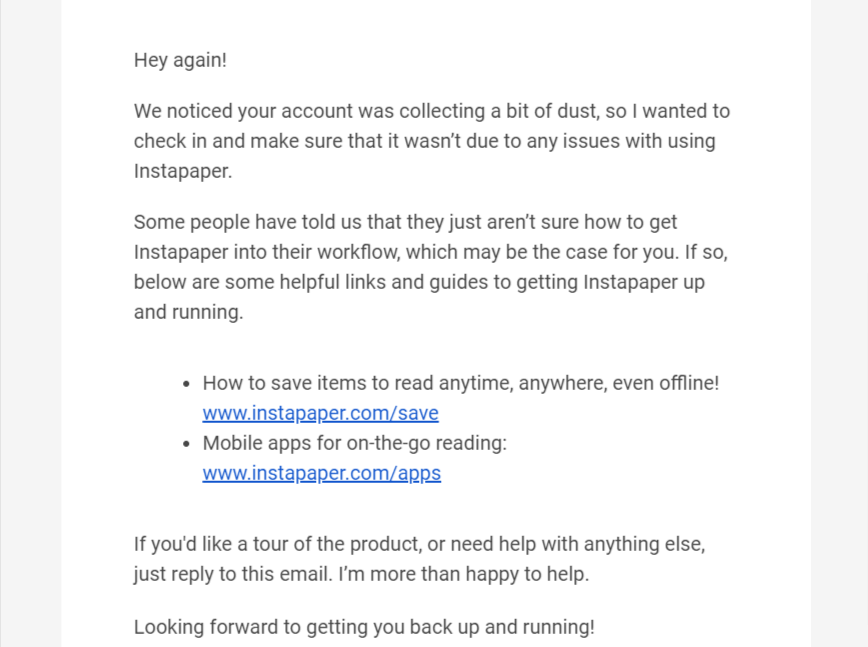

Nevertheless, keep in mind that these types of emails should be time-sensitive. The best way is to use real-time triggered emails that can help those users just as they’re about to leave.
It’s a great strategy to maintain engagement.
With reminder emails, you get the customer to think back to what they were trying to do and how much value they can get as soon as they log back in.
You’re operating on the assumption that they just didn’t fully understand the value of your product, so you’re here to reinstate your benefits.
Best Practices: Grammarly
One good example of an effective way to re-establish a relationship with former users is Grammarly, a digital writing assistance tool.
What they do is briefly explain the customer’s previous action, and remind them of the great benefits they used during that process.
Additionally, a visually appealing button that brings the customer’s attention is a call-to-action method that might prompt the desired goal.
In other words, that’s a good way to get the user to return to the product again.
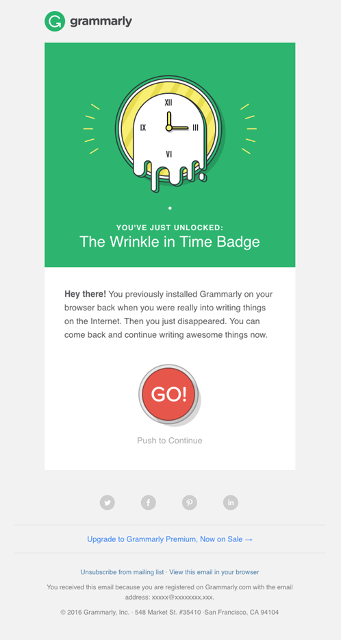

Not every customer will be ready to return, but there is a small chance that among your inactive users, there are those who simply need to be reminded of how great your product is and how they can benefit from re-engaging with it.
Announce New Features With Pop-Ups and Tooltips
Include pop-ups and tooltips in your onboarding process to announce new features.
Even with the most intuitive user interface, there will always be those customers who will need an extra bit of guidance.
Pop-ups and tooltips are helpful for subtly guiding your customer’s attention to some features they haven’t tried before, but that might be useful for them.
They’re also great for announcing every software update that you make, to highlight even more benefits of your product.
Nothing is more annoying than doing your work when a new update notification interrupts and forces you into a long tutorial on how to use all the new features.
Getting new features is exciting, but being thrown into a guide on using them when it’s not at the top of your priority list is counterproductive.
It’s best not to bother your customers with in-depth guides once they start using your product.
However, if used in a smart way, tooltips can help you nudge them once in a while without being too intrusive.
Some software is more complicated than usual, and users sometimes forget what each icon or action does.
In that case, pop-ups and tooltips can be useful to remind users of the changes that will happen if they click or engage with specific features.
Best Practices for Using Tooltips
The first tip in using tooltips is to avoid using too many.
They’re great for initial onboarding and even for the infrequently used features, but once the user gets the hang of how to use a product, it’s best if they disappear.
Remember, they’re called quick reminders for a reason.
They should tell the user in short sentences what they need to do and what this action will do. No more and no less.
No one needs an encyclopedia of information when they hover over the “Eraser” button.
Pop-ups and tooltips are a part of the broader education process during onboarding.
By keeping them short, subtle yet noticeable, you’re ensuring that your users get the most value out of your product.
Conclusion
Successful user onboarding is a delicate procedure that requires careful consideration.
It is an important process because it represents the very beginning of customer acquisition and, if done correctly, it can lead to great customer retention.
Personalization, the use of checklists, and short product walkthroughs are necessary steps to reducing the friction that can cause churn. Another essential part is the clever use of email to bring back those customers who still haven’t seen the potential of your product.
Remember, no user onboarding is the same. You should follow these best practices because every minor detail counts and for the best retention rates during onboarding.