


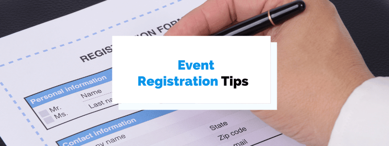
Event registration used to be a lengthy process that required attendees to fill out printed forms by hand and send them by snail mail.
This was followed by organizers sorting out the documents and manually checking whether everyone’s payment had arrived.
It was tedious and time-consuming.
Luckily, the entire process, from registering to payment processing, can now be done in minutes, thanks to event registration software.
Below we present 8 tips to streamline the event registration process, improve your users’ experience and increase conversion chances.
- Make the Registration Page Engaging
- Connect Registration Forms With Email Marketing
- Communicate Registration Urgency
- Have Visible Support Contacts
- Never Redirect Users to Another URL
- Personalize the Registration Paths
- Leverage Drop-Down Menus for Easier Answering
- Test Your Registration Process
- Conclusion
Make the Registration Page Engaging
The registration landing page for your event should offer the audience a glimpse of what’s about to happen, and make them excited to attend it.
Its purpose is clear—to get people to register.
So, a sales pitch filled with boring details that reads like a manual won’t pique your attendees’ interest.
However, a simple, visually appealing summary of the essential information a prospective attendee is interested in will.
This is also more efficient, as research by HubSpot found that reducing the number of forms from 4 to 3 means that 50% more people will complete it.
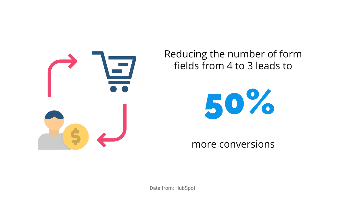

Source: Regpack
As you can see, a seemingly insignificant reduction led to much better results, so keeping it short and sweet is the proven way to go.
A good idea is to segment information to contain only the aspects a specific audience is interested in.
For example, suppose your event is a MarTech conference. In that case, your landing page can feature one section for people who want to know more about the tech aspect and another for people who want to focus on marketing.
Show each category why attending your event is a great idea and how they can benefit from it.
Each category should highlight only the information relevant to that group, making people interested in exactly what they want to get from the event.
Select the parts attendees will be excited about and add photos or videos of speakers, accompanied by their quotes.
Your visuals can be colorful and fun as long as you make sure they’re on-brand and fit your overall image.
Connect Registration Forms With Email Marketing
Email address is a required field on every registration form because confirmation emails need to be sent somewhere, which gives you a vast pool to market to.
They’ve already shown an interest in what you offer by registering, so you just need to expand on it strategically.
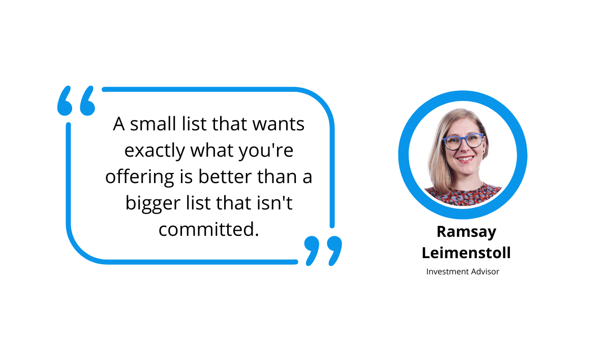
As investment advisor Ramsay Leimenstoll pointed out, it’s better to have a small list of people who want what you’re selling than an extensive list of those who aren’t sure.
Source: Regpack
Sending an email to 20 persons who have already shown an interest in an event is bound to lead to more conversions than sending it to 100 who’ve never heard of it.
To increase your chances of success, an email should always be personalized and start with the person’s first name.
The name grabs the reader’s attention, making them feel special and 26% more likely to open it, as Experian Marketing Services’ Study showed.
Think about it; you’re probably more likely to move something to spam if it just says “Thinking about attending X event?” than if it says “Jane, are you thinking about attending X event?”
If the message refers to you specifically, it simply seems more relevant and vital.
You can also use emails to send exclusive offers or discounts to attendees. When email marketing remember to be watchful for your DMARC report to avoid getting hacked.
As with first names, this appeals to people’s sense of importance, making them feel special because they’ve been selected for a discount.
It can range from early bird promos and last-minute deals to discounts for people who have already attended a similar event in the past.
Choose whatever works better for your particular event and the number of people interested.
Communicate Registration Urgency
Leaving things to the last minute is a part of being human. 15–20% of adults do it regularly, so your attendees probably do it too.
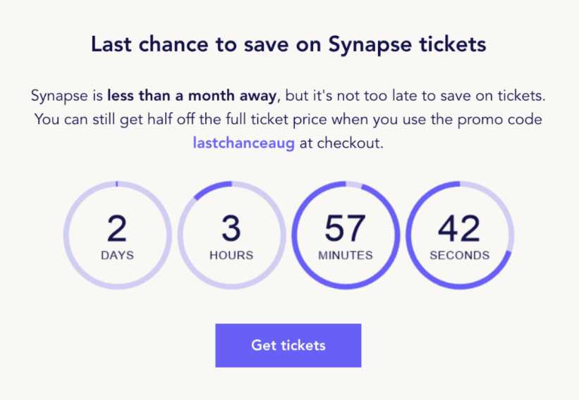
There’s no better way to beat procrastination than by reminding the users of a deadline approaching, so that’s a tactic you should implement, for instance, by adding a timer to your event website and emails.

Source: Moosend
The example above by Moonsend combines a countdown timer and a discount, doubling your attendees’ motivation to register.
It creates a sense of urgency and a feeling that this shouldn’t be missed.
In fact, this technique works so well that one company found adding a timer to its Black Friday sale contributed to 400% more conversions.
Another effective way to create a sense of urgency is to use powerful words. This makes attendees anxious to participate in an event by leveraging their fear of missing out.
Some examples of powerful subject lines include:
- NOW is the time to buy your ticket!
- Don’t miss out on the event of the year!
- You only have ONE WEEK to register.
- Secure your spot ASAP!
- Uh-oh, only 10 tickets left!
Using words that grab people’s attention will make them want to act immediately and get their tickets for this fantastic event as soon as possible.
Have Visible Support Contacts
Regardless of how much effort you’ve put into organizing your event and ensuring everything is clear, people will have questions, sometimes related to the information that you’ve already listed right there on your event page.
Good customer support service plays a vital role in people’s decisions for or against something, so providing answers to questions can significantly boost your event attendance.
You should aim to give customers as much information and answers as possible. Getting answers will clear all their doubts, which can only increase their chances of registering.
Don’t be that company that makes customers jump through hoops to contact you. Not only is it unprofessional, but customers will hold it against you.
Contact options should be in plain sight across your website, and the best choice for this is a chat window.
It’s a highly customer-centric tool that acts as a shortcut instead of going through the menu and searching for contact options.
The importance of direct and quick customer support is backed by data: 44% of online customers say that instant communication is the most essential option for a website.
In addition, 45% of US adults will abandon an online purchase if they don’t find an answer to their question quickly.
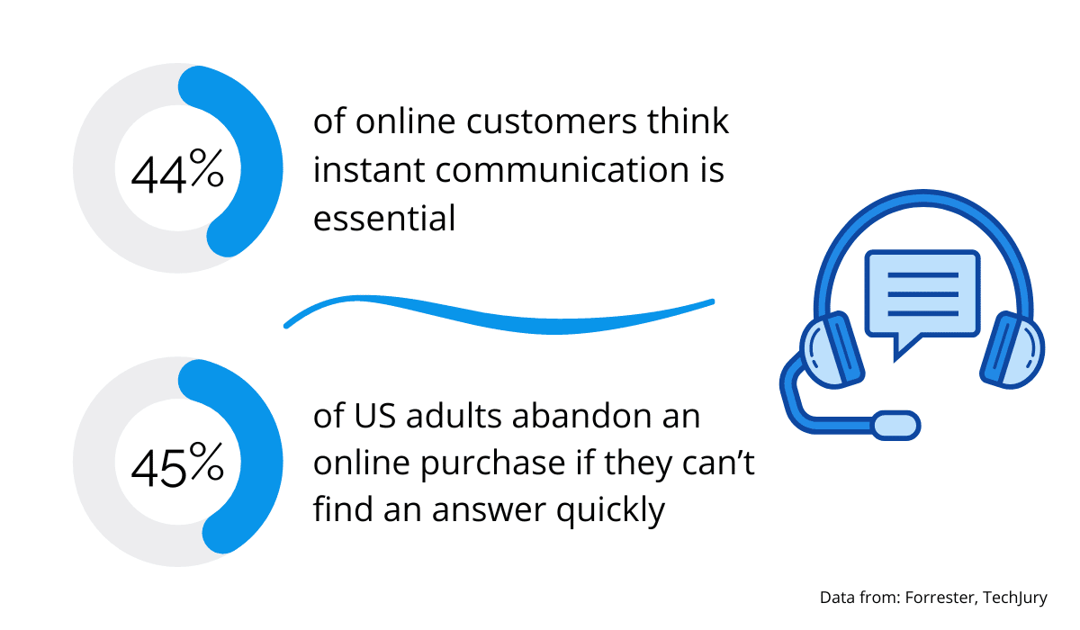
Source: Regpack
As everyone is on social media, another good option is to have a link to support channels on your social media accounts.
Some people might prefer it to a chat window on your website because it’s easier to type on Instagram or Facebook, and they’re already used to the interface.
Furthermore, if they forget what the answer was, they can access it easily in their direct messages.
With chat windows, messages are often automatically deleted when you close them, making it impossible for users to revisit the conversation.
Never Redirect Users to Another URL
When registering and paying for your event, users expect to do it all on your site.
They sometimes feel uneasy when referred to a third-party website because they know nothing about the site or its provider.
It seems like an unnecessary detour, which can discourage them from going through with the registration process.
That’s why having an all-in-one registration and payment system is the best option.
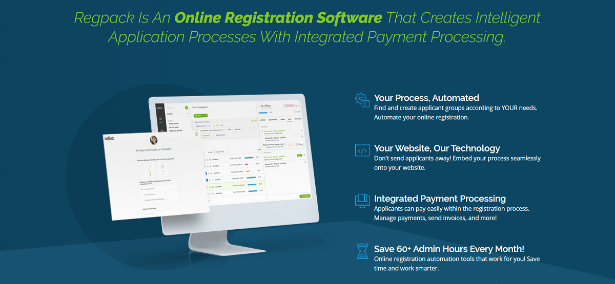
Regpack is a quick and hassle-free way to handle your customers’ registration and payments online.
This integrated solution offers useful registration features such as registration form templates or group registration and automates your billing process.
It gives you the technology you need to get payment from clients in a fast and secure way on your own website.

Source: Regpack
It can be used for various activities, such as camps, trips, or programs and it’s fully scalable and customizable to fit the size of your event and your specific needs.
Users care more and more about their privacy and the security of the information they share on the Internet, and their distrust of complicated procedures increases.
When unnecessary additional steps are eliminated, there will be no surprises along the way, so they will feel more confident to give you their information.
An added bonus for a payment solution integrated into your website is that both the registration confirmation and the payment confirmation emails will come from you, instead of one from you and the other from a payment provider.
This will also help users feel more comfortable because they will know that you received the payment and that their spot in the event is secured.
Personalize the Registration Paths
If you remember paper forms, you know that they listed all the information relevant to everyone because there was no option to modify them.
So, even if you answered NO to the “Any dietary restrictions?” question, you still had the “Which ones?” option next to it because there was no other way to eliminate the question when the form was universal.
Luckily, technology has evolved and something called conditional logic can now be used to ensure that the process is customized for each user.
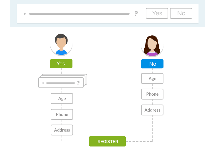

Source: Regpack
It uses an “if-then” condition to predict outcomes based on parameters from answers to previous questions.
Going back to our dietary restrictions example, if you answered NO in a registration form that employs conditional logic, you simply wouldn’t be shown any other questions related to dietary restrictions.
Personalized registration forms will streamline the process both for you and for users.
Users will complete the form quickly because they answer only the questions that are relevant to them.
There will be no sidetracking and they won’t feel like they’re wasting time filling in unnecessary information.
Furthermore, there will be less information for you to collect and process, leaving your employees free to focus on what’s relevant.
The registration experience can be made even more enjoyable if you offer options that are available only to a specific group.
For instance, if some of your users are registering for a camp as mentors, you can organize a mentor-only brunch and send an invitation for it only to that specific group.
Knowing that the form was made specifically for them will make them feel like members of an exclusive club from the start of the registration process to the event itself.
A positive experience builds loyalty, making them more likely to continue using your registration services.
Leverage Drop-Down Menus for Easier Answering
The point of drop-down menus is to make entering data easier, yet sometimes they do the exact opposite.
If such a menu is not made well, you might have to scroll through too many options, or your option may not even be on the list, and you can’t move to the next page without clicking one.
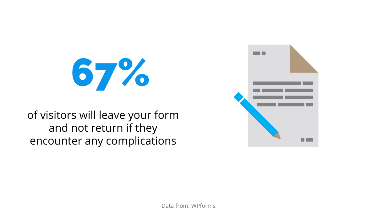
As data by WPforms indicates that more than 67% of users leave a form as soon as they encounter a setback and never come back, removing all obstacles from your answering options should be a top priority.
Source: Regpack
According to Justinmind, drop-down menus are considered usable by user experience standards if they don’t require too much scrolling.
Therefore, the best course of action is to reduce the number of possible answers in the first place.
For example, grouping countries into continents or regions is a good practice to help your users find the desired category quickly.
If reducing the number of categories isn’t possible, you can enable search in your drop-down options.
This way, even if your user’s answer is at the bottom of a list because it starts with a Z, they won’t have to scroll all the way down.
All they have to do to get to their answer is type the first two letters, and be shown what they’re looking for.
Finally, don’t forget to add “Other” as an option in a drop-down menu.
You won’t be able to predict every outcome, and there’s nothing worse than an error message preventing you from clicking “Next.”
Giving users the chance to select “Other” shows flexibility on your part because it allows users to complete the registration process even if their answer is not on the list you’ve compiled.
Test Your Registration Process
You’ve listened to theory, all that’s left now is to check if your process works in practice.
Before going live, you should give it to various people you know to test. You’ve probably been working on it for a while, so it will be challenging to look at things objectively.
However, an outsider can spot any mistakes or inconsistencies and give you an honest and objective opinion.
Their fresh perspective can also point you in the right direction when you’re stuck or give you a chance to improve the things you hadn’t considered before.
Continue to test the process on an ongoing basis, especially if you accept multiple payment methods and currencies because this increases the chances of mixups.
Finally, never forget to test for mobile. As founder and editor of Mobile Marketing Daily, David Murphy famously said:
“The future of mobile is the future of online. It is how people access online content now.”
In other words, you should try to adapt your page for the 230 million US consumers that own a smartphone because many people will use one to register for your event.
If a potential attendee can’t type into a box because it’s too small on their phone, they will leave the page and won’t look back, which is an opportunity lost for you.
Conclusion
In order for your event to succeed, you should make the registration process as straightforward as possible.
Users registering for an event appreciate a personalized approach that caters to their unique needs. They want to find answers fast and feel confident that the data they provide will be safe.
Luckily, it won’t require too much effort on your part, just the right software and some testing to ensure you’re checking all the boxes your users need.