


From the moment the user lands on your website to register for your service, it should be smooth sailing to the desired outcome—one more customer for your business.
It’s hard to overestimate the importance of increasing registrations.
However, with the number of options users have today, you can be sure that they won’t waste their time and money on a confusing, lengthy and unoptimized registration experience.
Luckily, you can do many simple things to increase registrations on your website. In this article, we’ll provide you with advice on how to do just that, so let’s dive right into it!
Showcase the Value of Your Offering
When you ask your user to register on your website, you’re essentially asking them to spend their valuable time and make an effort so you both could benefit. Therefore, it’s fair to show them the value you’re offering.
You can showcase the value of your offer simply by reminding the users why the service you’re providing is worth registering for.
Below you can see how the MoneyConf conference demonstrated the value for the users. They’re not too pushy and overbearing; just sticking to the facts is quite enough to convince a potential customer.


Source: gevme
As you can see, they opted for a testimonial from a reliable source, some figures and a short text about why the conference is important.
Another idea is to offer a part of your service or product for free. That way, you can attract users that are having second thoughts about registering and demonstrate a high level of confidence in your offer.
Here’s an example of the Wasabi cloud storage service that offers a free trial if you register.
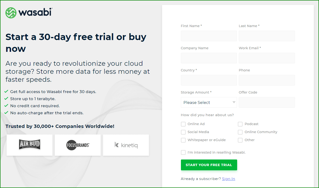

Source: wasabi
They’ve also included a few sentences about why their service is worth trying out, thus showcasing the value for the user.
Furthermore, access to exclusive content can also be an enticing incentive. For example, if you have a fitness website, you can offer a free ebook or a few free videos and provide access to more for those who register.
There’s nothing wrong with making your customers’ effort worthwhile if they fill out your registration form.
After all, your goal is to have as many registered users as possible. To paraphrase that famous saying: “All is fair in love and war—and on the internet.”
Showcasing the value of your offering is a great way to increase registrations on your website. The reason is simple. People will register for something they find value in.
Position Your CTAs Strategically
Having a clear call to action (CTA) on your web page is a great way to boost registration.
Many companies format their CTA as a button that leads to the registration form. If you choose the same solution, where you position your CTA can significantly impact the number of registrations.
When the users land on your website, they should be able to find your CTA button easily.
First, you should ensure that the users can get to your registration form in the least possible amount of time, effort and clicks. Therefore, placing your CTA on the homepage is an obvious choice, and so is any other page that’s frequently visited.
Having selected the best pages, your next step is to position the CTA button on the page. There are several options to consider here.
Many websites choose to place their CTA button above the fold—in other words, on the portion of the website that’s immediately visible without scrolling. That’s a good option because the user doesn’t have to scroll down to find it.


Source: grantbaldwin
One more thing you can see in the example above is that the CTA button isn’t without context.
That’s very important. If the CTA button is above the fold, you should surround it with information about your offer; for example, a headline, some indicators of the value of your offering and a photo or video depicting your service or product.
The other option is to place the button below the fold. According to Uxplanet, this is the better choice when you have to provide more information to the users.
For example, if you’re offering a complex service or a niche product that needs a more elaborate explanation, below the fold is the way to go.
That’s where the AIDA model of building pages comes in.
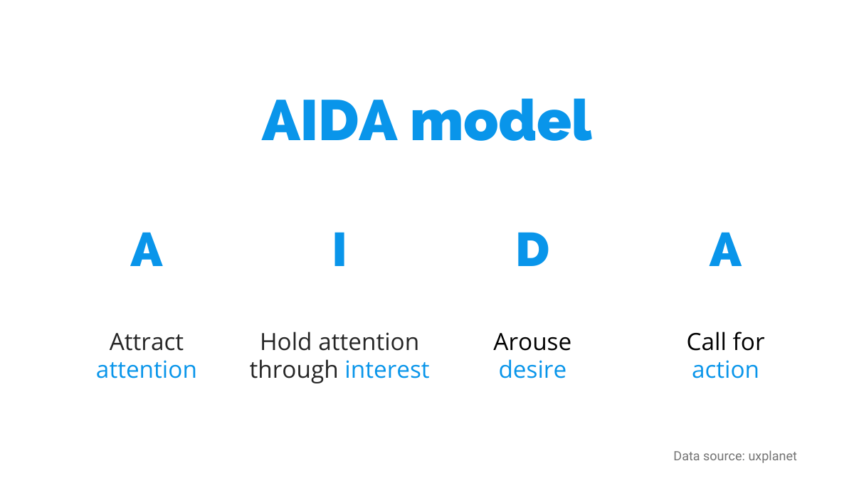

Source: Regpack
The AIDA model is a multi-step process. You provide some information to the user, and when her interest is at its peak, you close the deal with an effective CTA.
Wherever you decide to implement your CTAs, they should be visible, clear, and lead directly to your registration form. That’s the best guarantee you can get that they’ll lead to increased registrations.
Select a Natural Place for the Registration Form
Selecting a good place for the registration form can easily increase registrations on your website. But, it works in the other direction, too; place it poorly and you’ll lose potential customers who might have become valuable users.
Like the CTA button we examined in the previous section, the registration form should be visible and apparent to anyone visiting your website.


Source: optinmonster
It should also be readily accessible; if the users have to dig through your website and click through five different links to get to the form, be sure that many of them just won’t bother. And that certainly doesn’t lead to increased registrations.
Bear in mind that the registration form is usually larger than the CTA button. Therefore, if you opt to place the form directly on your homepage or another frequently visited page, you might not be able to surround it with important contextual information.
That’s why it’s essential to place it logically; why would anyone fill in the registration form before knowing anything about your service or product?
Be sure to navigate your users through the necessary information and selling points before presenting them with the registration form.
The importance of registration form placement has been researched quite a lot.
In one test, according to the research by Uxplanet that we’ve cited earlier, the conversion rate of a registration form increased by 304% after it was placed at the bottom instead of the top of the page.
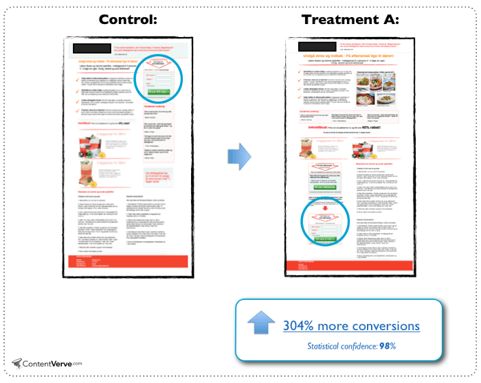

Source: uxplanet
In the above example, users were more informed, and therefore more prepared to take action, when the registration form was placed closer to the bottom of the page, and that made a world of difference.
Another option is to place the form side by side with the description of the course, service, or product you’re offering.
That way, you eliminate the risk of users going back to read about the offer, changing URLs, and hassling with opening the form in a new tab in the browser and other actions that might lead to them leaving the registration process.
The HR company Lever implemented their registration form right next to the description of their webinar.


Source: lever
When you’re considering where to put your registration form, put yourself in the users’ shoes. How would you navigate the page if you were on it for the first time? In most cases, the perfect position for your registration form will present itself.
Provide Trust Signals
When you ask your users to register on your website, you ask them to provide you with personal and sensitive information. It would be wise to provide some trust signals to your potential customers to put their mind at ease.
Users want to feel safe on your website; according to Statista’s data, most internet users have some concerns over the security of their data. Only 8% of them don’t worry at all.
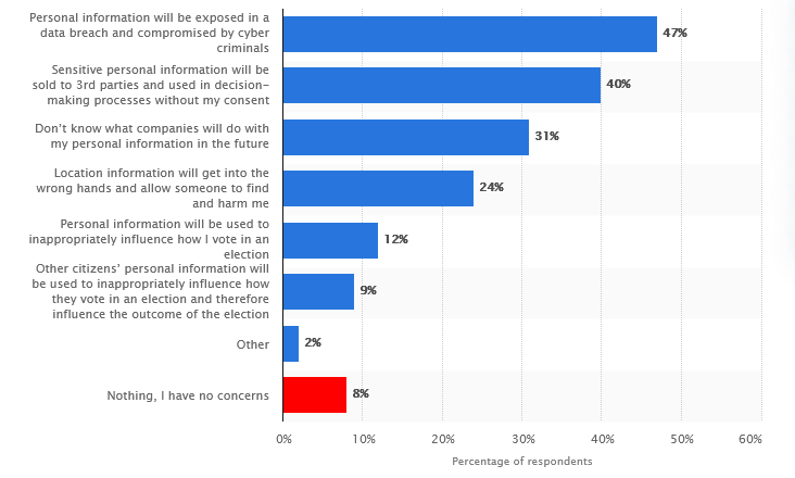

Source: Statista
One of the simplest and most effective trust signals you can provide are testimonials and reviews.
The psychological effect of seeing other peoples’ positive experiences with your offerings can be quite significant, so this is a low-effort solution with a potentially huge result.
Testimonials need to sound reliable, so having a photo and the name of the users can be beneficial in that regard. Just be sure to get permission from your reviewers to use it.


Source: sixads
Another clear trust signal is not only including your privacy policy and terms on your website but making them easy to understand. For example, you can write a few bullet points about what data you gather, who can access it, and so on.
Of course, if you also deal with payments on your website, users should feel comfortable sharing their financial information with you.
One of the best signs that you care about your users’ safety is an SSL certificate that protects sensitive information. The users can easily spot it if your URL begins with “https” instead of “http”.
For example, check out the Regpack URL below.


Source: Regpack
In addition to that, you should consider having strong encryption on your registration form, especially if it collects billing information.
The example from CCBill makes it very clear to users how their data is protected and how they can further check the payment.
![]()

Source: ccbill
There’s nothing too complicated about why you should gain your users’ trust—if they don’t find you dependable, they won’t register for your service. Provide them with reasons they can trust you and your business, and they’ll appreciate it.
Reduce the Number of Required Fields
Think of it from your own perspective. Like any other person, you just love filling out twenty required fields in a registration form.
Wait, you don’t? Well then. It might be a good idea to reduce the number of required fields to a minimum.
According to Neil Patel, you want to lower the barrier for registration as low as possible. After all, your goal is to increase registrations on your website, and the simpler that process is, the more people will complete it.

Source: Regpack
Since you don’t want your potential customers to give up on your registration form halfway through, think about one question: what data is absolutely necessary to collect?
Do you need the users’ addresses if you aren’t shipping them anything? Do you need their ZIP code or their mother’s maiden name? There are a lot of fields that you could eliminate simply by focusing on the essentials.
A lot of research supports the notion that, when it comes to the required fields in the registration form, less is more.
One from Imaginary Landscape showed a 160% increase in submitted forms when the number of fields was reduced from 11 to four.
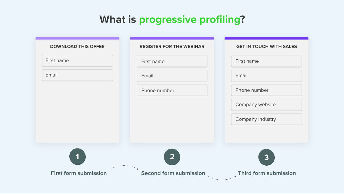
Unfortunately, sometimes reducing the number of required fields is easier said than done. Sure, you want to increase the number of registrations, but you also want to collect as much information about your users as you can without scaring them away.
If you have trouble achieving that balance, you might find some value in progressive profiling. Using this method, you don’t ask for everything in one long registration form. Instead, you collect crumbles of information in different stages.

Source: newbreedrevenue
That way, the user isn’t barraged with questions all at once, and you increase the chance of successful registration.
Reducing the number of required fields during the registration process shows your users that you value their time and privacy, which can be a significant advantage to your business.
Optimize Registration Forms for Mobile Use
The number of users that land on your website via mobile shouldn’t be taken lightly. The potential of registering that way is vast; therefore, you should optimize your forms to take advantage of it.
Stats speak for themselves here. Mobile internet traffic makes up more than half of the total web traffic worldwide. According to Statista, in 2020. it consistently surpassed the 50% mark and reached new heights at the end of 2021.

Source: Regpack
There are a few noticeable differences between computer screens and smartphone screens. When it comes to optimizing, perhaps the most important one is size.
The screen of a mobile phone is much smaller, so the amount of information required in the registration form should also be smaller. For example, instead of separate fields for first and last names, you can put one field for both.
Furthermore, the smartphone screen is vertical, which is another critical factor to consider when optimizing registration forms.
Most of the time, the form needs to be adjusted to fit; otherwise, it might look bad or even not work at all.
The example below shows what can happen when the registration form isn’t optimized for the mobile screen; parts of the questions are literally missing.
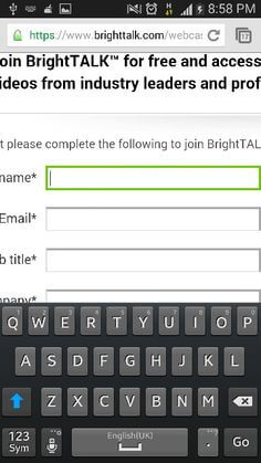

Source: blog.cws
Furthermore, it would help if you implemented solutions to speed up the registration process and reduce the amount of typing required. Among them are, for example, drop-down menus for choosing answers and enabled auto-fill in required fields.
In addition to that, mobile registrations are more hassle-free when there’s an option for social login. For instance, SoundCloud lets you sign up with just one click on the Google, Facebook or Apple icon.
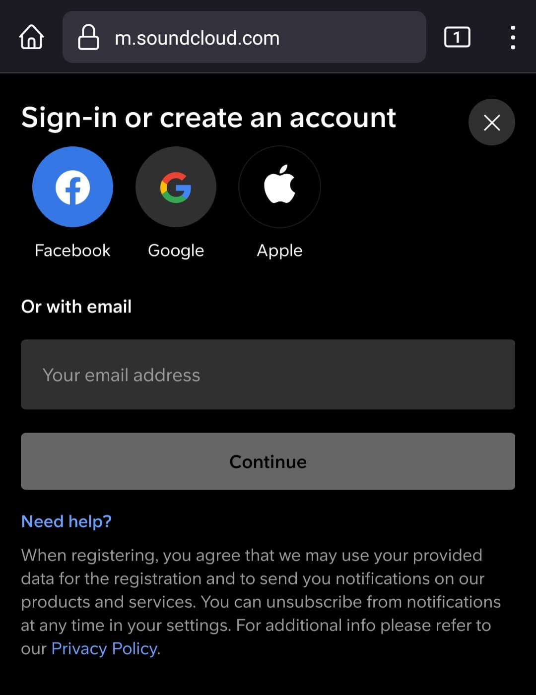

Source: SoundCloud
There’s really no way around the simple truth; if you want to increase registrations on your website, your registration forms must be optimized and polished to perfection for mobile use.
With global mobile traffic only rising from year to year, it’s a factor that’s crucial for every business. Website monitoring is a great way to ensure that your site continues running smoothly. We can help you with website traffic, conversion rates and more.
Continuously Test Your Registration Process
To increase registrations on your website, you first need to find out where’s room for improvement in the registration process. The easiest way to uncover that is by continuously testing it.
Don’t be afraid to test and change your registration process.
If you want to increase registrations, it’s vital to know what the problem areas are, as well as what works and what doesn’t.
Only when you know that can you take the appropriate steps.
There are plenty of online tools to track your users’ behavior on your website. For example, Google Analytics has the Behavior Flow, which visualizes how the users navigate your website.
That’s useful in two ways. You can see what engages them the most and the potential issues you need to address.


Source: marketlytics
For instance, you may think that you did a splendid job with designing and positioning your CTA, but the Behavior Flow shows that users mostly bypass it and instead register through the form you embedded on the “About us” page.
With that kind of data, you can act accordingly, make changes and test again.
Some tools, like Hotjar, offer heatmaps and recordings of the users’ behavior. That’s another way of visually tracking if your registration process works as you intended, in what stage users give up, etc.
If you need a registration form that is easy to embed, change and tweak according to your test results, Regpack offers simple solutions.
You can easily embed the form and customize it in accordance with your service and offers. It’s also optimized for different devices, which is often critical to increasing registrations, as we’ve examined in the previous section.

Source: Regpack
Testing is a continuous process that can be very beneficial to the number of registrations on your website.
For example, if you’re unsure whether the shorter registration form would yield better results, don’t guess—test it! The more you test, the more likely you’ll increase registrations on your website.
Conclusion
Increasing the number of registrations on your website can make the difference between a mediocre and a thriving business.
You can implement much of the advice presented in this article with a bit of effort and some common-sense thinking.
You don’t have to be a computer scientist to showcase the value of your offering, cleverly position your CTAs and registration form, provide some trust signals, optimize and shorten your forms and regularly test the process.
Doing all that can boost the number of registrations tremendously; you’ll see for yourself.