Email How-To Series: Writing Application Deadline Emails

Since my “Email How-To” series was so successful and I got such great feedback, I decided to continue on the awesome train and bring you some more commonly sent emails to applicants and registrants during the online registration process. As always, feel free to use the text how you wish and make it your own! Today’s “How-To” is focusing on Application Deadline Emails.

These emails are an important part of your communication with applicants and will help you close the deal with applicants on the fence about your event or program AND give a kick in the pants to those who are almost done but not quite there yet.

There are many reasons why someone hasn’t yet completed their application the first time around. They got distracted, they ran out of time to complete the forms, they needed to get some more information before continuing, etc. Life happens and people forget, people are slow going on getting the info they need and aren’t tuned in to when your application deadline is or they simply forgot to finish their application but fully intend to attend your event or program.

You live and breathe your registration but your applicants, not so much. They need gentle reminders full of helpful links, easy to read and understand instructions and most of all, a subtle balance between “hey this is a reminder to get on top of your application” and “we’re so excited that you’ll join us for this event, but please finish your application so we can stop bothering you, hooray!”.

Below is an example of a GREAT application deadline email. As in my previous email how-to posts, after the text we’ll look at what about this email is GREAT so you can apply those same principles to your application deadline emails!

GET MORE FREE EMAIL TEMPLATES TO USE! DOWNLOAD THE FREE EBOOK NOW!

Example of a GREAT Payment Acknowledgment Email:

good email

So why is this Email great?

There are a lot of little things in this email that make it great. The main thing is that it covers all the bases:

  • Email titles tell the applicant that this is not only informational but an action is needed.
  • It is not too long.
  • It gives only the important information and the most important information is highlighted and/or underlined to draw the eye to it.
  • It has a list of what is still outstanding so the reader knows where they stand and why the application is not complete. Plus it uses color, specifically red which people associate with ‘stop’ or ‘bad’ to draw the eye to missing items.
  • It contains links so the reader can immediately access the website or page they need in order to complete the call to action of the email (to finish their application).
  • It has information about how to login and also what their username is (since people forget).
  • Last but not least, it has contact information that is easy to find in multiple places.

Let’s talk about this more in detail, shall we?

There is a call to action right from the title.

Email overload is something that we all suffer from. I personally get so many emails I sometimes wish someone would kill our email server for a day or two (not really but it would be be a great excuse lol).

Email overload means many people sometimes only read the title of an email in order to determine if they are going to address or not. Hence the title needs to be to the point and explain what is in the email. Note that the title of this email starts with “Action needed”. This tells the recipient that this is not only an informational email but that they actually need to do something about it! These two little words will get a lot more people opening your email and also acting on it since you were very clear that they need to do something about this email. Small little detail translates to a big result in your application completeness ratio and your bottom line.

The email is not too long.

Emails should be short and to the point. Drake Baer even claims all emails should be 5 sentences long. I would not go as far as that because communicating with clients will usually require more text, but I agree that emails should be to the point and not contain superfluous information.

It is important to state that this does not apply when you are writing email that are connected to payments such as payment confirmation emails or payment reminder emails. When you are sending an invoice and asking for payment, you can’t really make it short and sweet. And when it comes to payments, people are willing to read more since their money is on the line. This is not the case here, your main goal is to get your applicant to click the link of their incomplete form(s) or go to your website and complete their application. You want everything about your process is be in the “2 minutes to do” category. This applies to the email and to the action they need to do. So start with the email. Keep it short. All they really need to know is the date it needs to be done by and how they can do it.

The email gives only the important information, which is highlighted and underlined to draw the eye to it. It has a list of what the applicant still needs to complete.

Like I said above, the reader just needs to know what the deadline is and where they go (without having to open other emails or figure it out for themselves). The deadline date is highlighted and the forms they still need to complete are colored red so draw the eye to what is missing and give the applicant a clear picture of what still needs to be completed. This also tells them why you are sending the email and exactly what is incomplete. This will prevent people answering you with “But I thought I completed everything” or “Can you tell me what I need to complete?”. These emails take time on your end and will result in less people completing their application. Who wants to send an email and WAIT for your response to get going on the task anyway? Failing to enter the information about what they did not complete will cost you in incomplete registrations (aka, less people coming to your event or program).

The list of incomplete forms are also links that will send the applicant to the form right away if they are already logged into your registration process (which your system should allow). This will bring them to the point of action right away and will ensure that they do not get confused with forms that are already complete or forms that they do not need to fill out. If your online registration software is smart, when they complete the first form and submit it, it should take them right away to the next form they have not completed and not to forms that do not demand action. In Regpack, this was built from the get go which is why the +3000 organizations that use Regpack see a 30% increase in completed applications from day one.

Obviously you should not be entering the incomplete forms for each user manually. Your online registration software should do this for you automatically when you send the email through the system.

The email helps the user with their username and password

It is important to include a blurb about their username (tell them what it is, an email system that can automate this process is great and saves tons of time!) since it means they again don’t have to go to a previous email to find out what it is or try and guess what they made it. Remember, you know your system in and out, your applicants hopefully go through it only once (or twice if they did not complete their application and you are sending them this email but generally your goal is to have them in the registration system only once and that will actually be the result if it is a good system) so they do not remember everything about it and they just want to finish the required action. Help them do that! They will love you for it and your finance department will love you for it too.

The email contains links so the reader can immediately access the website or page they need in order to complete the call to action of the email (to finish their application)!

In addition to having each form they need to complete be a link, having a separate line that says, “please login to your account here to complete your application” is helpful and is another opportunity to include a link to their account. The email should make it easy to find where to click to access their profile, even if it’s short and the point. Every part of the email should be easy to say “oh I click here to get to my account”! Most people don’t read the full message so if they are only reading a snippet, make sure that snippet contains something useful and helpful to get them started on the task at hand.

The email has contact information that is easy to find in multiple places throughout the email.

While the point of these well crafted emails is to get the applicant on task without having to bother you about what they are still needing to complete, etc, there are always going to be people who want to email you or call you to follow up or ask clarifying questions. Don’t make it difficult for your applicants to get in touch with you. Note your email and/or phone number in the body of the email AND in your signature. Different people will look in different places to find this info so make it accessible. Just mentioning too, like the email above does, that they should be in touch with any questions makes you seem approachable, caring and helpful to your registrants, which is always a good thing!

Another point regarding contacting you: most people will hit “reply” if they have a question. Make sure that the email is coming from the email address you want the inquires to come to. If your online registration software does not allow you to control what email it is sending out from… it is time to look for a new system!

GET MORE FREE EMAIL TEMPLATES TO USE! DOWNLOAD THE FREE EBOOK NOW!

What does a bad email look like?

bad email

Now that we have seen what a GREAT application deadline email looks like, it is time to see how a bad one looks like. The differences are not that big, after all God is in the details, right?

Why is this email bad (if you can’t already tell!)…

Since you’re an expert already, you can probably already tell why this email isn’t so hot.

  1. It isn’t personalized. It doesn’t mention the program or event they are attending nor does it include their name. It reads bulk email all over it and so even if you sent the email only to people this applies to many of them will think it does not apply to them. The chances of your applicants completing registration when they receive an email message like this are VERY low.
  2. It contains no links or contact information. This is a huge problem and will most likely result in one of the following:
    • Those who are on the fence about coming won’t come (and you won’t get paid).
    • You will be inundated with emails and calls from applicants asking questions like “where do I go to complete the registration”, “how much do I owe” and “when is this due by”.

    What a waste of time and defeating the whole purpose of a great online registration software!

  3. It doesn’t include the date of when the application is due by! Hello! This is the whole point of the email!!!

One thing the email gets right (sort of) is keeping things short and sweet. So there’s that. But in my opinion, too short or too long are a similar problem

Do you have any suggestions for future “how-to” email posts? Any emails you send all the time that you’d like to refresh or get some our of “Regpack perspective” on.

GET MORE FREE EMAIL TEMPLATES TO USE! DOWNLOAD THE FREE EBOOK NOW!

About The Author
Asaf Darash
CEO and Founder of Regpack

Asaf, Founder and CEO of Regpack, has extensive experience as an entrepreneur and investor. Asaf has built 3 successful companies to date, all with an exit plan or that have stayed in profitability and are still functional. Asaf specializes in product development for the web, team building and in bringing a company from concept to an actualized unit that is profitable.

What is Regpack?

Regpack is an online registration software that creates intelligent application processes with integrated payment processing.

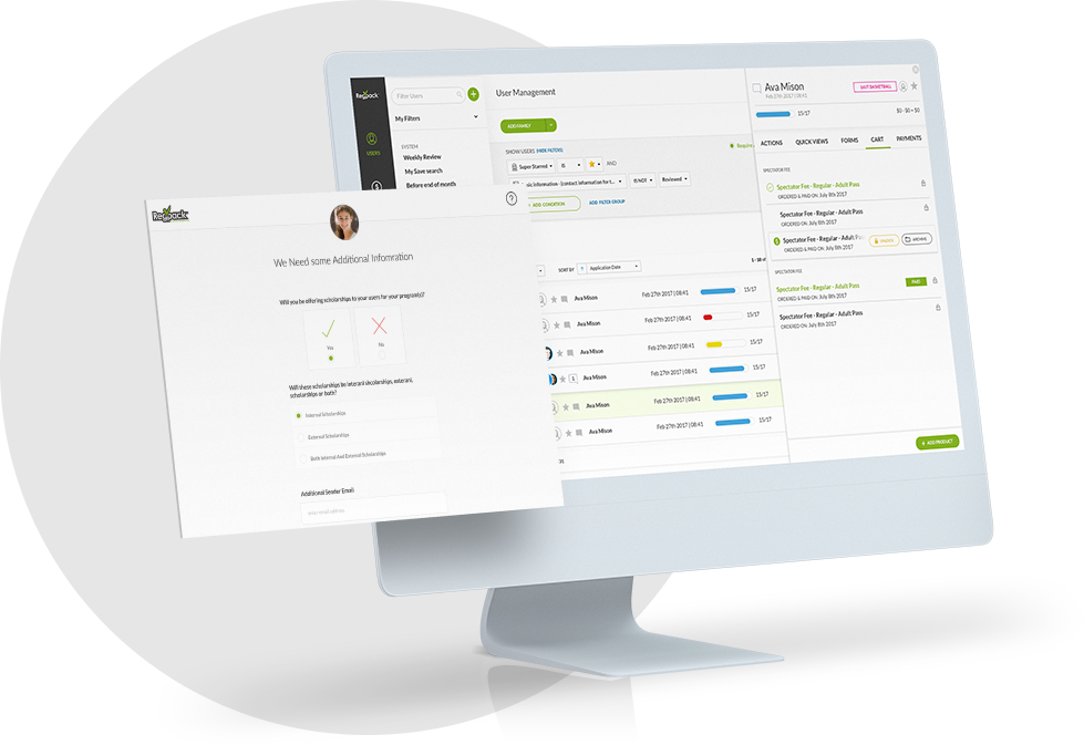
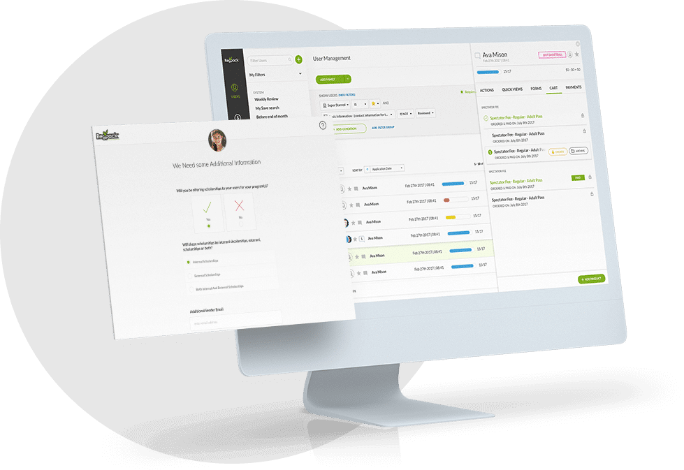
Your Process, Automated
Find and create applicant groups according to YOUR needs. Automate your online registration.
Your Website, Our Technology
Don't send applicants away! Embed your process seamlessly onto your website.
Integrated Payment Processing
Applicants can pay easily within the registration process. Manage payments, send invoices, and more!
Save 60+ Admin Hours Every Month!
Online registration automation tools that work for you! Save time and work smarter.