
What would qualify as a good event registration website design?
Most people would argue that the quality of the content is crucial, but what good is it to have outstanding content if it’s visually bland and makes it hard for visitors to find what they’re looking for?
Your website should grab the readers’ attention and make them look forward to your event instantly. Otherwise, they’ll forget it and won’t come back.
Luckily, there are some proven methods and tips to increase the number of registrations for your event and drive conversions.
Read on to find out what they are.
- Make Your Website Mobile Responsive
- Create a Strong Visual Hierarchy
- Have Only One Call to Action
- Use Strong Visuals
- Ensure Easy Site Navigation
- Keep Registrations Simple
- Conclusion
Make Your Website Mobile Responsive
“Everyone’s on their phones these days” is an omnipresent saying that you’ve probably uttered a couple of times yourself.
It’s true—people spend an alarming amount of time scrolling through their phones.
However, instead of viewing this as a negative thing, it can be seen as an opportunity to optimize your site for mobile use and increase conversion rates.
This is backed by data, as one study has found that mobile-optimized sites drive 61% more conversions.

Source: Regpack
Moreover, Google is moving towards mobile-first indexing, meaning that it will use mobile versions of a website for ranking content.
The emphasis on mobile optimization, or any optimization for that matter, is on user experience. It needs to be seamless across all devices.
Having a clunky website that you only see half of on your mobile screen is anything but.
Users will instantly recognize that this isn’t a mobile-friendly site and won’t bother switching to a desktop to access it.
Size is crucial for mobile versions.
Tiny letters and buttons you can’t click on are frustrating, which is why you need a responsive website.
With it, the content adapts to the user instead of the other way around. It will make the buttons bigger, and the text will be arranged so that users don’t have to scroll endlessly.
Speed is another essential feature a mobile-optimized website needs. We live in an age of instant gratification, and users are used to getting what they’re looking for in seconds.
So, if a site takes forever to load, a user might think it’s not working at all and simply close it.
This is why you need a good hosting provider that will allow your page to load quickly, making users more likely to stay and buy a ticket for your event.
Create a Strong Visual Hierarchy
People are highly visual creatures, so visual elements in a website must be organized neatly to create a visual hierarchy and lead the eye where you want it.
Luckily, there’s a scientifically proven way to do this: the Z and F reading patterns, typically followed by Western readers.
The patterns are easy to skim through and show the essential data in a user-friendly layout.
Let’s look at the Z pattern used by Facebook.

Source: LinkedIn
It leads the eye from the top left corner in a horizontal line, where your logo should be, directs it to the right, and then moves diagonally down left again.
This is where you should place a powerful image representing your event to attract potential customers.
Finally, the bottom right corner is the place for your Register now button. It will increase the possibility of conversion, as this is the part of the page the readers’ eyes will naturally go to.
The F pattern, used by LinkedIn, follows a similar logic, organizing important information in the form of the letter F.

Source: LinkedIn
Another way to create a solid visual hierarchy is to use negative space.
Yes, the space that’s empty actually has a purpose in web design.
If a site is teeming with various elements, the user won’t know where to look and might miss the crucial things.
Simply put, if everything is important—nothing is important. So, by cleverly using negative space, you can emphasize the things you want and make them stand out.
Take Compference 18, for example.

Source: Bizzabo
They know their biggest selling point is the location: Disneyworld.
They used very few other elements because they counted on the fact that highlighting such a fantastic location would pique everyone’s interest.
Finally, having a strong visual hierarchy isn’t possible without colors.
Using colors to achieve a specific effect is an art in itself, used extensively by designers.
According to 99designs, when users decide whether they like your product, 90% of the decision is based on color.

Source: Regpack
That’s why your event’s colors should be chosen carefully to reflect your company’s identity and make an impact, e.g., by using contrast to make specific information really pop.
Have Only One Call to Action
Your event registration website has one goal—to get people to register for your event. So, you shouldn’t give them the chance to wander around and forget about registering.
Instead, you should make registering for the said event as easy as possible.
The best way to get them to register is by adding a call to action (CTA) button to your website.
A CTA is so powerful that one company, Toast, found that adding one to its emails resulted in 371% more clicks and a whopping 1617% more sales than the companies with multiple CTAs.

Source: Regpack
If you give visitors several options, they’ll spend time thinking about them and might not decide on either in the end.
On the other hand, if there’s only one option, they have to choose it because there’s no alternative.
Below is an excellent example of the CTA for Namely’s HR Redefined event.

Source: Bizzabo
The CTA, Register Now, is displayed prominently. It catches the visitor’s attention, and there’s nothing else to distract them, so they won’t be inclined to click on anything else.
With a single CTA, you’re a guide on your client’s journey, showing them exactly where they need to go and giving them the most direct and quickest way to get there.
Plus, having only one CTA is optimal for mobile use, making it easier for a greater pool of potential clients on mobile phones (i.e., the majority) to register.
Use Strong Visuals
We’ve mentioned the fact that we’re visual creatures. In addition to deciding how to arrange elements visually and which colors to use, there are also images and videos.
The images you use will set the tone for your event. Think about it; you probably won’t wish to attend an event if its website shows photos of people looking bored.
A good idea is to have a photographer capture the atmosphere at one of your events and then use these candid photos for your next edition.
The images will act like a sneak peek into what they can expect.
People will appreciate the honesty and real emotions and want to partake in such a fun event.
Here’s an example from the 2018 Great Place to Work Conference.

Source: Bizzabo
This will leverage the potential attendees’ fear of missing out, making them more likely to register because they won’t want to miss such a fun event.
Video marketing is trending upwards, so another good idea is to have videos on your website.
Let’s say you’re hosting a cooking event. You can make a video of one of the lecturers showing how to cook a simple meal you know everyone will love.
It’ll act as a teaser. People watching it will love that it’s so simple, so they’ll want to sign up for the event to learn how to make more simple and delicious meals.
One final caveat regarding visuals—don’t forget image and video quality.
Blurry photos and low-resolution videos could undermine your company’s reputation, indicating that you don’t take your job seriously.
Ensure Easy Site Navigation
Finding the information you need to register for an event should be quick and easy.
Users should be able to come to your website and register for an event in a few clicks.
Otherwise, they’ll get annoyed and leave. Just like at sea, it should be smooth sailing, not choppy waters.
And just like at sea, there shouldn’t be any unpleasant surprises. This means the elements should be in a familiar location, so the users don’t have to look for them for hours.
For example, a website navigation menu is typically found at the top of the page or on the left.
While you might think that placing it at the bottom would be unusual and quirky, the user would likely only find it confusing, increasing bounce rates.
In general, drop-down menus and similar menu options should be kept to a minimum. Once again, the reason is that too many options are confusing.
Another reason is that the human brain can store a maximum of seven items at a time, so you should keep the number of categories in each menu or category below that.
Below is an example of a great menu from MozCon.

Source: MozCon
The menu is at the top of the page. It contains the most important information and a single CTA.
The search option is also there, which is another helpful feature as it makes the navigation process seamless by enabling visitors to find anything they need.
Finally, don’t forget about the footer. Visitors reaching the end of your page shouldn’t be happy to be nearing the end of your interaction.
On the contrary, the items you add to your footer menu should intrigue them and make them want to continue exploring.
For instance, this is a good place for your blog or client testimonials because it’ll allow customers to get to know you better.
A Back to top button is a must here because users don’t want to scroll all the way back up to get to where they started.
Allowing them to conveniently do it in a click will make them more likely to stay on the site and, therefore, more likely to buy a ticket.
Keep Registrations Simple
Once your visitors finally reach the registration page, the process itself should be simple and the interface clean.
Let’s look at the thing that makes registration possible, registration forms. They should be short and sweet.
We cannot overstate the importance of keeping it short. In fact, Hubspot found that fewer form fields lead to more conversions.

Source: Regpack
Ask your attendees only the basics, such as first and last name and email address. Once you have their email address, you can send follow-up questions when the event approaches.
Furthermore, the event-related info, such as time, date, location, and ticket price, should be clearly visible on the registration page.
That way you make sure people are aware of the date long in advance, which makes them less likely to change their minds at the last minute.
Showing the ticket price will show that you care about transparency and assure visitors there aren’t any hidden costs.
Below is an excellent example by MoneyConf.

Source: Gevme
It has all the essential information about the event, tells you the price, and even offers a 2-for-1 discount code.
Another thing to keep in mind is repeat attendees. If someone liked the event enough to return, don’t make them fill out the same form twice.
Saving their information will make the process quicker and more convenient for them, meaning a more likely conversion for you.
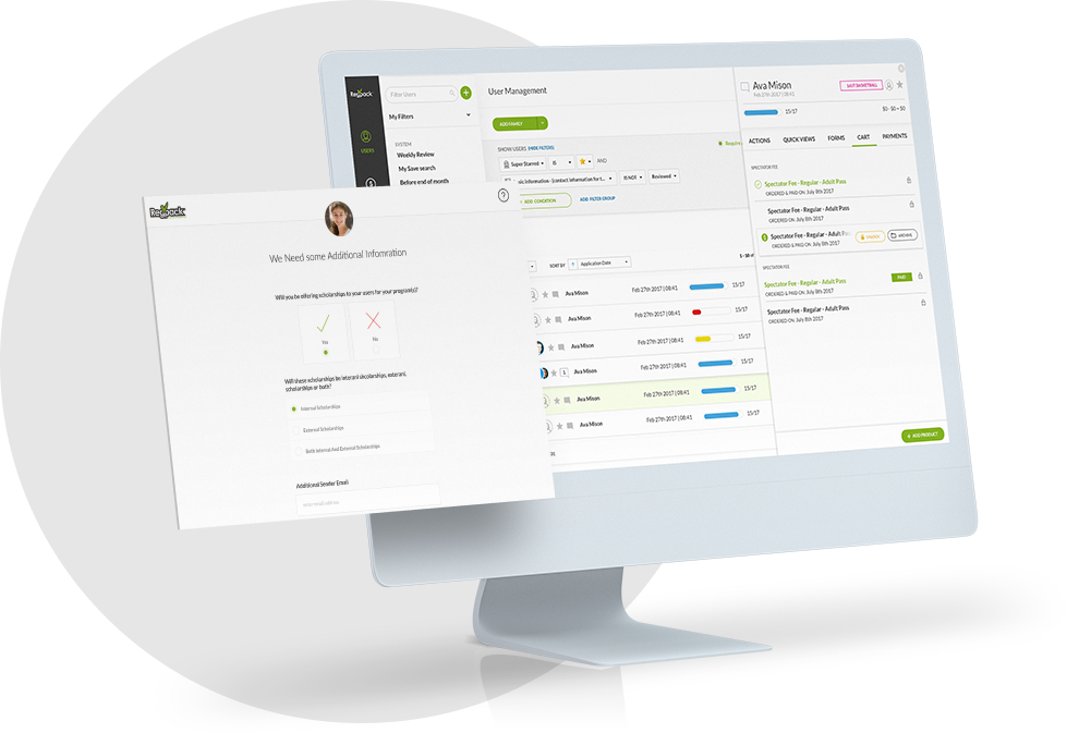
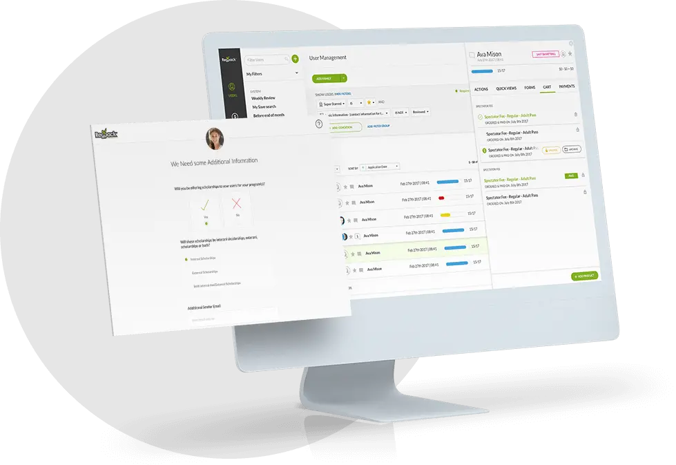
Software such as Regpack can help simplify the registration process and keep attendees coming back.
Features such as automated emails and discounts will show attendees that you care about them, encouraging them to return year after year.
Conclusion
Making an event registration website comes with its own set of challenges, but it doesn’t have to be headache-inducing.
The most important thing to remember when building one is to focus on users and remove all the obstacles they could encounter when registering.
They should be able to find the information they need quickly and access the registration page in a seamless and direct way, regardless of the device they’re using.
Having a clean interface with striking visuals and without distractions will drive conversions and help sell out your next event.