

SaaS companies often focus too much on their product optimization and adding new features while completely neglecting the first steps potential customers have with their product.
In other words, they don’t pay enough attention to user registration.
Although it might sound self-evident and useless in the grand scheme of things, the fact is that most of your digital marketing should happen at this stage.
This is where you turn visitors into customers.
Because it’s an essential step in setting first impressions, you have to commit to providing the best possible experience.
Should you choose a friction-based or frictionless user flow? How long does the registration form need to be? What about third-party authorization?
In this article, you will find tips and best practices for all your user registration needs, as well as examples of some of the SaaS companies that implemented them.
Jump to Section
What Is a Sign-up Flow?
Types of SaaS User Registration Flows
User Registration Process Best Practices
User Sign-up Flow Examples
What Comes After User Registration?
What Is a Sign-up Flow?
The sign-up flow is the first step in the onboarding experience, in which customers create an account to use a website or an app.
It consists of collecting relevant data about potential customers to help personalize their accounts and make the process as easy as possible.
This is where SaaS companies make the first impression on their customers. If utilized correctly, it can spur your growth in the long run.
Generally, you should make it simple and easy.
By improving their sign-up flow, some companies improved their conversion rate by 36%. In SaaS, keeping conversion rates high keeps businesses afloat.
Friction, or the amount of effort a user has to make to gain access to a product or a part of it, is an important part of this process.
Users will either complete the sign-up form and start using the product, or find it too difficult and never come back.
The trick is to make the process seem natural and highlight that, by giving up their data, customers are getting something good in return.
Types of SaaS User Registration Flows
The amount of friction in your sign-up will depend on factors like your target customer, the kind of product you offer, the UI, and the purpose of the sign-up.
When it comes to user flow, the less friction you have is usually better, but sometimes the overall user experience benefits from a bit of friction.
So, let’s take a look at the different types of user flows.
Each type of user flow has its pros and cons, and they depend on the context.
1. Data Upfront, App Access After
This is the most common type of user flow. The user has to provide their data before accessing the software.
Then, after they receive a confirmation email, their account is set up.
While being most common, this type is also full of friction as it requires a considerable amount of effort from the potential user.
The good news is that customers are familiar with this process and are more ready to trust it, despite the initial difficulty.
As a service provider, you’re relying on the users’ commitment bias by making them do all the heavy work before giving them access to your product.
This means that, once they complete it, the chances are they’re going to want to stick to it.
On the other hand, some users might not be ready to commit to something they haven’t used before, and giving up their data is a big concern.
In those cases, it is helpful to explain why you need a specific type of information. Microcopy can help you ease their worries and persuade them to try out your product.
This sign-up flow has the added benefit of keeping spammers away.
There is less abuse of the trial period, and you have a better view of who really wants to use your product.
Those who have signed up are far more likely to remain active—but it also means that you might have fewer numbers of successful sign-ups.
The chances of dropout during this process are high, especially if you ask for too much data. To prevent this, it is vital to motivate the user to take meaningful actions.
2. User Finishes Account Setup After Getting App Access
In this type of flow, we’re trying to eliminate all possible friction by asking the user for minimal information. It is usually enough for users to give their email to gain initial access to the software.
By removing the password requirement (and, in some cases, email verification), the initial user experience is very seamless.
They gain access to what they want, allowing them to interact with the product to verify the perceived value.
In this way, if they become inactive, you can still send them reminder emails to bring them back.
This type of user flow combines the justification of giving data and the early removal of friction.
So, if they like your product, they will continue with the registration process later on.
There is no commitment bias, and those who might initially be doubting about giving too much of their info are now more likely to test your product and possibly become active users.
When you have committed users, it’s easier to upsell and stop wasting time on spammers.
The downside is that you’re also likely to get more spammers with this approach, since many people aren’t too fussy about verifying their email if it’s the only thing they have to do.
Additionally, you’re not getting as much information from the user that can help you streamline your product, thus creating better retention.
Although you’re gaining less valuable information and potentially attracting spam accounts, this approach nevertheless combines the best of both worlds: you’re removing unnecessary friction, and you’re gaining more sign-ups.
3. Instant App Access
In the final approach, customers come to your site and immediately gain access to the product, learn how to use it, and internalize its value.
The data collection is contextual, so the user knows why they’re asked for certain information, and the entire process prioritizes user experience.
There are no sign-up forms, so friction doesn’t exist.
This has its benefits and some drawbacks.
It is the riskiest approach because you do not gain any information about your customers, and there’s an immense potential that unguided onboarding results in more significant churn.
That is why some experts recommend ensuring that potential customers understand your product and the reasons why they should care about it since they first access it.
The users should find value on their own, and this approach can push them to their first Aha! Moment much quicker.
This approach is useful for products with easy UI and doesn’t require any integrations to work, like Trello.
New businesses depend on data, and they need feedback on the usability of their product.
With this approach, it’s doubtful companies will get the information they need to improve and be relevant in their target market.
Engaging with customers in this approach is challenging because once they leave, you have no way of retargeting them.
Wanting to remove friction can sometimes do more damage than good.
Using frictionless user flows is tricky because the opportunities for streamlining customers and upselling opportunities are few and far between.
User Registration Process Best Practices
It bears repeating that different companies need different registration processes, depending on their products, goals, and target audience.
There is no one-size-fits-all approach to getting users to sign-up for your product, but there are some steps you can take today that will appease most users and invite them to see value in your product.
Find Your Optimum Friction Level
As mentioned before, user experience during the signup process depends on the amount of friction.
Friction-based flows are more about gathering data, while frictionless flows rely on providing value right from the start with a more straightforward sign-up process.
You have to decide what you want to achieve and consider the advantages and disadvantages of each type of flow for showcasing your product, so you can bring users to their Aha! Moment and keep your conversion rates high.
Keep Forms Simple and Minimal
Forms are less about persuading the user and more about providing easy access to your product.
Therefore, a good sign-up form should eliminate distractions and use as few elements as possible to drive your customers to your product.
The lack of an attention span online is a real issue, and long forms might hurt you even though they provide more credibility to your company.
In general, shorter forms are more frequently used, especially those that provide one-click access through a third-party auto registration.
Our end goal is easy access, and the fewer fields customers need to fill in, the better.
Focus on the most important information that you need for your business goals. Other data can be obtained when the user sets up their profile.
If there’s still some more information you need from your users, you can separate them in a multi-page process and keep in mind that they should be simple and straightforward so you don’t overwhelm them.
Another helpful tip is to provide a progress bar to let the user know how long the sign-up process will last.
Never Repeat Fields
In sign-up form optimization, you mustn’t repeat fields.
It creates unnecessary friction and irritates the user because they have to give the same data twice.
Your users just want to finish filling the form as quickly as possible. By adding extra fields, you’re unintentionally blocking them in their path. They are more likely to exit your form because the additional fields are wasting their time.
Design your sign-up form, so you only have to ask your customer for their information once, and if you really need some information twice, you can auto-fill them.
Short forms are especially valuable in mobile apps.
Avoid Complex Password Rules
Asking your customers to create a password is enough of a hassle.
They already have a gazillion registrations under their belts and having to come up with a new password is a chore.
Therefore, you should make it as simple as possible while still having security in mind. If you make it too complex, the visitor will forget it and never come back again.
Some reports show that if a customer forgets their password for a site, 45% of them never come back to it again.
Avoid setting a maximum length for passwords and only show them the strength of their password. Users can decide for themselves if they want to make it better or change it.
Highlight Required Fields
Sometimes you will have to include a long-form during the registration process.
This applies to companies with many different products that require credit card information as well as a billing and shipping address.
Customers know they have to fill in that information, but don’t expect them to be thrilled if they have to fill out 30 pages just to buy a toothbrush.
Instead, you can help them out by highlighting the most important fields. This will also help them detect if filling out the form is worth their time.
Create visual indicators to highlight important fields. Use different color fonts and symbols to point out the essential info you need.
Don’t Ask for a Password Confirmation
Asking users to confirm their passwords doesn’t help speed up the registration process, nor is it more secure.
It just yields more friction by forcing your customer to type in the password again, especially since most of them will mistype it anyway.
Back in the day, password confirmations were used for better security when there were higher chances of people monitoring your activity over the shoulder.
Nowadays, they don’t have any justifiable use.
Eliminating this unnecessary step can tremendously improve your analytics.
For instance, after removing the confirm password field, Formisimo had a conversion increase of 56%, and 35% more visitors completed the registration.
If you have to ask for password confirmation, put an icon that will unmask their password so there’s less of a chance they will mistype.
Allow For Social Sign-Ups
Social sign-ups are widespread in today’s registration forms. Why?
There are many advantages:
- they allow for a quick and easy sign-up process to a new website
- there is no need to come up with a username or a password, which reduces friction
- once customers sign-up using their social login, they are more likely to spend more time on your website
- it gives you access to all the data the third-party platform has already gathered, helping you target them with the appropriate content
In short, social sign-ups streamline the process while giving you access to a treasure trove of reliable information that can help you understand your user base without requiring additional forms on your side.
And the best part is that you don’t have to ask for it directly from the user.
So, when applicable, allow for a single-click sign-up through most widely used platforms like Google or Facebook. It’s easier for the customer and saves you and them a lot of time.
User Sign-up Flow Examples
Here are some examples of the best registration forms used by different companies with different levels of friction.
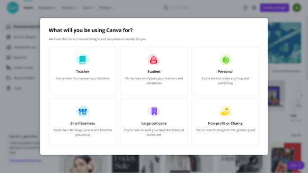
The first one is Canva. They opted to ask for all the data upfront.
Canva
Right from the start, Canva is trying to ease the sign-up process by implementing social sign-ups through Google and Facebook.
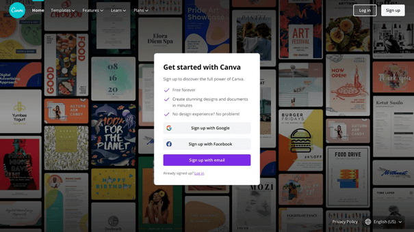
Users also have the option to sign up by email.
There are only three options to choose from, so the user is not overwhelmed.
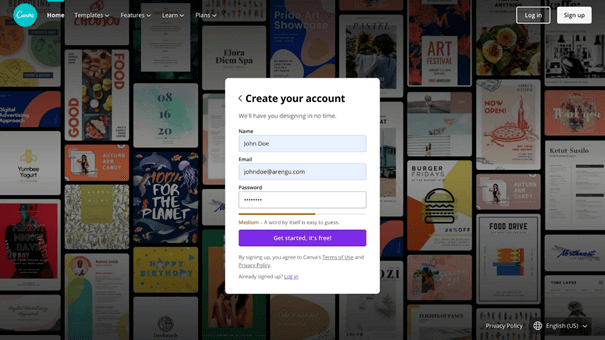
If users choose to sign-up with email, they’re taken to the next step, where there’s also a minimum of fields required for successful registration: only the name, email, and password.
Canva makes it easier for the user to identify the strength of the password by providing a strength meter and doesn’t have any other password requirements.
The onboarding experience will vary depending on which email is entered.
For work emails, there are a few more steps that require more information about the company, such as name and company logo.
On the other hand, a prominent skip button on the upper right corner allows for a much faster sign-up process.
The next few steps include an upselling pitch where Canva invites the user to try CanvaPro, and the last step before entering the website is asking the user to sign up for their newsletter.
After entering a password and email, the user can skip some parts of the registration process, which is commendable and makes the process faster.
The skipped parts can be updated later.
For private users, this is the final step after providing an email address that will take them to the website.
Canva also tries to personalize their experience by asking about their user profile.
In short, Canva is cleverly using all the best practices of a good registration process.
Even though they require a password (an option for those less inclined to use their Gmail or Facebook account), they use a password strength meter to help users avoid account breaches.
They streamline their users’ experience based on their provided email and personalize it to target their user base better later on.
The sign-up flow is quick, easy, and personal.
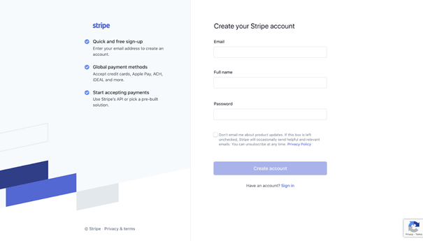
The following example is Stripe. They also ask for data upfront and then grant access to their app.
Stripe
Stripe doesn’t have social sign-up, but they also request minimal info from their users. The user is asked to provide their email, full name, and password.
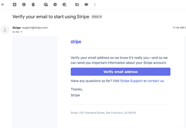
After creating an account, the user is asked to verify their email, which could cause some initial friction.
Users have to take additional steps in logging in to their emails and click on confirmation which then takes them to Stripe’s website.
After the verification, the users can now use Stripe and set up their profile.
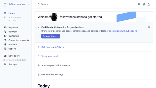
While a user has to tolerate a certain amount of friction to gain access to the website, once they do that, they are automatically logged in so they can use the service immediately.
Stripe has cleverly balanced the amount of friction for their users to streamline the user base better.
Slack
Slack is an example of a completely seamless sign-up flow with no password needed.
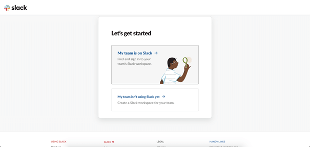
When users visit Slack’s website, they are automatically encouraged to use the platform as soon as possible.
Once they choose the right option for their type of use (new user vs. old user), they are sent to the next step.
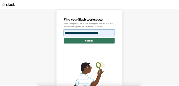
Here users are asked to provide only their email so that a link can be sent to their inbox to verify their identity later.
This step helpfully eliminates some of the spam sign-ups and, while not too secure, it can reduce friction for the user.
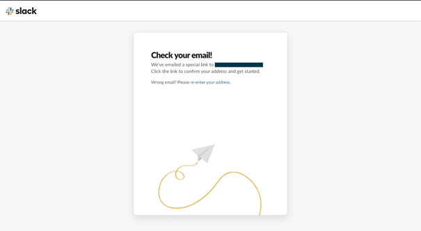
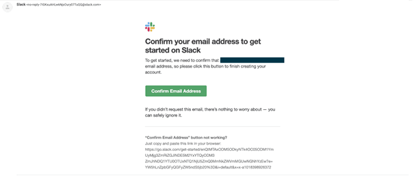
After verifying their email, users are sent to the website and they can start using it with one more click.
There is no profile setting, and users can begin their work after just a few clicks and no friction.
What Comes After User Registration?
Once you’ve successfully registered a new user, your work isn’t done. Now you have to successfully onboard them and show them how to use your product.
The onboarding experience should be a smooth extension of the registration process, and there are several things you should keep in mind when setting it up.
Make them feel special by sending a welcome email and offering support.
After a customer’s first login, try to give them a brief but engaging product walkthrough.
Use different elements to make the learning process more enjoyable, especially checklists and progress bars.
Make the learning meaningful so users can get to their Aha! Moment faster, which will allow for speedier product adoption.
Successful onboarding is a continuous process, and everything in your product should be user-focused to make for a better overall UX.
Leaving them to their own devices after registration is the biggest mistake you can make.
As with the registration forms, any other data collection has to be simple and meaningful.
If you have to gather billing info from your customers, you should strive to make it simple with only necessary fields listed and highlighted.
Filling forms and handing over their data is an inconvenience for most users, so everything should be accessible.
Conclusion
User registration is the first step in a successful onboarding experience, and it is the first impression you leave on your customer. You have to make it good.
There are different approaches, from friction-based to friction-less user flows, and there are strengths and weaknesses in both.
Asking for all your customer’s data might be the most popular approach, but don’t be afraid to provide some friction in the user sign-up process if it will mean better retention and conversion rates.
Remember, keeping forms simple, avoiding complex password rules, and having social sign-ups are some of the best ways to make an excellent registration process.