


When planning an event, it’s easy to put the registration form on the back burner.
But if you’re not designing your registration form with best practices in mind, you’re sacrificing many potential registrants.
The most effective registration forms have a large impact on conversion rates.
How many times have you started signing up for something online—be it an event, a membership program, or even a newsletter—and frustration made you give up and navigate away from the page?
If you want to maximize attendance and start your event off on the right foot, you need a registration form that makes it as easy and painless as possible for users to finish the signup process.
In this post, we’ll cover seven essential best practices for ensuring you’re getting the most out of your event registration forms.
- Keep the Form as Short as Possible
- Make the Registration Form Scannable
- Use Inertia to Your Advantage
- Give Users a Sense of Progress
- Make Error Messages Immediately Visible
- Allow Users to Register Multiple Attendees
- Enable Event Form Submission Confirmation Emails
- The Key to a High-Converting Event Registration Form: Efficiency and Ease of Use
Keep the Form as Short as Possible
First, in the world of event registration, less is definitely more.
The tension, in this case, is between your need to collect as much information as possible with every user’s desire to complete the registration form quickly and easily.
While you may feel that collecting maximum information is the best way to provide a satisfying event experience, the registrant will often decide filling out the long and arduous form isn’t worth their time.
The longer your form, the more likely registrants are to get bored, distracted, or overwhelmed.
And this isn’t conjecture. One HubSpot study found that there’s a direct correlation between the number of fields in a form and the number of signups.
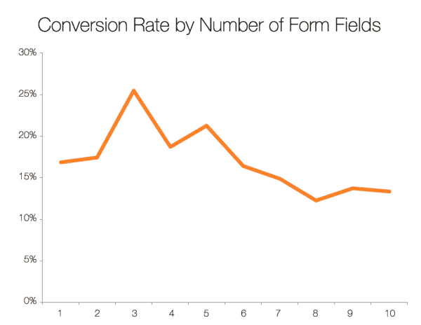
Source: Hubspot
As you can see, the ideal number of form fields is in the 3-5 range, and anything after that could contribute to fewer conversions.
Of course, you must balance brevity with collecting necessary information. Include all the essential details for the event—and no more.
Keep the following tips in mind to reduce form fields:
- Limit questions to what’s strictly needed for adding registrants to your event. Remember that you can ask additional questions later, like in a follow-up survey via email.
- Highlight required fields. One popular method is to add asterisks to required fields, which allows guests to skip optional fields while still completing their registration.
- Use registration software that incorporates conditional logic. For instance, Regpack’s if-then condition uses triggers to reveal additional questions if a registrant answers a specific way—but those questions don’t appear otherwise.
You can see an example of what we’ve talked about in the image below.
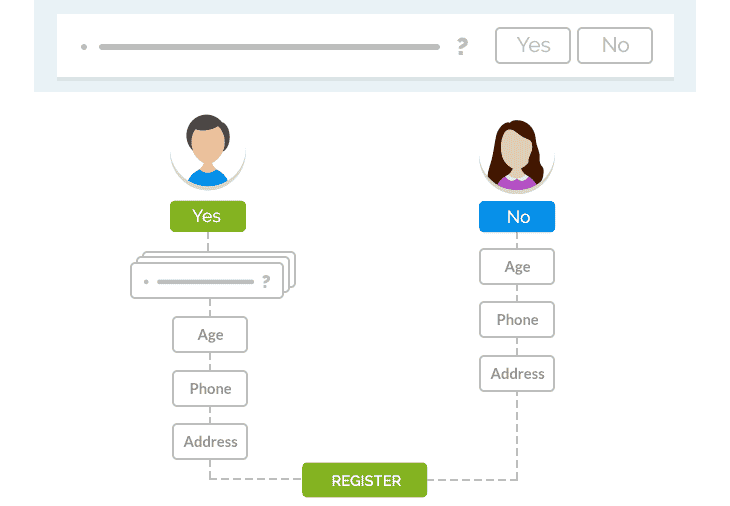
Source: Regpack
Finally, remember that form length is more than the number of form fields. Make sure every question is written as clearly and concisely as possible.
Make the Registration Form Scannable
In the same vein, keep in mind that you won’t be able to hold your users’ attention for long.
That’s not an insult to your audience—the average human’s attention span is just over 8 seconds.
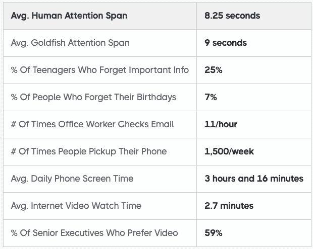
Source: Cross River Therapy
We live in a high-speed world.
Your attendees have access to every website on the planet at the swipe of their fingers or the click of a mouse—so you need to do everything you can to keep their interest in the face of overwhelming distractions.
Skimmability is one way to optimize your registration form for combating distraction and page abandonment.
Readers should be able to get a good idea of the required information at a glance so that they understand exactly what will be required of them and how long it will take.
Here are a few tips to make your form easy to scan.
Stick to the Basics
This is definitely not the place to showcase your witty quips. Use common labels for form fields (name, email, etc.)—and remember, be as concise as possible.
Keep the Colors Easy on the Eye
Most people prefer dark text on a light background when it comes to forms. Don’t get flashy with unusual colors, at least in the form field area of your landing page.
You don’t want users to think you’re trying to direct their attention away from something in the forms, so keep them straightforward.
Make CTAs Easily Visible
Follow best practices for a good call-to-action, which include keeping it short and easy to find. If there’s a submit or payment button, place it in a spot on the screen that draws the eye.
The CTA button is the place to use a bold color—and don’t be afraid to incorporate a sense of urgency with words like Reserve My Spot.
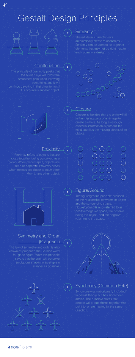
Follow Gestalt Design Principles
Gestalt theory states that our minds work to perceive objects as part of a pattern or a whole. We’re wired to see elements like similarity, continuation, and symmetry in images.
Source: UX Design
But what does this have to do with form design, you ask?
Understanding the science of how humans perceive visual data can help you create forms and webpages that are easier on the eye and, therefore, more functional for the user.
As Miklos Philips writes for UX Collective:
“The implementation of Gestalt principles can greatly improve not just the aesthetics of a design, but also its functionality and user-friendliness, and are a valuable set of ideas for any designer to learn.”
For example, here’s how following these Gestalt design principles can make your registration form easier to scan:
- Similarity—All interactive elements should look similar throughout your form. Use consistent symbols, fonts, text alignments, and colors.
- Continuation—Your user’s eye should naturally flow down the form fields without interruption. One way to increase flow is to place field labels above the fields, not on the left.
- Proximity—Wherever possible, group related fields closer together. This placement helps registrants organize the form in their minds and find it easier to fill out.
Therefore, help your registrants out by shaping your forms in a way that’s natural for them to follow.
Use Inertia to Your Advantage
It’s best to keep registrants flowing smoothly through the signup process. Make it as easy as possible to get started, then eliminate any snags.
For instance, kick-start the process with the easiest and most logical questions.
Beginning the form with fields like name and email makes it easy for users to start filling out the form on autopilot.
Then once the ball is rolling and they’re working through the form, beware of anything that might trip them up—like complicated questions they can’t answer off the top of their heads.
As user experience expert Amelia Warren writes for UX Collective:
“Any fields that require your user to go elsewhere (to check a date, to find a ticket number) is where you’ll lose users. Cut it or put it at the very end of the process.”
For questions that you’d love to ask but that are too complicated or supplemental to justify taking up precious real estate on your form, remember that you can ask for additional information after the user has purchased the event ticket.
This pre-event survey template from SurveyMonkey is an excellent example of the kinds of questions you may want to save for after the guest has committed to attending:
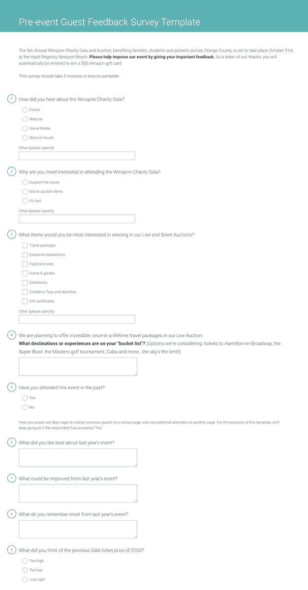
Source: SurveyMonkey
Finally, avoid redundancy. Repeating fields—like confirming their email or password—risks impeding the momentum your user has built up in moving through the form.
Any unnecessary repetition risks frustrating the user, which could lead to abandonment.
Give Users a Sense of Progress
Of course, not every registration form can be limited to just 3-5 input fields.
If your form is on the long side, showing your registrants how far they’ve come—and just how far they have left to go—can do wonders in keeping them motivated.
One simple way to do this is to split your questionnaire into a few (very short) pages. Then, include a page number on each form.
Or, you could include a visual progress bar like the one on this sample form:
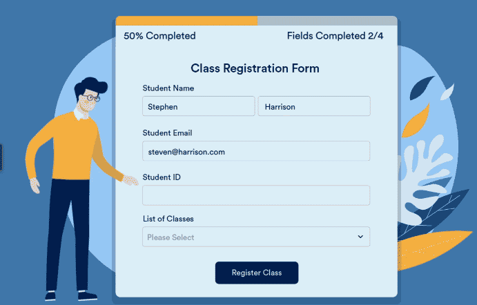
Source: Jotform
This will give your registrants an overview of their progress and prevent them from jumping ship too soon.
Make Error Messages Immediately Visible
There’s nothing more frustrating than clicking submit, then seeing a vague error message when you don’t know what you did wrong.
To avoid this situation in your own forms, be sure to follow error message best practices.
Each error message should stand out to the eye, preferably in a bright color (red is a common choice).
And instead of listing errors together at the top or bottom of the page, it’s better to specify what went wrong in a message next to the input field containing the error.
Here’s a good example of an error message that follows the commonly accepted standards:
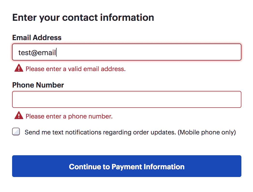
Source: Nielsen Norman Group
Also, notice that in the example above, there’s not only a warning symbol but informative text making sure the user knows exactly where they went wrong.
To keep things positive, your error messages should be framed affirmatively (Please enter a valid phone number.) instead of negatively (Phone number is incorrect!).
When choosing event registration software for your business, keep its error message functionality in mind.
The best registration tools use real-time validation to alert the user to an error before they click Submit.
The important thing to remember about error messages is that they’re obstacles to an easy signup process.
The smoother you can make the error-correction process, the fewer chances you’re giving your user to give up completing their registration.
Allow Users to Register Multiple Attendees
In group registrations, nobody wants to register one person at a time.
That’s why it’s best to allow individual users to register multiple attendees at once.
Instead of tediously filling out the same registration form several times, the user can register their family, group, coworkers, or students from a single registration page.
Allowing group registrations cuts down on the time users spend on the form—and, as with anything that reduces user effort, increases conversion rates.
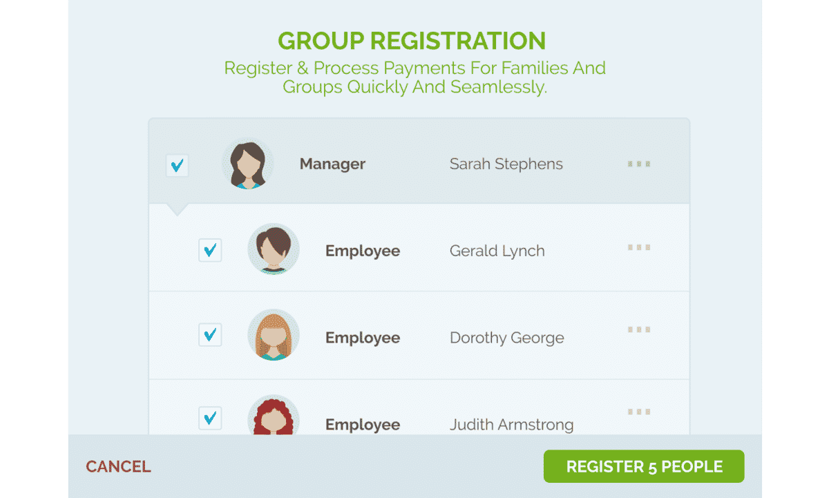
Source: Regpack
The best registration software allows group registration as a built-in service. For instance, with Regpack, our conditional logic technology makes group registration intuitive.
The head unit (such as the parent or company) creates an account, and then the system prompts them to register additional sub units (such as family members or employees).
They then fill out only the information needed for each sub unit instead of a whole new application for each user.
The head unit account then pays the fees for their group in one easy payment.
Enable Event Form Submission Confirmation Emails
The work isn’t done when the user presses submit. You need a confirmation process to welcome the user to your event.
Anytime someone makes a purchase or registers for an event online, they expect a confirmation email.
These emails give the registrant a sense of security and reduce the need for customer support, since the registrant is confident that their registration form was accepted and processed correctly.
Here’s an example of a confirmation email template in Regpack:
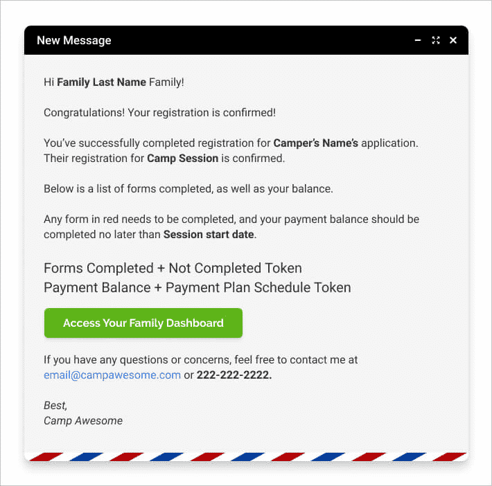
Source: Regpack
Your confirmation emails should be personalized to each registrant.
Notice the bolded words and phrases in the email above—these are called tokens, which you can place in your template so that the system will replace them with each registrant’s relevant information.
The email should also point the user forward, with contents like:
- Essential event information—E.g., the date, time, and place of the event
- A link to their registration dashboard—In case they’d like to review their payment or registration information
- A call to action—For instance, an invitation to close their balance or take a pre-event survey
- Resources for preparing for the event—E.g., an orientation, reading materials from the featured speakers, etc.
To be as effective as possible, your event registration confirmation email should tell the user what they can expect and why they should be excited about your event.
The Key to a High-Converting Event Registration Form: Efficiency and Ease of Use
If you’ve noticed a pattern in the tips above, you’re not wrong: the best event registration forms make the process as easy and painless as possible for the user.
Eliminate unnecessary questions, organize the form so that it’s easy to scan it at a glance and build momentum as you go, and give your users a sense of progress.
Then, to prevent frustration, be sure to immediately alert the user to any errors they make, and allow them to register their whole group on one page.
Of course, the best ally in your event marketing strategy is the software you use to register and communicate with customers.
Choose a tool that comes equipped with features—like Regpack’s conditional logic and group registration functionality—that eliminate friction and decision fatigue among your registrants.