
Your event registration page is the last chance you have to sell tickets.
No matter how the visitor got there—from a social media post, an email newsletter, or a paid ad—the landing page is the last thing separating a casual visitor from a registered attendee.
That’s why it’s crucial to follow established best practices to maximize the chances your event landing page visitors will convert.
The best event websites present a perfect blend of information, excellent user experience, and brand personality.
Let’s take a look at five event registration page examples (ranging from a training webinar to a music festival) that should inspire your next event registration strategy.
MozCon
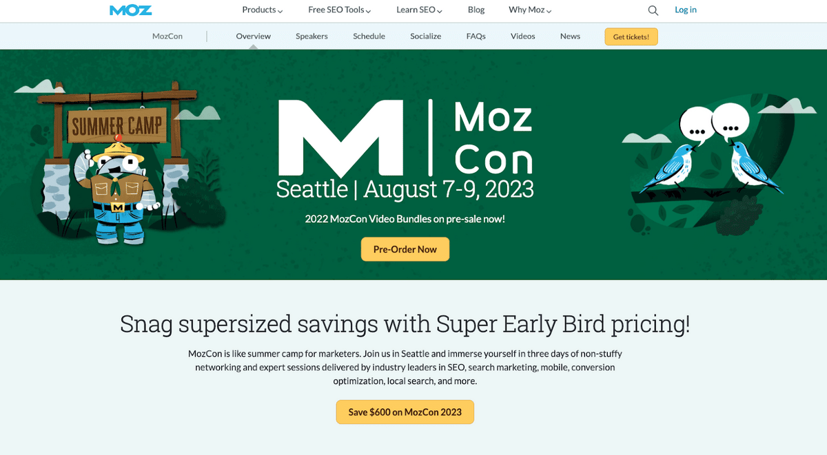
The SEO platform Moz hosts MozCon, a “summer camp for marketers, every year”. Their event registration page is a great example of highlighting the value of the event well.
Above the fold features a short, clear, yet appealing description of the event.
It further sparks the interest of the visitor by focusing on the fact that the attendees will benefit from a number of different activities, speakers, and networking opportunities.
Source: Moz
Without needing to scroll, a visitor can see when and where the event will take place, as well as a brief description of what it will entail.
There are multiple CTA buttons within easy reach.
And of course, the copy introduces a sense of excitement and urgency. It describes the event in a fun way (“MozCon is like a summer camp for marketers”) that makes the reader want to join in.
And with the promise of saving $600 with Super Early Bird pricing, the reader is motivated to register right away.
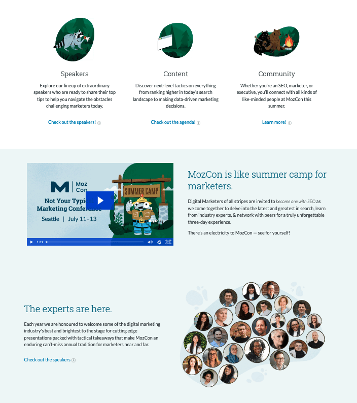
Then, the page transitions to a heavy dose of proof about the value to be found at the event:
Source: Moz
Readers can follow links to learn more about the lineup of exciting speakers, the types of content that will be covered, and the types of attendees they can expect to meet at the event.
But notice that each section doesn’t just ask the reader to click the link to learn more; the copy gives a preview of the value that will be provided.
Since many visitors won’t bother to explore all of the sub-pages you have to offer, it’s important to give them summaries of all the information you want to get across.
That way, readers have a good sense of what you’re trying to communicate, no matter how surface-level they remain.
And by scrolling a little further down, the reader is greeted by a collection of headshots of the guest speakers for the event, with another blurb giving more information about them—and inviting the reader again to click the link to dive deeper.
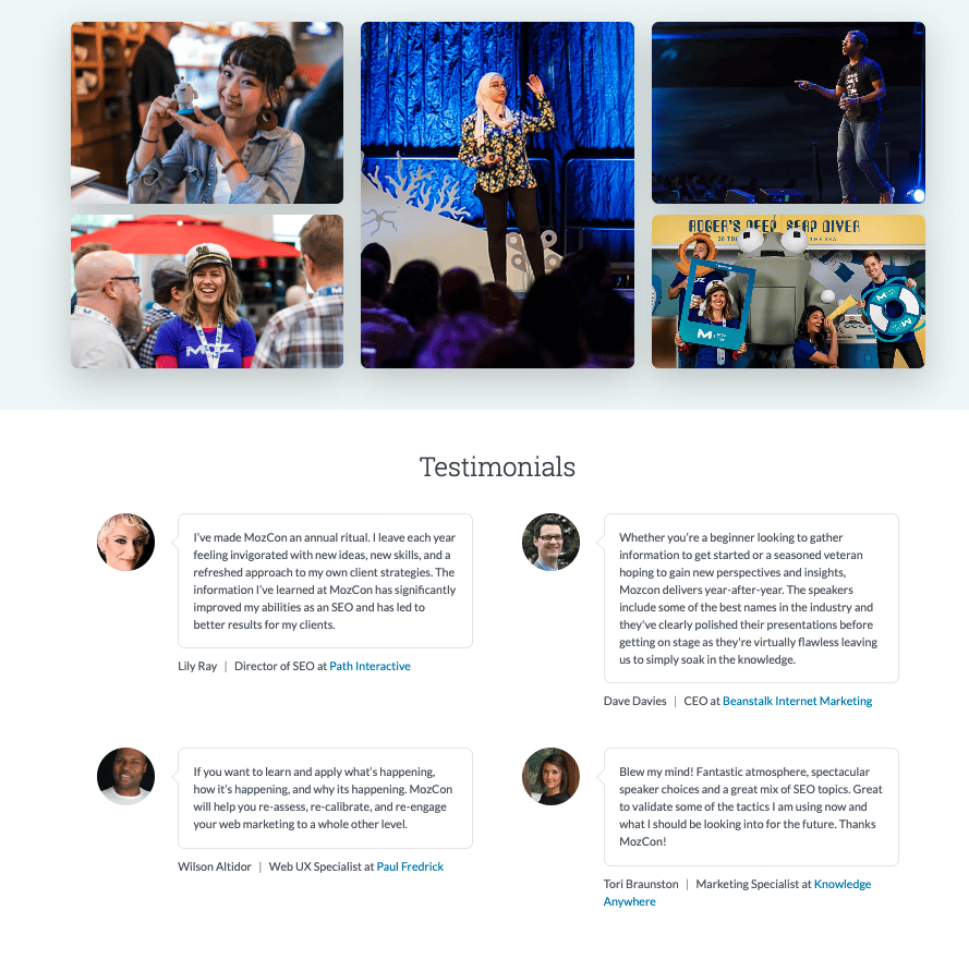
Source: Moz
Finally, the reader can scroll to the bottom of the page to see social proof from past events. Candid photos from last year’s MozCon add a touch of humanity and energy, making readers excited to join in on the fun for themselves. And testimonials from past events help convince readers that real industry peers attended and saw value in the event.
B2B Marketing Exchange
B2B Marketing Exchange is a yearly event for account-based marketing (ABM) professionals.
Their event registration page is another great example of leveraging social proof, and it also boasts a modern and engaging design.
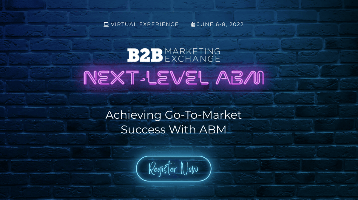
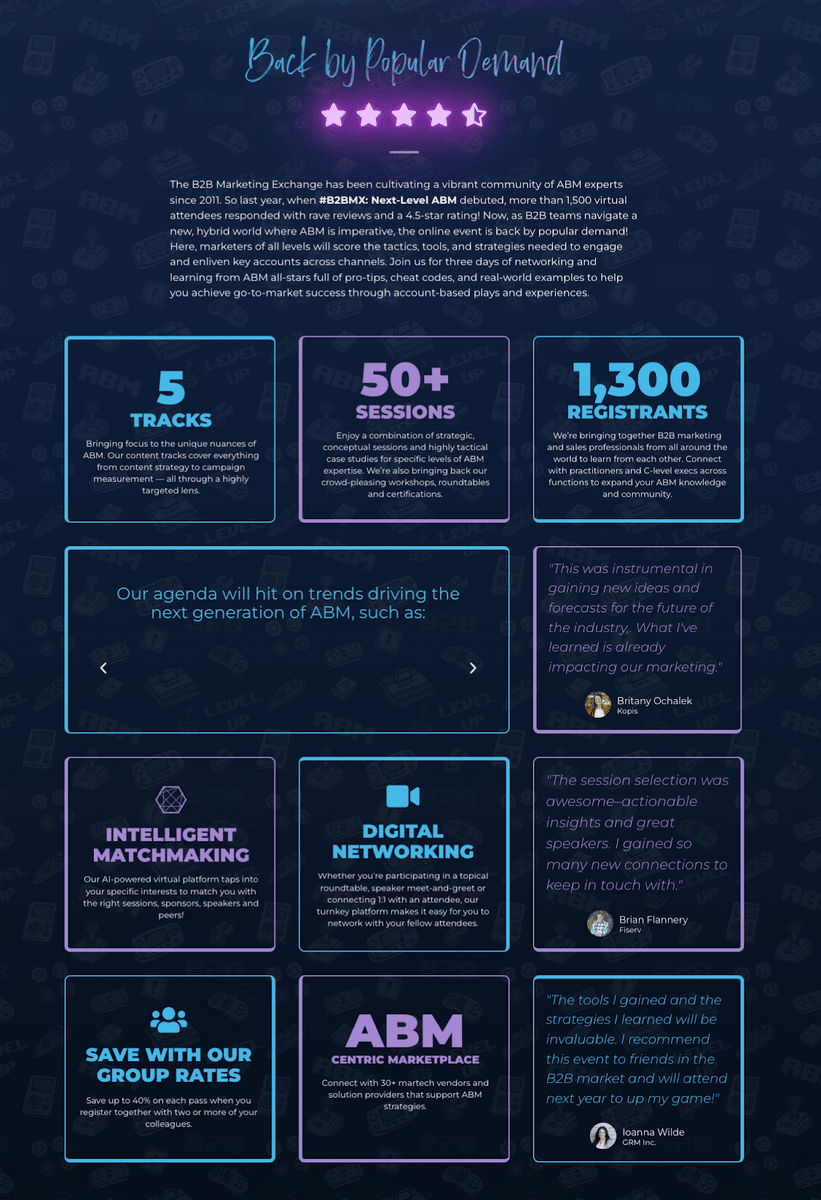
Source: B2B Marketing Exchange
Above the fold, you’ll see eye-catching neon text over a dark background.
You see everything you need to know right away, including what the event is (and the topic the event will cover), where and when to access it, and a CTA inviting viewers to register.
Source: B2B Marketing Exchange
Scrolling down, the visitor is then immediately bombarded with social proof and evidence of the event’s value. The initial copy explains more about the history and popularity of the B2B Marketing Exchange.
Then, dynamic blocks update with real-time registration numbers, as well as planned sessions and tracks the event will be divided into.
Some content blocks display reviews from the last event, while other blocks display the value attendees can get from the event, like:
- Networking tools
- A marketplace
- Group registration rates
- An AI-powered matchmaking tool to match attendees with sessions
This page is a great example of saying a lot with a little space.
The symmetrical design means every content block draws the eye further down the page, while the copy demonstrates the value attendees can realize from the event.
eTail Conference
Next, let’s look at an event registration page that provides extensive, detailed information about the event without making the page too busy.
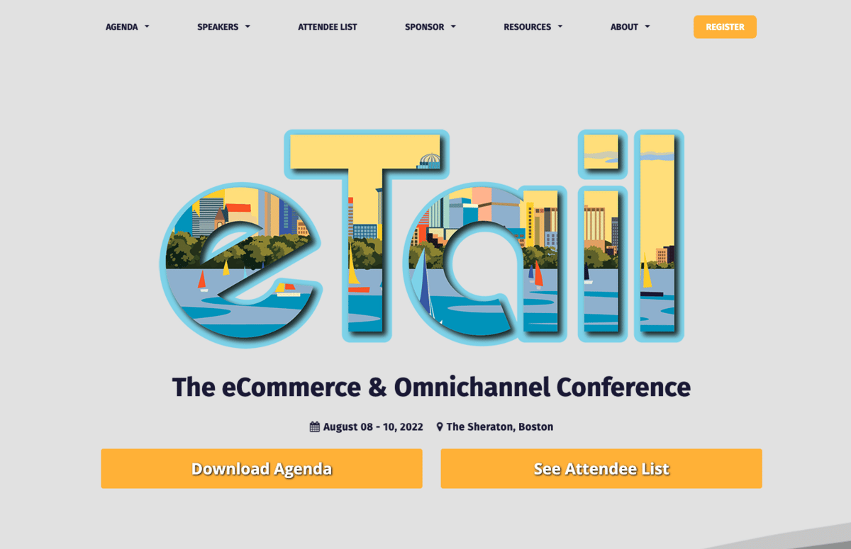
Source: eTail
For the eTail conference registration page, avoiding overwhelm starts with a minimalist above-the-fold section that contains a sleek and modern graphic, basic information about the event, and a clearly visible CTA to register in the top right corner.
And placing their registration button in the header menu is a great technique, since the reader will have easy access to it no matter how far down they scroll on the page.
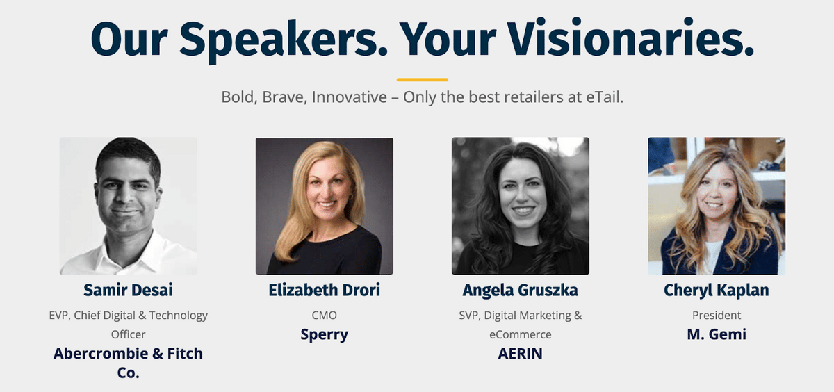
Directly below the fold, the page includes all the basic information about the event, including an introductory video, a short elevator pitch, and a list of guest speakers with their headshots.
Source: eTail
Remember that including human faces in your registration page statistically increases conversions.
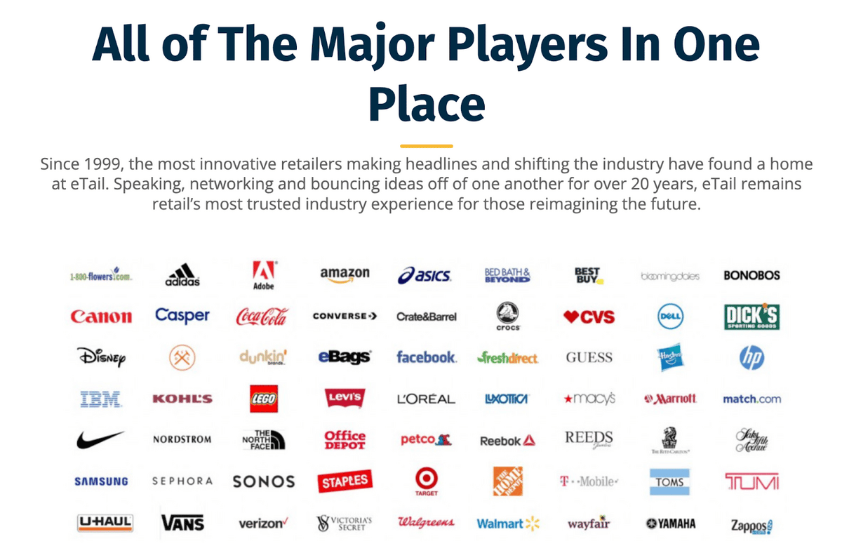
Next, the page launches into social proof and reasons why the event will be valuable to attendees.
Visitors can read testimonials from brands as well as a graphic block with the logos of major players involved in the event.
Source: eTail
Finally, the visitor is pointed to a few articles that provide deep dives into the value of the eTail conference.
Next, readers can see a detailed agenda for the event, along with colorful graphs of the diverse business audience attending. And for curious readers, access to the agenda and the attendee list is always one click away.
This section really demonstrates that you can pack a lot of information into a small area—and make it fun to look at.
eTail’s landing page ends with even more social proof: testimonials (with a link to read even more reviews), photos from previous events, and another reminder of the venue.
It even includes a link to see more about the venue, which may be a draw to readers, since eTail is taking place in Boston.
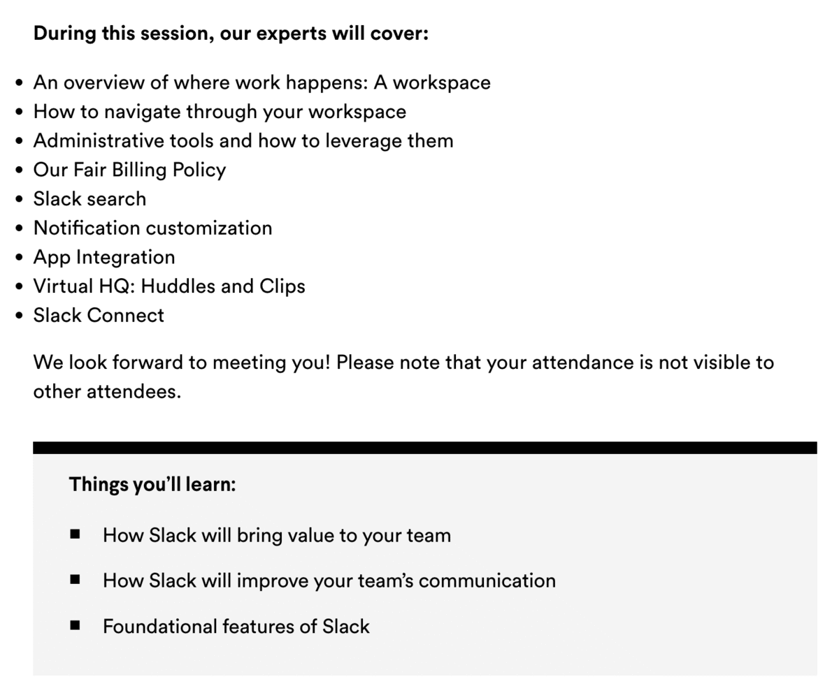
Slack 101 Webinar
Team messaging tool Slack holds a regular live webinar introducing guests to its platform’s features.
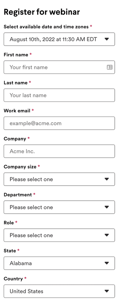
The Slack 101 webinar registration page stands out thanks to its simple and clean layout.
It offers a short registration form on the left, with a clear breakdown of the event duration, topics, and speakers on the right.
Source: Slack
This kind of layout ensures quick and easy access to essential information. The less the user has to scroll, the less likely they are to get bored or navigate away from the page.
And yet, there’s nothing missing from this page.
An engaging header explains exactly what to expect from the event, and the main copy quickly breaks down both who the event is for (new Slack users) and the event’s agenda.
Notice that this page makes effective use of bullet points and white space. It’s eminently skimmable, while still providing in-depth information on the event’s agenda, topics, and speakers.
Source: Slack
Another effective feature of this page is that it highlights the length of the event—50 minutes—which makes it easier for the reader to commit.
An event that’s less than an hour? Everybody has time for that, right?
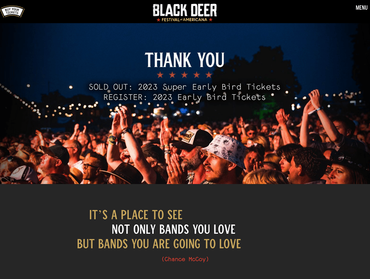
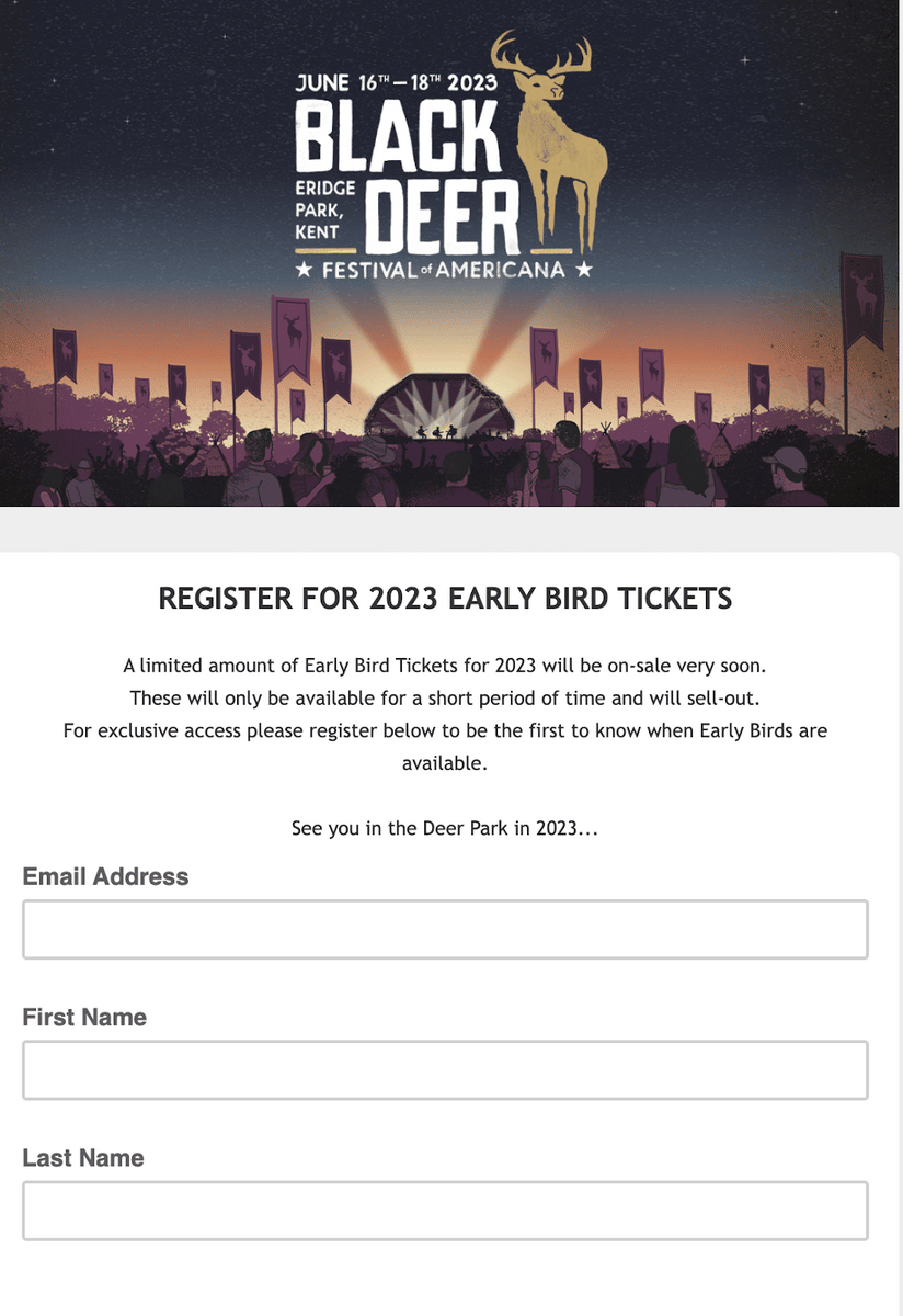
Black Deer Festival
The Black Deer Festival registration page is unique because it relies on visuals and subtle psychological cues to persuade the visitor to attend the event.
Source: Black Deer Festival
The page starts with a simple header that takes a unique approach: instead of introducing the event and what it’s all about, it includes a “thank you” message for the sold-out early bird tickets.
This technique increases a sense of urgency because the reader can see that tickets are going quickly.
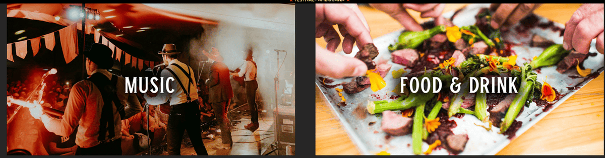
As the reader scrolls down, they’re faced with a colorful collection of images rather than text-heavy content.
Using images from the festival gives the prospective attendee an idea of the atmosphere and lets them know what they can expect if they attend.
And each image is a link to more information about the festival, for those who want to dig a little deeper.
Source: Black Deer Festival
The interactive carousel displays the lineup for the event, so the reader can scroll through the artists and click on each one to learn more.
This event registration page style isn’t a good fit for most event types, but it tends to work well for festivals and concerts—especially the well-known ones.
Source: Black Deer Festival
If your event isn’t well-known, you’ll need to clearly explain what it is, who it’s for, and why the reader should care about attending.
But in cases like the Black Deer Festival, it’s both relatively well-known and doesn’t require much introduction. Even those who haven’t heard of the event can quickly ascertain that it’s a music festival for Americana artists.
So focusing on images instead of text helps give the impression that the event organizers don’t need to explain the event to you or convince you to buy tickets.
Again, the strategy for this page is exclusivity, the opposite of trying to sell to the reader—which, in this case, makes the reader want to buy all the more.
What Do the Best Event Registration Pages Have in Common?
A registration landing page is a powerful tool in your event marketing arsenal. It’s your final chance to convince visitors to register, so it’s crucial to use your space wisely.
There’s no room for fluff here; every image, video, and piece of text should serve a purpose.
As you can see, there are many “right” ways to create an effective event registration page. The style you use depends on your brand personality, target audience, and marketing strategy.
But the most effective landing pages tend to follow the same best practices.
First, they use clear and concise copy. The most important information—location, date and time, and event content—should be above the fold if possible.
Also, the landing page is clean and intuitive, and uses plenty of white space.
Next, it’s important to keep in mind that social proof sells. So, highlight testimonials and the big names attending your event, whether they’re speakers, attendees, or brand sponsors.
Create a sense of urgency with things like limited-time offers, exclusivity, and sold-out notifications for early ticket tiers.
And finally, keep registration forms short and to the point.
Learn from the examples above to find inspiration for your next landing page design.