

One of the best ways for service-based businesses to increase their revenue is to update their subscription-based website for better conversion rates.
There are many ways to make this happen, from providing transparent details at checkout to delivering an amazing user experience throughout the registration process. In this article, we’ll break down five methods for increasing your conversions.
- Choose the Right Platform for Your Membership Site
- Provide Transparent Details of Your Subscription
- Emphasize the Benefits of Your Service
- Deliver Outstanding User Experience
- Offer a Valuable Promotion for First-Time Users
- Conclusion
Choose the Right Platform for Your Membership Site
It’s crucial that you choose a platform for your membership site that enables users to quickly register for or buy what they’re looking for. If the process is too complicated, they may give up.
When you’re running a subscription-based site, digital platforms are great for creating the seamless online registration experience customers desire. These are places for exchanges of information and services between buyers and sellers.
Fortunately, many digital platforms are also usually easy to implement, so they will quickly reduce business costs and increase conversions.
A high-quality digital platformshould provide the following:
| Trustworthiness and Security | It should clarify the terms and conditions of the purchase and answer questions like “what will you do with my data?” |
| Connectivity Via APIs | The platform should enable APIs that allow you to integrate third-party platforms to expand the platform’s capabilities. |
| Ease of Use | Users should be able to easily get the information they need and sign up and pay on your website. |
Most importantly, you should ensure that your chosen digital platform offers a painless registration process for end-users and various payment options.
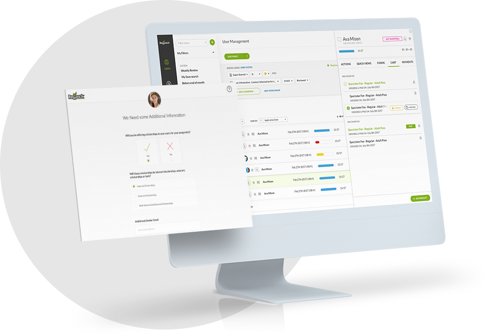
One such company helping service-based businesses embed their registration process onto their website, thereby creating a digital platform, is Regpack. It’s especially useful for those selling education services, experiences, and trips.
Through the user interface of Regpack’s online registration software, website visitors can onboard or sign up directly via a form you create on your website. After signing up, they can also make payments using the same interface.
Source: Regpack
This is better than having your participants jump to another site to pay, which can reduce the likelihood of them making a purchase.
Even better, companies can use its conditional logic feature to create onboarding processes that are individualized to each unique participant, making the experience even more pleasant.
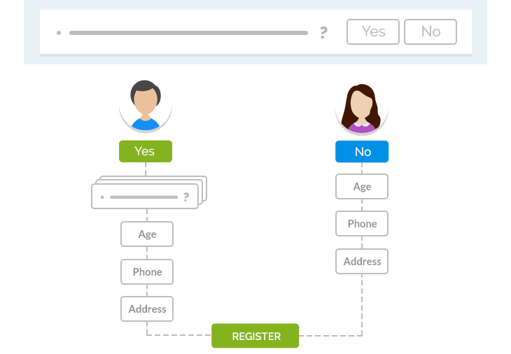
Source: Regpack
For example, if one person answered yes to a specific question on the form, they’d be automatically prompted to answer related questions that a person who answered no wouldn’t see. This personalized flow is displayed in the image above.
Regardless of which digital platform you use, it’s important that your registration forms are easy to fill out. Include as few fields as possible and make it clear what you’re asking the user to input. The easier it is to fill out your form, the more conversions you’ll earn.
Provide Transparent Details of Your Subscription
Before signing up for your subscription, it’s likely that your customers will want to know the exact specifics of the agreement. They’ll want to know things like whether they can cancel their subscription, when the terms end, as well as the more nuanced details.
Telling them the price and first billing date isn’t enough.
If customers have any doubts that aren’t addressed at checkout, they may bounce off the page, too busy to call your staff and ask. And then they might forget about buying altogether, or head to a competitor with clearer information, and hence less risk on their part.
Therefore, it’s critical that you ensure your subscription details are as clear as possible to customers during the sign-up process.
As for what customers are wondering about, according to Split Base’s conversion optimization surveys, website visitors often have questions about the following:
- What if I still have products left from the previous month? Can I pause if so?
- What if the service doesn’t live up to my expectations? Can I cancel?
- Do I need to receive the solution every month, or can I change the schedule?
Furthermore, customers now value data transparency and privacy more than ever. Customers want to know what companies are doing with the information they give them.
According to a Sprout Social Survey, 73% of consumers are willing to pay more for a product that guarantees total transparency.
Therefore showcasing your data policies is a good way to stand out from the crowd, earn trust, and win more conversions.
To provide transparent details for your subscription, start by putting yourself into the mind of the customers. Write a list of questions they might ask in a document. Then write your answers to them.
After you’ve answered the questions, you can put them somewhere in the online checkout process where customers can easily see or access them.
For example, HBO Max does a great job of clarifying the subscription terms in paragraph form during the checkout process:
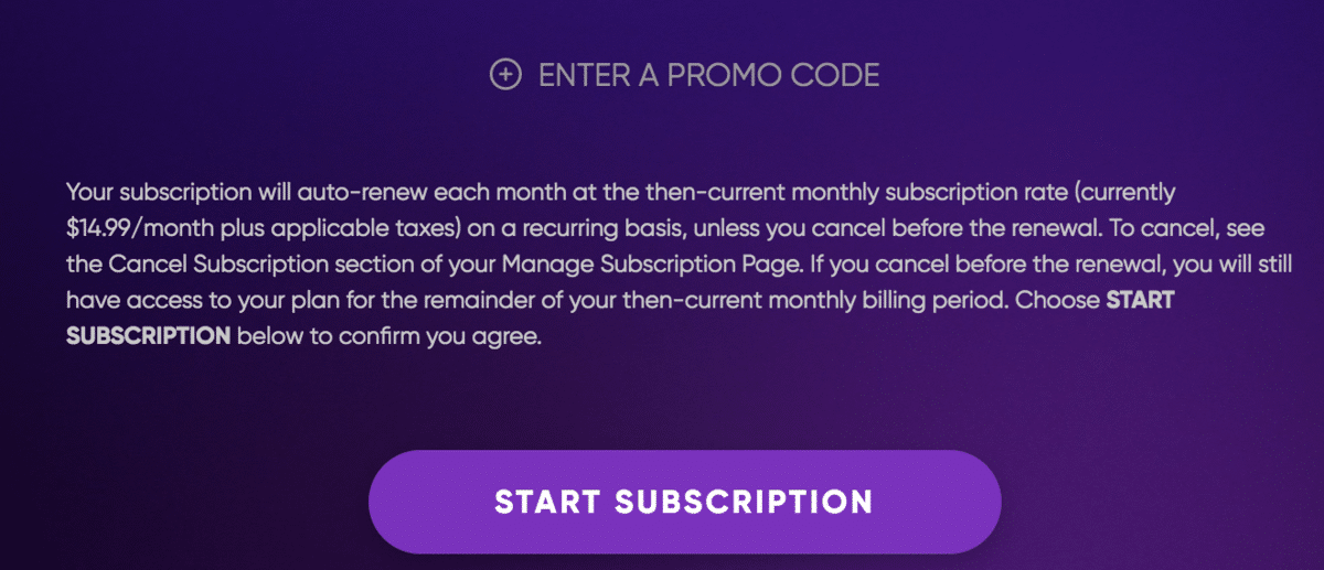
Source: HBO Max
In the above image, HBO Max tackles questions about auto-renewal and cancellation policies.
They also explain what happens if you were to cancel before the renewal date. This should be a sufficient amount of detail to make the buyer comfortable with moving forward.
Some services, however, have more to explain because of the more complex nature of their subscriptions. They, therefore, need a better format than a paragraph for getting this information across to the buyer, like in this example from Kiehl’s:
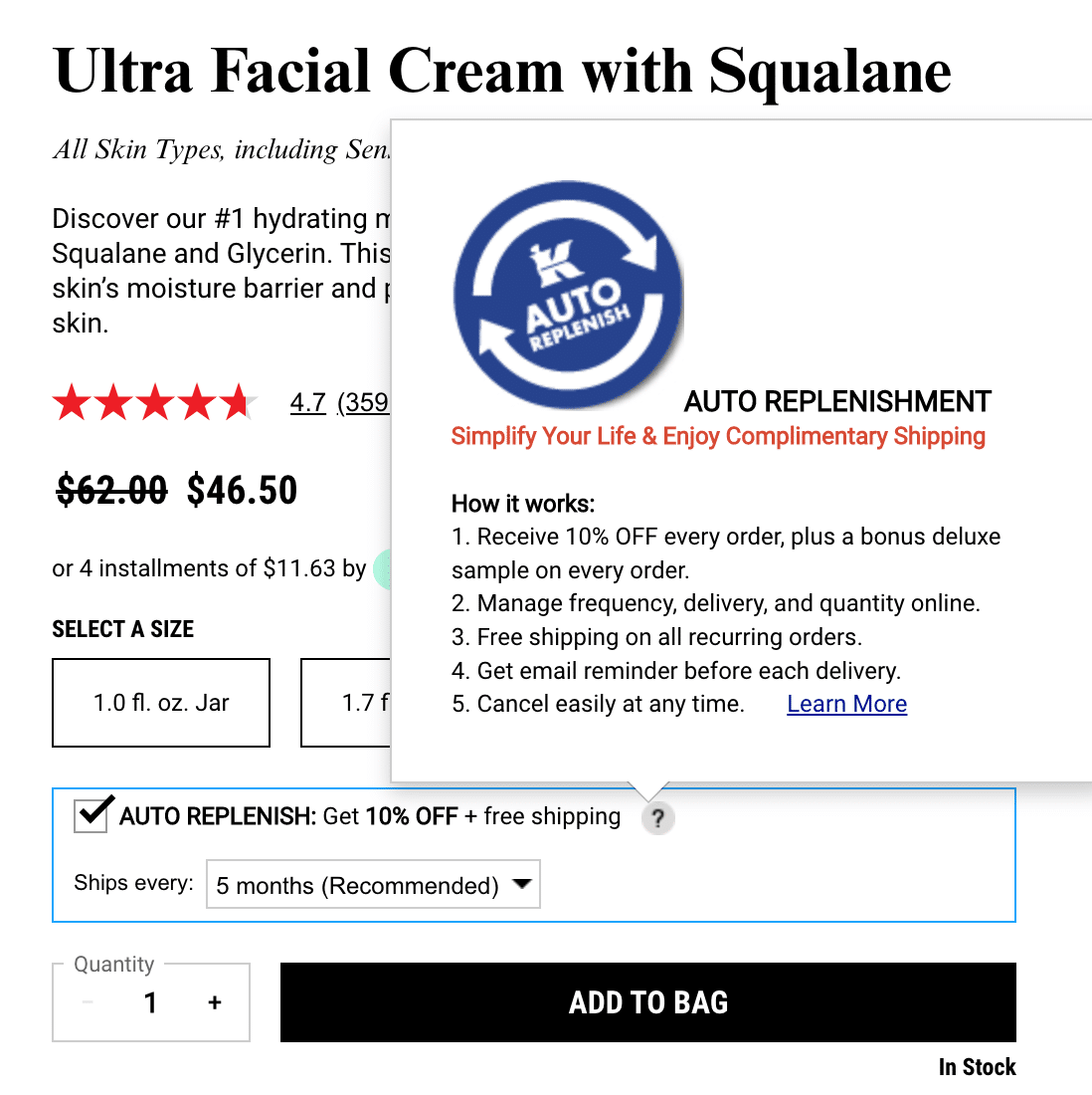
Source: Kiehl’s
They employ a bullet list that’s hidden unless the user hovers over the question mark on the checkout page. This is a great way to ensure your visitors get all the information they need without having to go over too many words on the page.
In light of recent data breaches and the public’s prioritization of data protection, It’s also a good idea to highlight any data security functionality in your checkout, as the New York School of the Arts has done on the purchasing page for one of their programs:
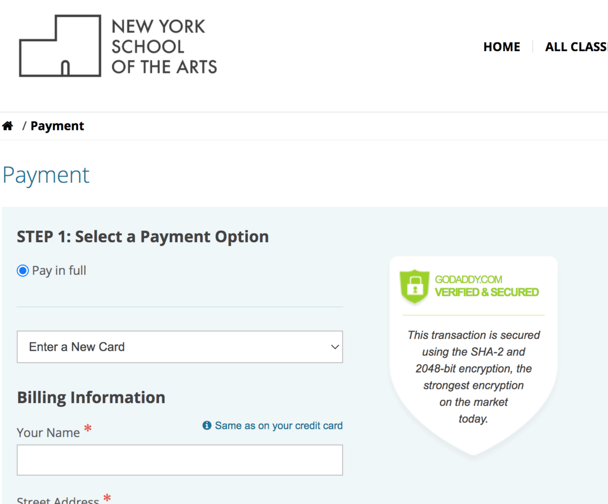
Source: NY School of the Arts
As you can see, they highlight the fact that the transaction is secured using the strongest encryption on the market. This final assurance can be enough to push the applicant over the finish line.
In conclusion, any details you can add to your checkout page that will allay any potential customer concerns will help you increase your conversions on your subscription-based website.
Emphasize the Benefits of Your Service
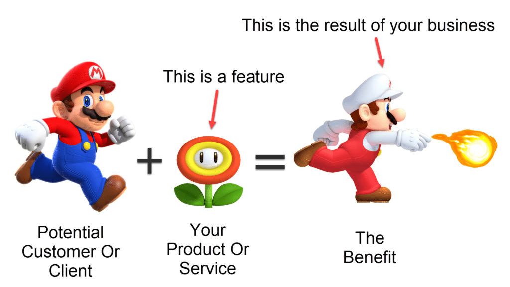
While mentioning your service’s features (what it is) is important, highlighting its benefits (what it does) across your website will have an even greater impact on your target audience.
Source: WaaSio
That’s because the benefits explain how their lives will improve post-purchase, and this creates an emotional connection between the buyer and your service. It gets them excited.
For example, top-class swim instructors might be a feature of your summer camp.
While that’s undoubtedly a great feature to have, the parents buying will likely react more emotionally to copy emphasizing a benefit such as “your kids will learn to swim so that you can take them to the beach stress-free.”
A strategy many companies use to emphasize a few of their best benefits is to include them in their USP, unique selling proposition, and place this slogan on their website’s homepage or service pages. Your USP tells buyers why your option is better than the competition.
Here’s an example of a USP from Warby Parker, an online retailer of glasses and lenses:
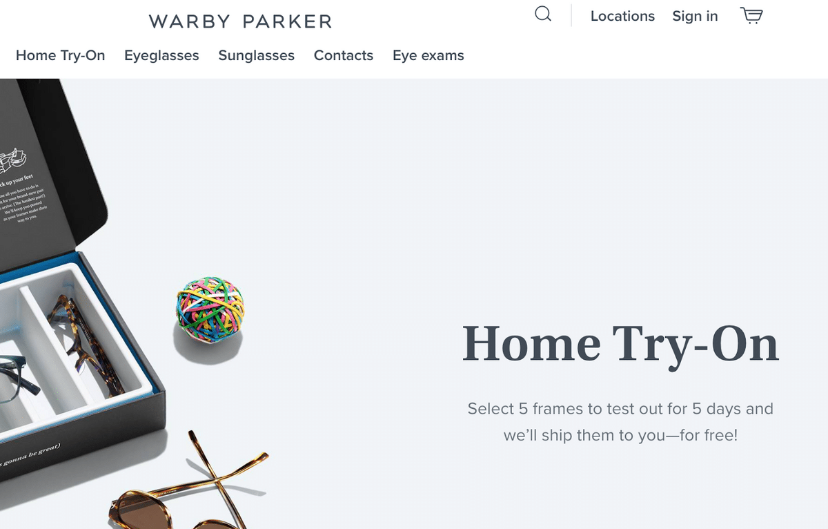
Source: Warby Parker
Streamlining the purchasing process for customers by allowing them to try on five frames at home is a great way to stand out from the competition.
If you still need a USP, check out this guide on how to find a USP for your service-based business.
Aside from USPs, there are other ways to highlight your benefits across your website.
A fantastic way to learn these methods is by studying examples from other companies who are showcasing their benefits effectively on their websites and then tailoring their techniques to work for your business’s benefits.
So let’s go over a few examples and why they work.
First, here are the benefits of our online course registration software:
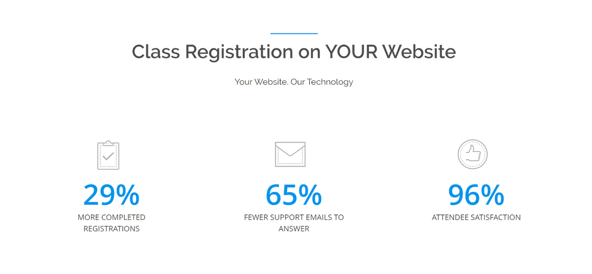
Source: Regpack
Notice how we’ve written three benefits underneath the software’s heading—more completed registrations, fewer support emails to answer, and increased customer satisfaction.
Before even understanding the functionality of the software, the buyer is already interested, and now more likely to read about how the software works.
If we did it the other way around, showing the features first, the reader wouldn’t be interested enough to plunge into further study with excitement. You need to give them a reason to read the more technical stuff.
Here’s another example of a benefit from Girl Scouts:
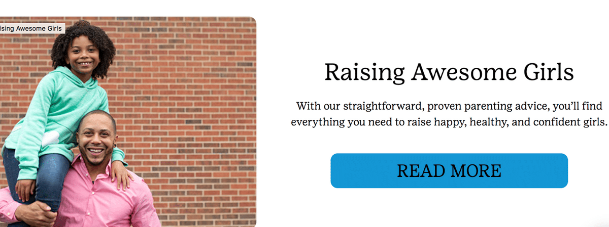
Source: Girl Scouts
Girl Scouts does a great job here creating and sharing a benefit that reflects a parent’s deepest desire for their daughters: that they grow into amazing adults.
The organization also uses a picture of real people to generate an even stronger emotional reaction in the potential subscriber.
Keep in mind that you should be highlighting your service’s benefits throughout the customer journey to consistently remind the buyer why they’re moving towards a subscription.
Deliver Outstanding User Experience
A fantastic user experience is directly correlated with higher conversions. That’s because a customer’s experience on your website affects their idea of your brand and the services you’re selling.
If purchasing the service on the website is a difficult endeavor, and it’s hard to find the information they need to make a decision, then visitors may infer that your service is just as frustrating to work with.
Therefore, it’s important to put your best foot forward by creating a UX that satisfies your customers and makes purchasing as fast and easy as possible.
To do this, start by ensuring your page speed is up to par. According to Forbes, 70% of consumers say page speed influences their willingness to buy. The chart below shows just a part of the survey on this topic.
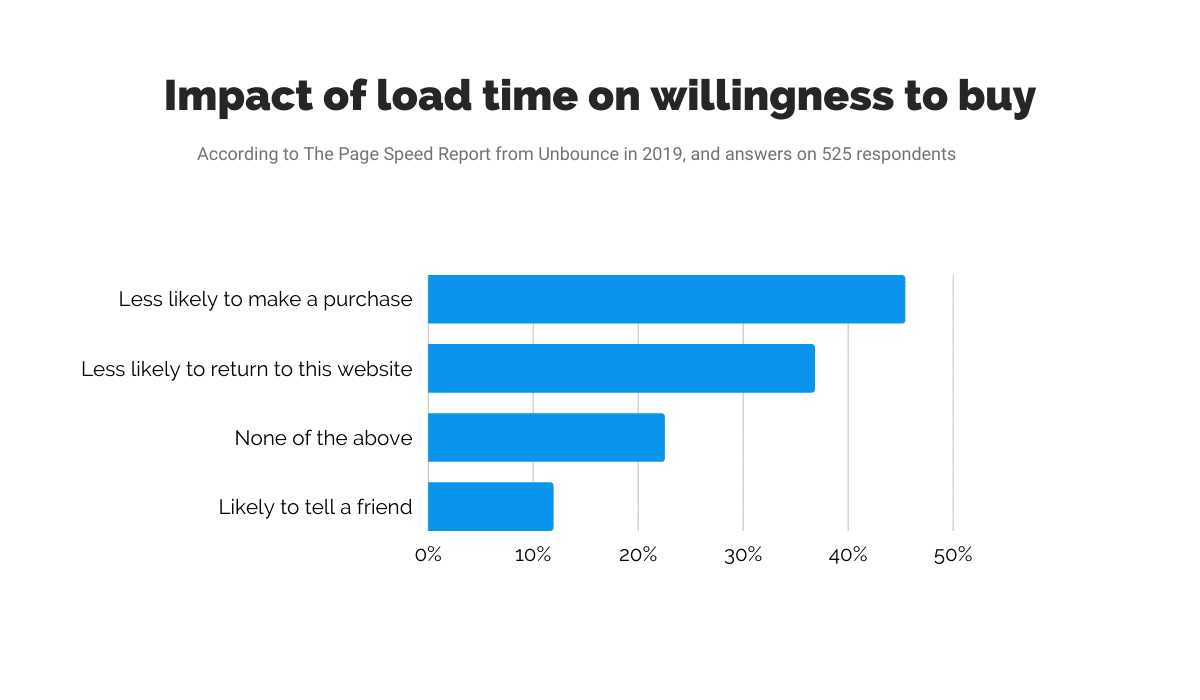
Source: Regpack
Customers are simply used to fast-loading pages, and will quickly become frustrated if your website is slower than that of the competition.
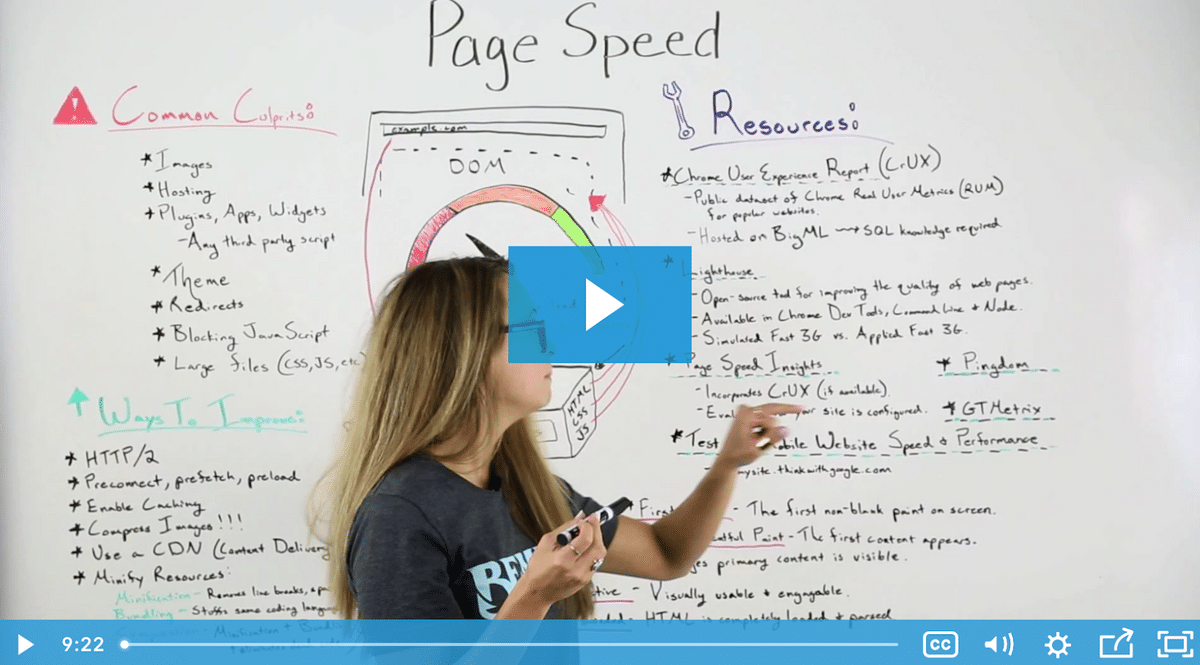
Increasing your page speed requires enacting practices such as enabling file compression, reducing redirects, optimizing images, and others, as outlined in Moz’s article on improving page speed.
Source: Moz
Additionally, It’s crucial that you create a mobile-friendly website, as 72.9% of online purchases were done through a mobile device in 2022, according to Oberlo.
Make your site mobile-friendly by choosing a mobile-responsive theme, avoiding large chunks of text, using 14px font, and placing your CTA buttons towards the lower middle of the page:

Source: Website Builder Expert
You should also make your subscription forms shorter and more to the point.
Not only does this look better on a mobile phone, but it also speeds up the subscription process in general, meaning more of your website visitors will have the patience to finish the form, whether that’s via their mobile device or laptop.
Shortening your form requires cutting the fluff, but still making sure you’re giving all the information that buyers need to avoid misunderstandings about what they’re getting, as Yellowstone Forever has done in their seminar registration form:
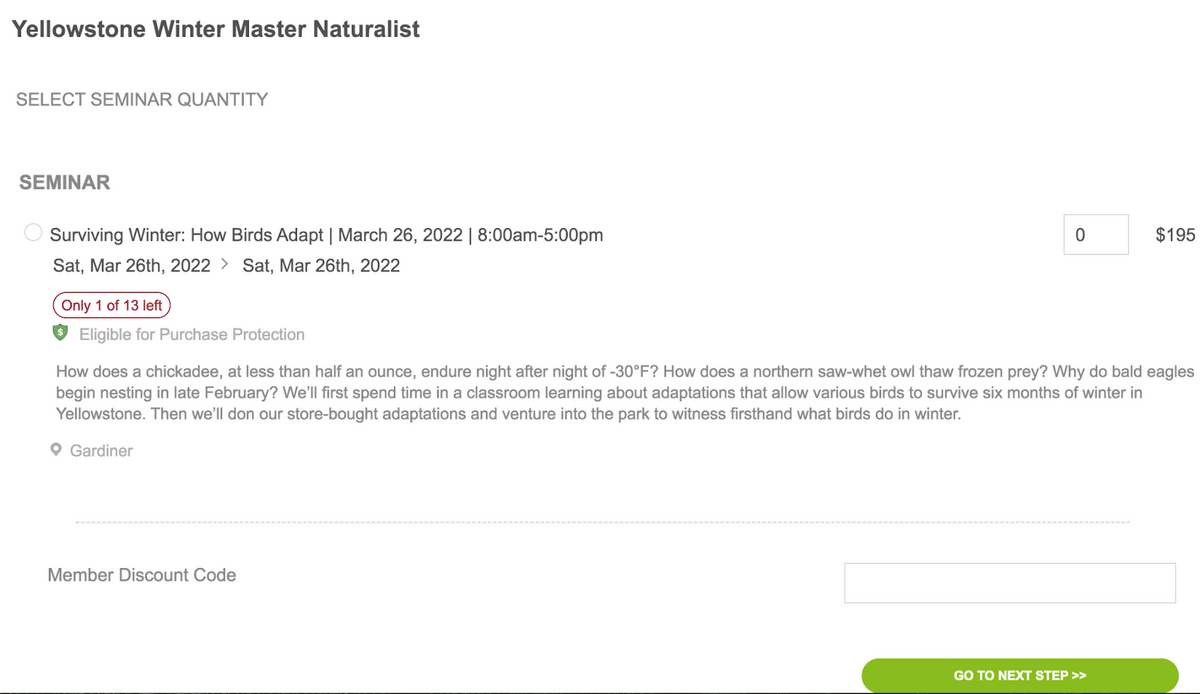
Source: Yellowstone Forever
This form tells buyers exactly what they’re purchasing without overloading them with information. It shares the date and time, the price, and even a short description of what buyers will learn and experience during the seminar.
For an extra nudge, it also tells users the number of tickets left, which, if low enough, can create a sense of urgency.
The above techniques are great starting points, but there are some other ways to enhance your site’s user experience:
| Use White Space Wisely | White space makes your website feel open and relaxed, while also directing the user’s attention to the most important web copy. |
| Keep Pages Consistent in Style | Your design elements, fonts, colors, and heading sizes should be the same throughout your site so that visitors don’t think they’ve switched sites. |
| Craft Informative Yet Succinct Headlines | Your headlines should act as signposts that tell your visitors whether they’ve found what they were looking for, thereby helping them navigate your site. |
You can even go a step further and create a personalized registration process for your applicants, which can be done using conditional logic found in Regpack’s customer registration flow.
Whatever you can do to make your sign-up process enjoyable and easy for your buyers will improve your conversion rate and increase your sales.
Offer a Valuable Promotion for First-Time Users
Often, the hardest part of subscription sales is convincing new users to sign up. Once they do, things become a lot easier. Renewals, cross-sells, and upsells often require less hard work on your part, since the buyer already trusts your brand and hopefully likes your service.
One of the most impactful ways to influence these new customer sign-ups is to offer first-time users a valuable promotion. This could be a discount, a free giveaway, or something else your audience would want.
In a global survey by RetailMeNot, two-thirds of respondents reported that they have “made a purchase they weren’t originally planning to make solely based on finding a coupon or discount.”
Discounts happen to be one of the most popular forms of first-time subscriber incentives, and for three good reasons:
| Discounts Create Happy Feelings | A Claremont University study found that saving money makes people feel happier. And, we all like (and buy from) sources of our happiness. In this case, that’d be your brand. |
| Discounts Reduce Shopping Around | This study shows that a discount can keep a lead from looking at competitors. Feeling a sense of urgency, they can get blinders and become focused on your solution. |
| Discounts Create a Sense of Urgency | When customers see a discount, especially one with a time clock, they feel a need to act ASAP. This pushes them over the finish line. |
Though discounting can be incredibly effective, it’s important to be strategic when offering discounts and other promotions to first-time users.
First of all, your discounts should be just enough to get quality leads over the finish line, but not too much that you end up convincing poor-quality leads to buy from you.
If you do the latter, you’ll have some people sign up, then just cancel when the discount ends, and maybe even leave bad reviews since it was a poor fit in the first place.
One way to ensure this doesn’t occur is to offer small “subscribe and save” discounts that continue throughout the subscription instead of a one-time discount such as “33% off your first month.” That prevents people from buying just for the low price and not for the value your service offers.
We recommend beginning with a small “subscribe and save” discount, of around 5-10%.
You can then track how conversion and churn metrics change when you slightly increase the discount rate until you land on the ideal percentage.
As for how to offer the discount to site visitors, consider using a pop-up box or web form that collects a visitor’s email address in return for a discount, which will be applied at checkout, as Kiehl’s has done on their site:
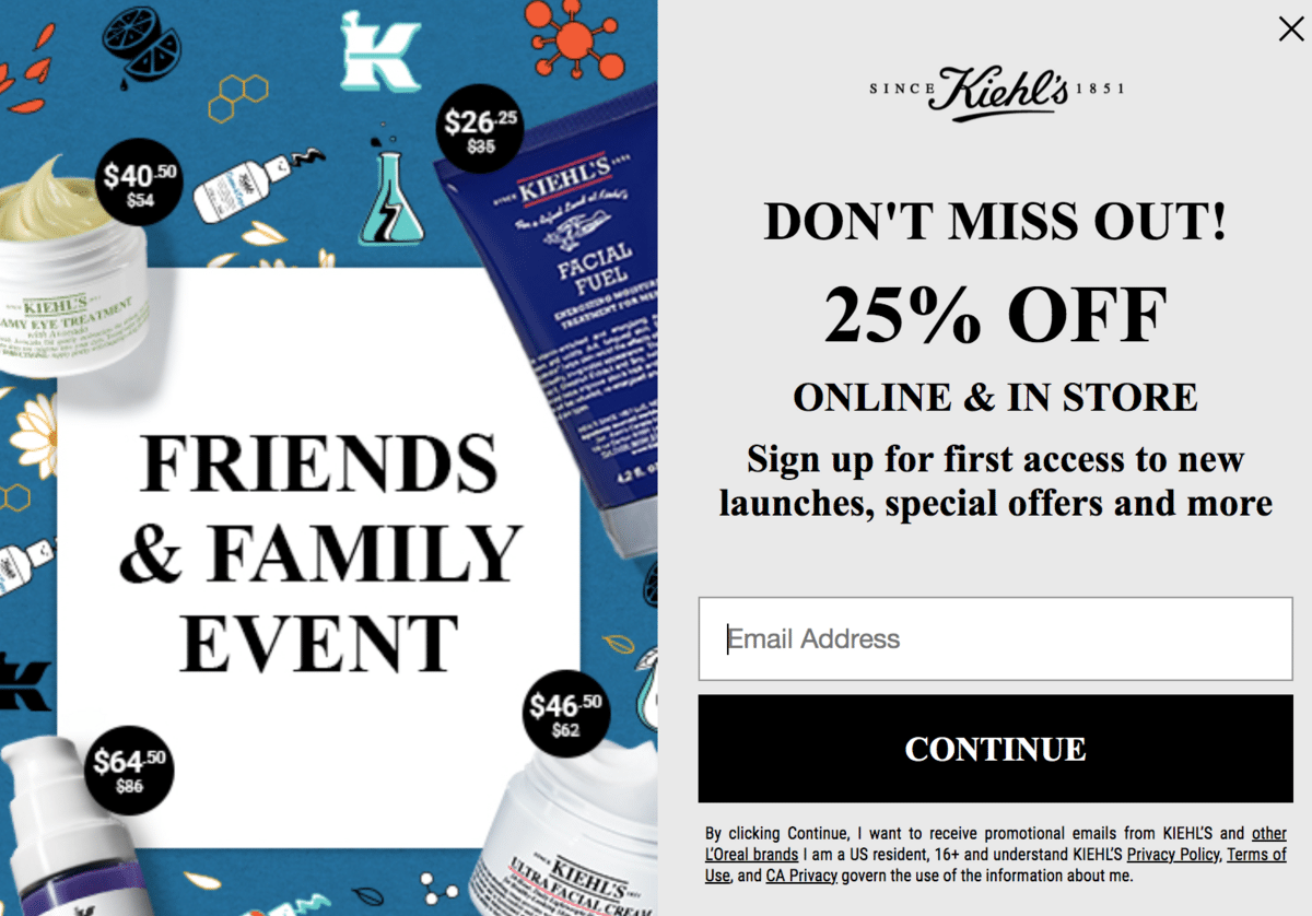
Source: Kiehl’s
Not only will this increase their chances of purchasing your subscription, but you’ll also be able to use this lead’s email address to market to them via email marketing.
In sum, making offers to your potential first-time buyers is a powerful technique for increasing conversions, but it must be used responsibly.
Conclusion
You should make your registration process as simple as possible if you want to ensure potential buyers convert into long-time customers. Their experience signing up will stick in their mind, so make it exceptional. Those first impressions count.