


Whether you’re organizing events, summer camps, after-school programs, or group trips, participant registration is at the core of your process.
And if you want to ensure a seamless experience for your applicants, an efficient and user-friendly registration form is vital.
After all, a poorly designed form, filled with errors or demanding unnecessary information, can deter potential participants, leading them to seek other services with smoother registration processes.
If you want to avoid this, you’ve come to the right place.
In this article, we will equip you with six invaluable tips on crafting the perfect online registration form that yields results—bringing you a steady flow of registrants.
Let’s dive in!
- Utilize an Easy-To-Use Form Builder
- Add Only the Necessary Fields
- Be Sure to Include Clear Directions
- Add a Compelling Call to Action
- Enrich the Form With Your Branding
- Optimize the Form for Mobile Devices
- Conclusion
Utilize an Easy-To-Use Form Builder
Creating the perfect online registration form doesn’t have to be a hassle.
You want a form that’s easy for your applicants to fill out and consists of short, straightforward questions that get the job done.
But how can you design such a form without pulling your hair out?
The answer is pretty simple—you need online registration software with an easy-to-use form builder, such as Regpack.
Regpack’s form builder is designed with ease of use in mind, allowing you to create custom-tailored registration forms effortlessly.
Through a drag-and-drop interface, you can add various fields that will allow you to collect all necessary information from your registrants—from contact details, health information, and dietary preferences, to payment details.
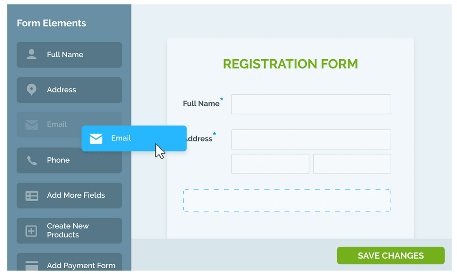
Source: Regpack
Moreover, you can customize forms for different activities within your organization and ensure you gather the right data for each program, be it summer camps, trips, or other events.
Say you’re running a summer camp.
You can whip up a general form for applicants, another one for emergency contacts, and a third for a specific trip you will take your campers to—all tailored to your needs.
The best part? You don’t need to be a tech whiz! Just know what you want to ask your applicants, and Regpack will help you with the rest.
The beauty of Regpack’s form builder lies in its seamless integration with your website.
You can create and host all forms directly on your site, eliminating the need to redirect your registrants to some unknown third-party sites during the registration process.
This proved essential for payment forms, as many people resent being sent to unknown pages to enter their payment information.
Ultimately, they abandon that site and the registration form altogether.

Source: Regpack
Another benefit of Regpack’s versatile form builder is the ability to create multiple forms with unique designs, all while building a comprehensive database for your organization.
Every piece of information your applicants enter, Regpack saves into a database.
You can search, filter, generate statistics, and create reports from this data whenever you want in just a few clicks.
So, here’s the bottom line—utilizing software with a powerful form builder, like Regpack, is the key to crafting the perfect online registration form.
It empowers you to create forms that will collect all necessary information efficiently without overwhelming your participants and driving them to abandon your form.
Add Only the Necessary Fields
We’ve already emphasized that the perfect online registration form should be user-friendly, short, and easy to navigate. But why is this so crucial?
Think about it—have you ever received a survey that seemed to go on forever with an endless stream of unnecessary questions?
Chances are, you probably abandoned it halfway through, frustrated and overwhelmed.
The same goes for your registrants. When faced with a never-ending form, they will likely feel the same frustration and hit the exit button.
Statistics prove this to be true, too. A survey conducted by Manifest has shown that over a quarter of surveyed people will abandon an online form if it’s too long.
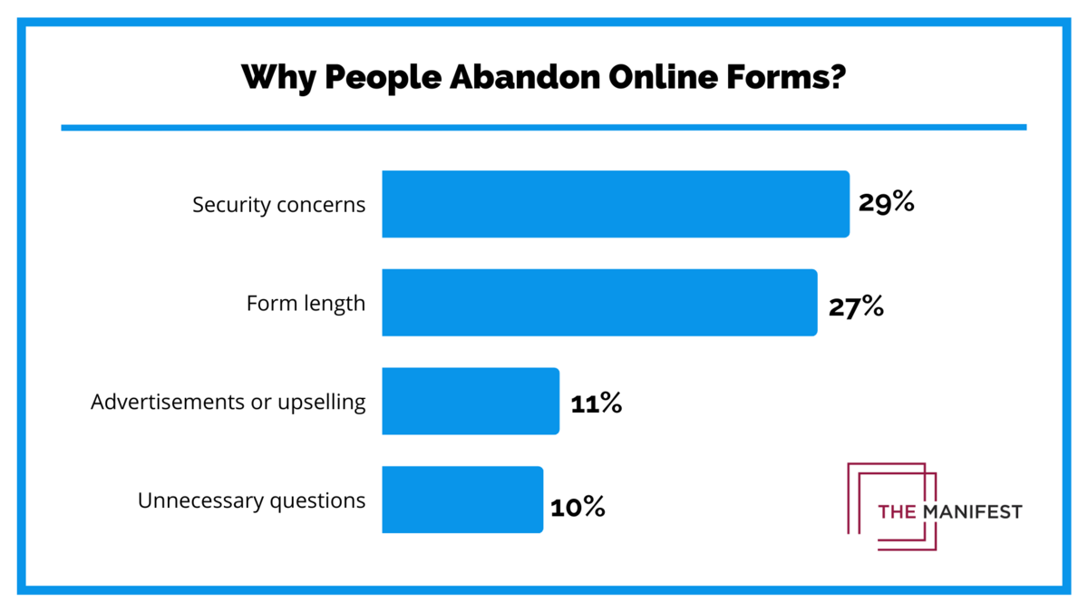
Illustration: Regpack / Data: The Manifest
To avoid this common pitfall and keep your forms concise, you need to identify and include only the necessary fields.
Leave out everything else that could make the process tedious for your applicants.
We understand that this is easier said than done, as there’s probably a fear of missing out on something important.
That’s why, before you start crafting your forms, you need to take the time to determine what essential information you’ll need from your registrants.
While the specific data you require will depend on your business type and the purpose of registration, some common elements apply across the board.
The table below summarizes what information you will need to ask for:
| General Contact Information | the name of the registrant, address, email address, phone number |
| Custom Fields | age, occupation, education level, area of expertise, meal preferences, allergies; based on your specific needs |
| Payment Options | payment methods you accept, one-off payment, payment plans |
In the “Payment Options” section, you can, for example, provide your registrants with a list where they can check off the available payment options that are convenient for them, instead of asking them to write them all down.
In fact, you can use dropdowns and checkboxes more times across the form to make it even more concise.
Oh, and here’s one more golden rule—avoid repeating questions at all costs! Keep it seamless and straightforward, because no one likes having to enter the same information multiple times.
In a nutshell, a clear understanding of the information you need is essential before diving into creating your online registration forms.
When you do start building them, make sure you omit any non-essential questions in order to keep things concise.
Be Sure to Include Clear Directions
To ensure a smooth and successful registration experience, nailing directions within your online forms is an absolute must.
Without proper guidance, registrants might find themselves lost and frustrated, which could deter them from completing the process altogether.
So, to avoid that rocky road, prioritize providing clear directions, especially by utilizing conditional logic to guide applicants through the form more smoothly.
Conditional logic automatically tailors the form for each applicant, presenting them with questions relevant to their unique situation.
It’s like having a personal guide, walking them through every step of the registration process.
Our online registration software, Regpack, utilizes this principle to deliver a unique registration flow for every individual applicant.
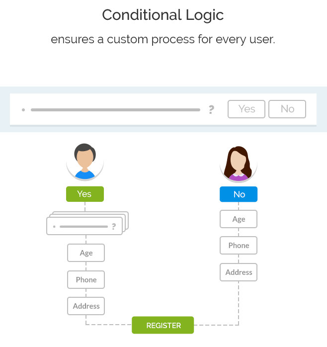
Source: Regpack
Let’s take the example of a summer camp registration form and see how conditional logic works.
If an applicant says they have allergies, the form will swoop in and ask for essential medical information, ensuring the camp has all the necessary health details.
But for those who are allergy-free, the form will whisk them away to the next relevant section without bombarding them with queries irrelevant to them.
You can also use this feature to ask the registrant (or parent) if they want to pay for everything at once.
If the answer is “yes”, the form will not show them the payment plans option. But if they answer with a “no”, the form will guide them on to select the most convenient payment plan for them.
This conditional logic makes Regpack very intuitive and easy to use.
Source: Regpack
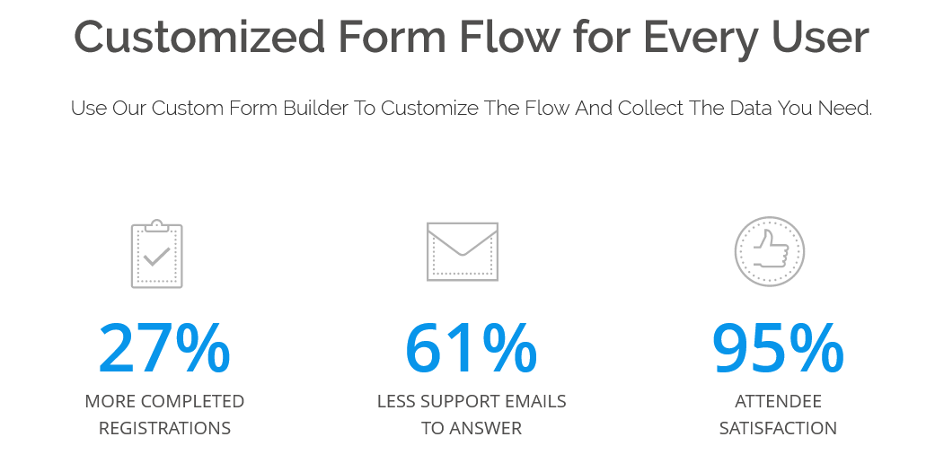
Moreover, with this feature, you can experience a 27% increase in completed applications compared to traditional forms, and 95% user satisfaction because registrations are so straightforward and easy to complete.
In conclusion, make your registration process shine by providing crystal-clear directions and harnessing the power of conditional logic.
You’ll be rewarded with higher completion rates, fewer drop-offs, and an all-around enhanced user experience.
Add a Compelling Call to Action
To maximize the effectiveness of your user-friendly form, including a compelling call to action (CTA) is crucial.
You want your registrants to feel that irresistible urge to complete the registration form right away, and a well-crafted call to action can make all the difference.
Let’s dive into how to create an attention-grabbing one.
Firstly, clarity is critical. Make sure your registrants know precisely what they are registering for, as this alleviates concerns and builds trust.
Avoid using the generic “Submit” text on the call-to-action button.
Instead, use action-oriented phrases like “Register Now,” “Learn More,” “Sign Up,” “Book Now,” or even more descriptive ones, like “Apply to be a counselor,” as in the example below.

Source: Camp California
Visibility matters too. Make your CTA stand out by increasing its size and choosing a color that contrasts with the background while still aligning with your page and brand.
Also, transform your CTA into a button format to make it clickable and encourage immediate action.
Moreover, personalization can add a nice touch to your call to action button. Use language like “my” and “me” to make your registrants feel like the registration was custom-made for them.
Take inspiration from Stitch Fix, an online personal styling service whose compelling and personalized CTA invites clients to take a quiz to discover their unique style.
The language they use makes clients feel like the service was designed just for them and that they will get a personalized experience.

Source: Stitch Fix
But don’t limit yourself to just one compelling call to action.
Yes, the initial one will drive registrations.
Still, you can enhance the user experience by incorporating additional buttons like “Click here,” “Continue with the form,” or “Take the next step” throughout the whole registration process.
These buttons can serve as directional cues, and giving directions to your registrants is crucial, as discussed in the previous section.
In summary, a compelling call to action will set the tone for successful registrations.
So, ensure your CTA stands out, feels personal, and takes the form of a button.
When you strategically incorporate such buttons at various steps, your registrants will easily breeze through the registration process.
Enrich the Form With Your Branding
Not only your call to action button, but your entire form should align with your branding to showcase your unique identity and legitimacy.
When registrants see forms that clearly belong to your organization, they will feel more secure in providing their personal data and payment information.
So, be sure to include your branding everywhere, from pre-applications to registration and post-registration surveys—essentially, in every form.
And not only online, but also physical forms, if you require them.
Take Stone Mountain Adventures, a summer program provider, as an example.
They have successfully integrated their brand name and logo into every form, including the physical doctor’s report form, which you can see below.
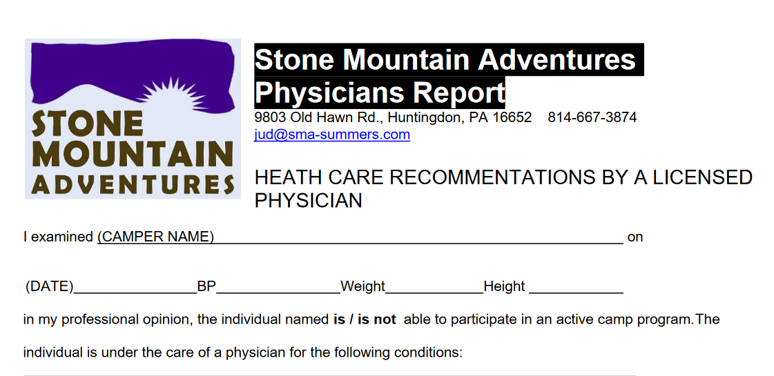
Source: Stone Mountain Adventures
By doing so, they establish trust and consistency throughout their entire registration process.
So, what does a company’s branding encompass?
- Brand name
- Logo
- Color palette
- Typography
- Tone and voice
- Graphics and images
- Slogan or catchphrase
Since the perfect registration form should stay short and concise, you probably won’t have space to put your slogan on every form page or add images to every field.
However, you can still include these branding elements here and there. They will not only show your identity but also break the monotonous stream of questions.
What’s most important is staying true to your brand through consistent colors and typography used on your web pages and social media, as well as maintaining the appropriate tone and voice.
For example, if you prefer addressing your registrants directly with the personal pronoun “you,” use it across all your forms.
Or, if using humor is your thing, create forms in that style (as long as you have enough space to gather all the necessary information).
All in all, consistency is the key to success for your organization, and branding is one great and effective way to achieve this.
Optimize the Form for Mobile Devices
Last, but certainly not least important tip for creating the perfect online registration form is optimizing it for mobile devices.
In today’s world, mobile optimization is a must when it comes to online forms.
With over 85% of the world’s population owning a smartphone, it’s safe to say that many use their phones for everything, including registering for various services.
Since convenience is key for all of us, taking out a smartphone for quick tasks often trumps using a laptop at home.
Therefore, mobile optimization becomes a top priority in crafting a compelling form that your registrants can fill out wherever they are.
Source: Think with Google
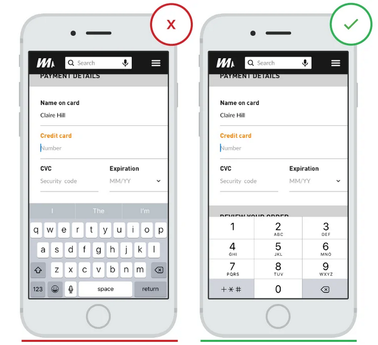
But how can you make your registration forms responsive on mobile devices?
This entails adjusting all aspects of your forms, including redesigning elements, changing spacing, adjusting font sizes, and optimizing your call-to-action buttons, among other things.
But doing this manually could be an overwhelming burden for you and your team.
Thankfully, there’s an automatic solution available.
The right online registration software can effortlessly optimize forms for mobile devices with a simple setting adjustment under the “Appearance” section, as shown in the screenshot below.
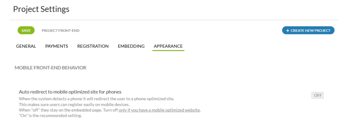
Source: Regpack
It offers the benefit of creating mobile-responsive forms, including payment forms, regardless of whether your web page is mobile-friendly or not.
These responsive forms will adapt seamlessly to any of your registrants’ devices, thus ensuring a smooth and efficient registration experience.
So, make it a priority to find online registration software that can automatically optimize your forms for any device your registrants use.
By doing so, you will undoubtedly witness a boost in successful registrations, making the mobile optimization process well worth it.
Conclusion
In this article, we’ve covered six crucial tips for creating perfect online registration forms for your organization.
Let’s recap the essential points.
Utilize an easy-to-use form builder, keep the form concise with only necessary fields, and provide clear directions for a quick and straightforward registration process.
Additionally, include a compelling call to action, maintain branding consistency, and optimize the forms for mobile devices.
Once you implement these steps, the number of successful registrations will rise, and you will have many more happy registrants.